
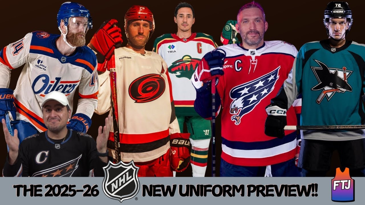
A LOADED Set of New Uniforms for the 25/26 NHL Season! | FTJ New Season Uniform Preview!
Hello everybody. Welcome back to Fon Talks Jersey. It is I, Fon Fal, a jersey connoisseur here in the wonderful world of YouTube. And yes, we talk hockey here as well too. I’ve said this before. I am a huge fan. I’m starting to become a huge fan of hockey jerseys. This is pretty much the first one I got in the collection. The Capitals Screaming Eagle versus Retro Alt. I love this one. It’s like probably my favorite, one of my favorite jerseys of all time. But, you know, as per usual with this channel, we do the new preview of the season, but not talk about the actual like who’s the best team onto because to be honest, I’m not sure who’s the best team in hockey, but we do look at the new uniforms we will be seeing. And let me tell you, for the 2526 NHL season, we got a lot of good uniforms coming about here. Spoiler alert, here’s just a quick kind of breakdown on what we’re going to be seeing. We talk about any new jersey or throwback uniform that comes back into for this upcoming season. It also includes some rebrands. Now, three teams have done a brand new rebrand, and of course, I did talk about those a while back, so link for those videos will be down below. One team got a new home jersey, one team got a new road jersey, six teams dropped an alternate jersey, and two teams got a throwback uniform. And let me tell you something, a lot of these, and majority of them had got some high grades here. I’m just going to tell you that right now, cuz they all just look so so good. And even hockey jerseys, like I said, I’m starting to like them a lot more. And to be honest, I might get one or two for the collection cuz that’s how much I like them a lot. But the grading criteria, you guys know how it is. How well do those uniforms look? How much of a fan I am of them, just the great simply how they look. Now, the previously done videos for the Bruins, the Blues, and the Mammoth, the ones I did already talking about like their new rebranding of the new uniform overall. I’m going to discuss those a little bit briefly, but not too much into detail because I already talked about them. Again, if you want to watch those, the links for those will be down below. And of course, they’ll be popping up here when I get to that team cuz we’ll be doing them in alphabetical order. And let’s just get now right into it. Here’s my new season uniform preview for the 202526 NHL season. Starting off here with the Boston Bruins. They are bringing back a classic here. They have a new logo and a new home and road jersey. Well, kind of because they did use these before. The new logo is the permanently adopted redesign of the spoked B logo they used for a couple of seasons ago as the Centennial season. They used them in the 2324 season and of course the 2024 Centennial game they did. Now, the jerseys they wore are going to be from the 1980s to 1990s as well as the prior Centennial game. And you guys saw it here. The home jersey is the black base with the logo of the gold bee with the black spokes and the gold wheel around it. And the road uniform is the white with the black bee, black wheel, and the gold spokes. I said this before, the Bruins have a nice classic logo here. It’s very simple. Works well. The color scheme looks really good here. The home jersey I gave an A minus at the time and it still applies here. And that road jersey gets the Agrade as well. Both jerseys are really good. And of course, you want more of a deep dive into it, you can check out that video, of course. The Carolina Hurricanes got a new road jersey. This jersey is based off the team’s 2023 stadium series jersey that they wore at Carter Finley Stadium. Also noticing a lot of teams are doing the Stadium Series jerseys as the regular rotation jerseys now because a lot of the Stadium Series jerseys are really good. But this time for their road jersey, it is based off that Stadium Series jersey, but the logo is now recolored to black and red with the white base. And it’s with the flag of North Carolina on the left shoulder and the struting Stormy mascot logo on the other side. That of course is based off the vintage local collegiate team logos that are on the right shoulder. And you know what? This gets a B-grade. I think I like the Stadium Series jersey just slightly more here. But again, it is a road jersey. It has got to be the white for the road team here. The logo, I got to say, I actually do like a lot here. The black and red combination actually works really well here. It pops with the white base. And the two logos on the shoulders here just overall looks like a really solid road uniform. And it wouldn’t shock me that maybe next year we’ll see their home and all jersey have something similar to this feel here because this was a popular stadium series jersey at the time. That’s also another future video, by the way, of the best stadium series jerseys. I got to do a deep dive into that. Chicago Blackhawks have a temporary new home jersey for the 100 Centennial season. Now, the Centennial Edition uniform pretty much looks exactly the same. You’re like, “Wait a minute, it’s not really a new uniform. Has some little bit of changes here. This time, they added a laced up collar here, and there’s gold trim around the crest of the logo in the center, and of course, the numbers on the back with also a 100th anniversary patch on the right shoulder.” Now, this is a temporary home uniform for the 100th season of the Chicago Blackhawks. So, after the season, they’re going to be going back to their regular home jerseys. So, for every home game this season, they’re going to be wearing this one with the gold trim around the logo and numbers. And look, yeah, it might not be any huge change here, but it still gets an A grade. I think the Chicago Blackhawks home jersey is probably one of the best jerseys in the NHL in my personal opinion. Someone who’s not really a huge hockey fan, but likes the jerseys, it is a really, really top-notch one. And even the gold around the logo here kind of adds a nice touch to it. And again with hockey jerseys. I love the laced up collar here. I think that’s like one of the more underrated parts of the hockey jersey like fandom overall. But yeah, agrade very simpler. No huge changes here. It is a very good jersey to begin with. Why mess it up? You added the nice stuff here with the gold around it and the numbers here. Good call. The Detroit Red Wings also have a 100 Centennial Edition uniform here, but it’s not a temporary home uniform. They’re going to be having this and the regular home uniform. This will be worn for a select few games. Now, this one, as I read here, it features inspiration from previous incarnations of the team, from the Detroit Cougars to the Detroit Falcons. And the crest here is the same one here, but has like the chain stitched effects here on the winged wheel here. And it’s the red base here with the multiple white stripes here on the bottom and on the arms. I think the Detroit Red Wings also have a very solid uniform rotation here. And this is really good, too. Another underrated part here is with the captain’s patch. Has like the letter triangle on it, too. This also gets an Agrade. I think this is a really solid uniform. I think the Blackhawks and that winged wheel for the Detroit Red Wings is one of the more better logos in the NHL. Something about that logo is just really cool here. And the chain kind of effect here with the wings and on the wheel itself here looks really cool. Very old school vibes and a grade. It’s very, very good. Now, personally, maybe if they swapped the colors with the stripes was the red here and the base of like that off-white thing. Maybe I would put it as an A+ grade. I feel like that would look kind of really cool, too. But still, this is another solid uniform. You guys see the trend here. A lot of good uniforms here so far. The Edmonton Oilers have an alternate jersey in the rotation. Now, they will only be worn for seven times this season here, but you see it’s a light tan base here with the Oilers word mark here and the crest of the new oil country on the shoulder patch. And it has like the blue here on the top here, the blue on the arms, and the blue on the bottom with the orange stripes on the top and bottom. And some people I saw on the internet aren’t too much of a fan of it, but I gotta be honest with you, I kind of actually like this uniform. I’m gonna give this one an A minus grade. I don’t know, man. Something about it is really cool. I like that wording of the Oilers here and that tan base here works really well here. I think the orange and blue again maybe a little bit biased because the Mets and the Knicks here. I think it’s a good color combination here. That scripture of Oilers looks really good here. The shoulder blue and orange looks good here and just overall just looks like a really good alternate uniform. I’m a fan of it. The Minnesota Wild have unveiled a throwback uniform and it’s reintroducing their former white jerseys. Now, they originally wore this their first season in 2000 to 2001, that inaugural season through 2012 to 2013. Now, this will be their 25th anniversary uniform, but with the formerly tan striping and sleeves numbers are now in gold. You mean to tell me this is their 25th anniversary? Man, I’m getting really, really old. But you see here it is the white base with the Wild logo here on the center here and on the striping on the side with the green, gold, and the red here. And I got to say, the numbers on the back here look really cool. This actually gets a B+ grade. I actually do like this uniform a lot here. I like the regular green one a little bit better here, but the white base is good here. Doesn’t take away from the logo in the center because the logo is actually really cool here. And the numbers here on the back here work really good. That number font is the best part of the uniform in my opinion. There’s some really good stuff here. The New York Rangers on another team that are joining the Centennial trend here, honoring the past with their Centennial Edition uniform they’re going to be wearing for a select number of home games. Now, this jersey is very, very play. As you can see here, it’s a lighter shade of blue compared to their regular Rangers jersey at a diagonal Rangers word mark in the white lettering. Now, this is paying tribute to the uniforms worn by the team during the inaugural 1926 1927 season. Now, this gets a B-grade. It is very, very plain, but I do understand it’s from 1926 to 27, that era here. But it still looks pretty solid, I will say. Again, not a lot going on. Simple Rangers wording here, but that blue makes up for I think the blue, that shade of blue is the best part of that entire uniform. It looks really good, I will say. Even though it is plain, but again, I get it is from the 1920s. The Ottawa Centers, for the first time since 2019 2020, they’re going to be having an alternate third jersey. And as you can see here, the jersey is red trimmed in black and gold on the hem and sleeves with the Peace Tower and the flag of Canada on the back of the jersey. And it’s a very simple jersey here with the red here with the black on the arms and the black on the top here. This also gets a B+ grade. It is a solid uniform. It actually works really well. I think the Auto Center logo is actually really nice, too. doesn’t take away from it too much here. Overall, a really solid also jersey. It’s a good one. I think they just make this their primary jersey in my opinion. The San Jose Sharks have a throwback uniform. And that makes me feel old because this is considered a throwback uniform now. It’s their Heritage 2.0 35th anniversary jersey. And this uniform they wore from 1998 to 2007. Their old teal uniforms here with the logo in center. You see the shark biting the hockey stick here. This gets an A+ grade. I absolutely love these uniforms. really growing up not watching hockey as much. I will say the Sharks were one of those teams that I liked because of those uniforms with that logo in the center. The Sharks overall have had a really good set of uniforms throughout its history. But this one, their Heritage 2.0 ones are really nice. That logo on the front here, it’s really cool for me. I don’t know why. Some might call a little bit goofy and very 90sx with the shark biting the hockey stick, but for some reason, I do like it a lot. I think the numbers on the back here, another underrated part of the uniform as well. Overall, this is a really good set. I might have to get one of these for the collection cuz I think they’re really good. The Seattle Kraken unveiled a new third Olen jersey here and this is a very very unique one. As you can see here, the logo of the Seattle Kraken in the center here. The jersey is black with the Soner inspired stripes on the sleeves and the socks here. But the main part of the jersey, as you can see, it might be a little bit plain here because it is a special kind of jersey. That’s because the crest here on the front, the logo, the stripes, and the sponsored patch, which again, it’s of course they have to do that. It glows in the dark. That’s right. The jersey itself you see here at night time. I guess if they want to turn off the lights at the arena in Seattle, it glows in the dark. Now, take away the glow-in-the-dark aspect here. It is a plain uniform. I think the Seattle Kraken has some good uniforms, but this one is a little bit plain here. It does get a B-grade here, but the glow-in-the-dark aspect, I think, personally is kind of cool. Now, some might call it a little bit goofy because a professional hockey team has a glow-in-the-dark jersey, and I do understand that, but I don’t know why. I think that is kind of a cool kind of add-on, something different with this team cuz it is a brand new hockey team. So, why not? Maybe Seattle will probably just turn off the lights in the arena and just play the game like this and we’ll see how it goes. The St. Louis Blues are another team on here that got a rean. And of course, a reminder if you want a deep dive into it. The video up here is for that. But quickly, I’ll go through it here. They unveiled a new logo and color. So, you see the logos here up on the side here, the one from 99 to 25 and then from 25 onward. Now, those are based on the heritage blue note used in the 2017 and 2022 Winter Classic games. Now, the home uniform resembles those worn in the 2017 game, and it also uses an Alton jersey from 2018 to 2025. Again, it’s not exactly the same, but has some inspirations for it, similar to the Carolina Hurricanes road jersey. Now, the road uniform resembles those worn in the 2022 Winter Classic game. And of course, their Navy jersey they wore last year and before at their primary home jersey will be used as an alternate jersey. Kind of gets to more clear out the inventory. But both these uniforms for the St. Louis Blues, I always like them a lot. I think they’re really good. They’re both good on their own. right here. The blue, you can see the logo. You’re not too sure how it’s going to look on the ice here. But the road one, I think, had a little bit more variation to it, but they’re both good in their own right. I gave them both an Agrade here, and it still stands. They’re both pretty good. The Utah Mammoth, again, another team I already talked about. Again, if you want to see my more deep dive into every single logo and uniform here up there, but I’ll do a quick little talk into it. Now, after being the Utah Hockey Club last season, is their first season officially as the Utah Mammoth. Now, I talked about the logos itself here. I’ll pull them up on the side here. I love every single logo here. They’re really cool. The U with the tusk here might be my favorite in a hat version too. These look really good. But quickly here with the jersey here. The home jerseys have been replaced with a diagonal Utah word mark with the Mammoth primary logo and the Utah State outline shoulder patches. And the road uniforms itself retain the actual word mark here which says Utah on here with the Mammoth logo on the shoulder. Now I gave the home jersey grade an A minus that still stands pack here. I think it looks really good here. Now the road jersey I still have it as a B minus grade. I do like it a lot, but I wish that they took away the Utah wording and swapped it here with that U with the tusk here. That’d be kind of good here in the center here. But overall, both jerseys and the overall colors and the logos work really good. And again, a reminder, you want to check out my full deep dive into it, link is down below. And lastly here, the Washington Capitals. As you can see here, they have a new alternate jersey. It looks like we’re not going to be seeing these jerseys again. It was a one-off special when it was a reverse retro and then the 50th anniversary alternate, but again, love this one. But the new one has a little bit of a change up. It’s similar to this. For the second consecutive season, they have the new also jersey here. As you can see, it is a red screaming eagle jersey. It’s this jersey, but in red. They’re going to be wearing it for 15 home games. This features a stripe and a white yolk representing the Capital’s original 1970s and 80s uniforms. But for this one, much like the other ones, the Screaming Eagle will be on the crest here and the Capital patch here you see with the Capital building with the hockey sticks will be on the shoulders. So, it’s pretty much very similar to the 1990s, early 2000, that 50th anniversary alternate. It’s the same jersey, but in red, different eras with that Screamy Eagle with the red and blue color. This gets an A grade. I think this is a really good jersey. Like I said, it’s one of my favorite hockey jerseys. I like the black a little bit better. I gave the black one at the time an A+ grade, but this red one is pretty good as well, too. Also an A grade. Now, might I get a red one for the collection? Maybe. I don’t know. Here. Maybe if they swapped the logos here, it’d be kind of cool here. But it is a little bit the same here. But again, it is just a nice jersey. I can’t complain too much about it. It’s still really good. Again, different errors in the one also. Really nice A grade. And that is my uniform preview for the 2025 26 NHL season. Now, let me know down below what was your favorite new uniform you saw in the rotation. Did I give a grade too high? Was there one too low? Well, I really didn’t give any low grades here. But what was your favorite of the bunch? And which one are you going to be getting for the collection? As always, you can always follow the channel here at Fontoj. Subscribe, hit the bell, tell a friend, and tell a couple friends. You can follow the Instagram page at Fon Talk Jersey for when the videos will be dropped. Here’s some exclusive stuff on there, too. Some jersey history show off the collection and whatnot, too. You can follow my other YouTube channel at FS the Falcon. Consider more like a throwaway kind of grab bag channel. I put some videos on there, just some random ones. I talk about some non-J related stuff on there. Tik Tok and Instagram, FS the Falcon. Would appreciate all love and support here. We’re on the road to this channel for almost 1,000 subscribers, man. We’re going to do it, man. And I’m very excited. But again, I want to thank you guys so much for this channel. Now, we got a lot of stuff cooking up on here. Of course, we got the week five best uniform matchups coming up later this week here and a bunch of other stuff. The NBA season preview for the uniforms and a bunch of other things with the collection and jersey stories. A bunch of other things. Man, we got a lot cooking up here and some non-J related stuff here. Sometime in November, we’re going to be debuting something else here again for the other channel, Falago. So, again, you want to stay tuned for that stuff as well. A lot of good stuff for the brand and the support here. I appreciate it and I love you guys. I really do. But for that, I’m going to take this off here because the AC is not on here and it’s really hot here and I got to cool off for a second. Have a good day, good night, good evening, whenever you’re watching said video and I’ll catch you all next time. Peace out.
The 2025-26 NHL Season has a pretty good amount of new uniforms will be seeing. From re-brands, alternates, and some popular throwbacks! Which new uniform are you liking the most?
Check out the following deep dives videos on the teams that got a full re-brand!
Boston Bruins: https://youtu.be/GsS8LbzbaKk
St. Louis Blues: https://youtu.be/0l8ekY6xR0w
Utah Mammoth: https://youtu.be/1qoMPzt1Dn4
Follow Fonz Talks Jerseys on Instagram: https://www.instagram.com/fonztalksjerseys/
Check out my personal YT Channel – @FonzDeFalco
Check out my other social platforms like my TikTok and Instagram: https://linktr.ee/FonzDeFalco
#jerseys #seasonpreview #nhl #hockey #hockeyjerseys #sanjosesharks #washingtoncapitals #bostonbruins #stlouisblues #edmontonoilers #minnesotawild #carolinahurricanes #newyorkrangers #seattlekraken #chicagoblackhawks #detroitredwings #ottawasenators #utahmammoth
2 comments
Those wild throwbacks are so beautiful, I want to see the green alternates make an updated comeback.
Lot of good jerseys, as a sharks fan I love our classic one