
NHL San Jose Sharks NEW Anniversary Jersey!
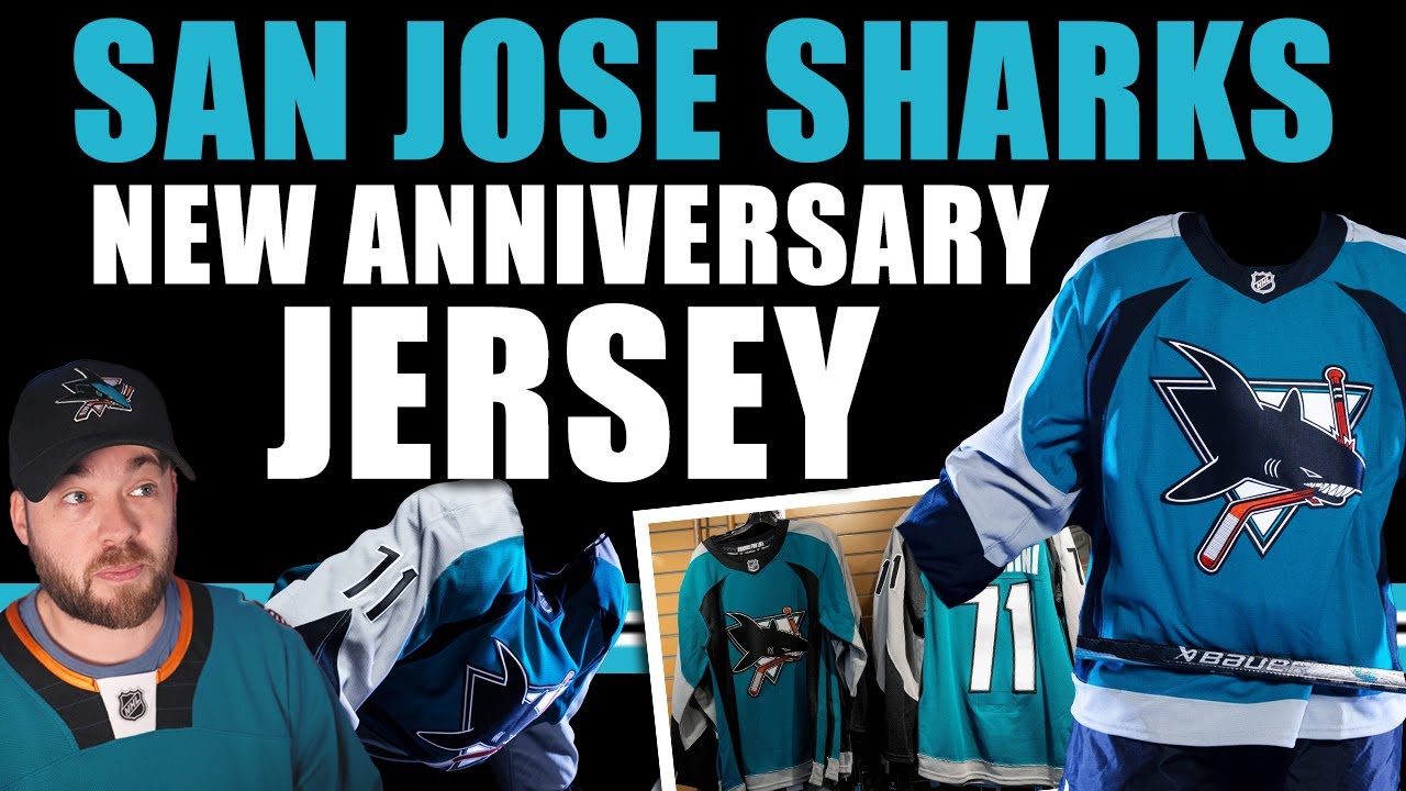
Hey everybody, Neil here from Post to Post. We’ve gotten so many jersey releases in the NHL in the last couple of weeks. It’s been a really exciting time leading into this next season. We went through the first year of Fanatics where, you know, jersey releases were pretty low compared to the Adidas years for good reason. It’s the first year of Fanatics, so they had some work to do. They had some manufacturing to figure out, you know, all that stuff, you know, but now we’re into the second year and we’re getting lots of jerseys. So, I think that uh the future, although don’t love fanatics, personally as a company, I think think the future is going to be pretty interesting in these next couple of years when it comes to jerseys. So, the San Jose Sharks have released their new anniversary jersey. Uh I can’t believe it’s been it’s been I guess what 5 years since the last anniversary jersey. I don’t understand where time has gone, but it’s time to celebrate another anniversary. So, with this jersey, the Sharks decided to go back uh go way back way back to basically the original jersey. So, I’ll bring up some photos and we can walk through this one and kind of uh talk it out. So, here’s the first photo that I saw. And it’s okay. You know, dynamic lighting and stuff. That’s that’s fine. That’s great. But, I was really looking for the other photos. I want to see the jersey as a whole. I want to see from top to bottom. These are cool photos, but they’re these are marketing photos. I want to see the jersey. So, I kept looking. I found this photo. And this is much better. This is a full-on, you know, I can see the shoulders. I can see the arms. I can see a little bit of the numbers and so forth. So, this is really the the view that I’m looking for. And I mean, there’s not really a surprise or shock here. It’s basically their original jersey. It’s okay. It’s okay. It’s nostalgic. That’s cool. But I don’t love it. I think it’s very, very like almost practice jersey in a way. It’s this colorization that kind of comes up here. It’s got some nice flow to it. It mimics the logo a little bit. It’s not terrible. It does make me nostalgic, but I was just hoping for maybe something else. Let’s take a look at the back. I think the back does look a little bit better than the front. Uh, I do like this black section up here. Uh, the number kit looks fine. It is what it is. The letters don’t necessarily replicate the numbers, but you know, it is what it is. It’s still nostalgic. Here’s another photo of the jersey. So, you can see a little bit more of the numbers there. And then I think I have one more that’s just a another front look. And they did release some other stuff as well. So, they released this graphic again. So, photos in different lighting, which I think it makes it look a little bit better if I’m completely honest. The gray just seems to pop a little bit bit more. They’re showing some of the details as well. Sharks for life in the inside of the neck. There’s some shark teeth uh stuff in actually I don’t know where in the jersey that is. Maybe the inside or the underneath uh on the bottom. I’m not exactly sure but uh but yeah. And they posted these photos as well from the team store and it’s you know it’s for sale. It’s for sale. People have these already. They’re wearing them and that’s pretty awesome. So you can get them right at the team store currently. And here’s another photo of them in the team store as well. So, I might seem a little bit disappointed in this video talking about this jersey. And I guess you wouldn’t really be wrong to have that perception of of me because I am a little bit disappointed, but it’s more so from like a conflicting way. Like I there’s nothing wrong with the jersey. It’s an okay jersey. It’s just I was just hoping for a little bit more spice. We just got done talking about the Minnesota Wild. They just came out with their anniversary jersey and yeah, it’s pretty close to what they originally wore as well, but it just seems a little bit more spicy. It’s got that gold in there. Just it seems to pop a little bit more. It seems like they made a lot of little decisions just to kind of bring it forward into the current future, but also feel retro a little bit where this to me personally just feels like kind of a replica of the original. And maybe that’s okay. Like this is all subjective. It’s all personal opinion. Uh I don’t necessarily think I’m right here. I just I was maybe just hoping for a little bit more. I love the fact that they’re using that logo. Like that logo is amazing. Super pumped for that. But yeah, overall maybe a little bit disappointed, but I still think it’s better than the home jersey. So I’ll definitely say that. So, that’s all I got for the San Jose Sharks. So, we talked about the Minnesota Wild in that previous video. Like I said, if you haven’t seen it, go check it out. Uh, we talked about the new Washington Capitals jersey, the Ottawa Senators one, the small change on the Chicago Blackhawks, the Rangers one. There’s been so many jerseys that have released recently. So, go check out those videos if you’ve not seen it. Subscribe for more future videos like this where we uh basically talk about every single jersey in the NHL as it’s released and obviously more. On Fridays, we do the jersey concepts. And the next video is going to be talking about some actually non-JS. We’re going to be looking at some of the new center ice designs in the NHL. We did talk about Vegas. We talked about Montreal because they came out with new center ice designs, but I want to just revisit Vegas very quickly because we got some footage of an actual game taking place. So, I want to talk about that center ice design and how it impacts kind of the visuals as you’re watching the game. Plus, we got new center ice designs from Detroit, San Jose, and LA. So, we’re going to take a look at those photos of those in that next video. So, hope to see you there. and let me know down below in the comments section how you feel about the San Jose Sharks new anniversary jersey. All right, we’ll see you in that next one. Adios. [Music]
Episode 1769
Supporting the channel can be done here:
YouTube Membership: https://www.youtube.com/channel/UCnWUMMlROKuT3roikjMp9TQ/join
Monthly Patreon contributions: https://www.patreon.com/Post2Post
Direct contributions: https://www.paypal.me/Post2Post
DEALS:
Save on jerseys by **FIRST** going to https://www.coolhockey.com/post2post and then using code “POST2POST” at checkout! This will save you 10%.
Save $20 off your first purchase at https://seatgeek.com/ with code: POST2POST
Save 10% off any template at https://sportstemplates.net/ with code: POST2POST
Want to submit YOUR jersey concepts to get reviewed? Please watch this video to find out how: https://youtu.be/fb_h_mB19fo
Play games with me on Twitch!
www.twitch.tv/post2post
PO Box: Unfortunately, the PO Box is now closed.
Find us on Social Media here:
https://www.Instagram.com/Post2PostShow
Tweets by Post2PostShow
Have a business inquiry or want to send me a fan video intro?
E-mail me here: productions@post2postshow.com
*Due to the amount of e-mails, a response cannot be guaranteed*
#NHL #SanJose #Sharks #SanJoseSharks
24 comments
Not bad but I still prefer the original first jerseys they had for a throwback. This jersey may have been better if the grey was a silver or something
The 1997 jersey is for their 35th anniversary
Vancouver and Buffalo reached 55th this season
I really want this jersey with the current logo!
Such a disappointment from a franchise with such a solid history of designs to have drawn from.
Fanatics have really gone alternate jersey mad, haven't they?
Born in 1992, I am absolutely loving the throwbacks coming out right now. The Sharks, Wild, Caps throwbacks hit me in the feels lol
Plus I am a Wings fan and love their Centennial jersey
Not exactly originals, these came 7 years in (as primary). Would’ve preferred the real originals.
Still more jersey releases to come that people don’t know about hehe 😅
They wore those from 1997- 2007
Many of us were first introduced to the Sharks wearing this jersey, I never had the opportunity to buy one then. They've finally came out with a legit replica and im glad they went "boring".
Neil there is reports there still maybe more coming so have to see i do like the gray looks darker stands out more . also as a Jersey man you see the Checkers new home and road that took the Panthers design but the colors to me make the design stand out more then their parent club Panthers . and the Thunderbirds made there blue 3rd there new road jersey then made a white jersey of it .
The whole teal uniform is really bad.
I really like the jerseys they started in.
Better with the dark helmets.
I'll get one Authentic pro next week… its amazing
its a solid jersey but this isn't their original jersey but that is their original logo which i have been a fan of!
I became a sharks fan in 1999 so this jersey is very special for me and for a lot of other Sharks fans here in the Bay.
I have the original CCM jersey and it's one of my favorites. I'll probably get this one if it goes on sale as mine is starting to fray
I’m sorry to offend any Sharks fans, but that logo is just…tired.
I loved this jersey. Wouldn’t mind this coming back with the new logo
New center ice from Calgary too
That is NOT their original jersey!
These are there 2nd jersey. I believe 97 first worn. These are my favorite….the original were traditional and a lighter teal. 🙂
obviously the centennial jerseys were going to have a classic look but it seems like the whole league is going back to their classic jerseys and i absolutely love it
sharks and wild have the nicest jerseys in the league right now with the return of these. so good!
Growing up, when I became a hockey fan in 2003-04 and I picked the Sharks as my favorite team, I always wanted one of those jerseys. They looked so colorful…. Now i think it’s time to finally get one haha