
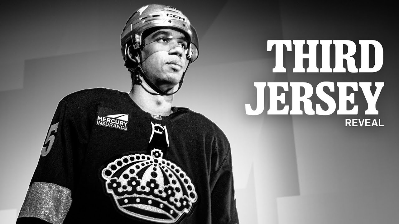
LA Kings Unveil New Third Jersey and it’s BEAUTIFUL 😍
AVAILABLE NOW: LAKINGS.COM/CROWN
“Fear of the Dark” by @ironmaiden
Find Us 👇
Instagram: http://instagram.com/lakings
Twitter: http://twitter.com/lakings
Facebook: http://facebook.com/lakings
Web: http://lakings.com
#LAKings #NHL #GoKingsGo
22 comments
👑
Love it GKG !! Byfield FOHer
If I don't see some Forum Blue and Gold soon …
Everything is great, but the helmets are brutal.
Ugly
Jerseys are jinxed don’t buy them!!!
Looks good
LA Queens lose to the Avs.😂😂😂
Too bad their playing was crap.
Fire
I’m gonna say this right now. They did the same thing with the NFL rivalry jersey reveals and they need to stop with the weird ambient lighting and filters because then I can’t get the full vibe of the jersey. It’s stupid. It’s a black and white jersey. How about not making the video black and white? Have these stupid videographers and editors never heard of contrast? Jeez
Not a fan of the jersey or helmets!
I like it a lot, but after one wash I think it would fall apart with fanatics quality…
Maiden?! Tight!!
I was at the Game Tonight and The 3rd Jerseys look good in person !
Bruce Dickinson's National Anthem was BADASS !!!!!!!
GKG !! 👑🏒🥅🏆🏆💯🤘😎🤘🔥🎸
What the hell is up with the tinfoil hats?
While I like the design of their thirds , I do wonder why they've abandoned the purple and gold? I dislike black in uniforms it's the lowest common denominator and it's lazy. In my opinion anyway.
Terrible choice of a song…. There’s a joke amongst metal heads, Fear of The Dark lyrics sound like “Fear of The Duck”
go look sharp as you lose to the oilers again
Colorless = Characterless
Quit being so boring. Your team name is the Kings. Perhaps your jersey should show that, beyond just the logo.
I love the Kings, but this jersey looks like a practice jersey. Not my style.
Should have went with the purple