
Jersey Comparison: San Jose Sharks Original vs Current look
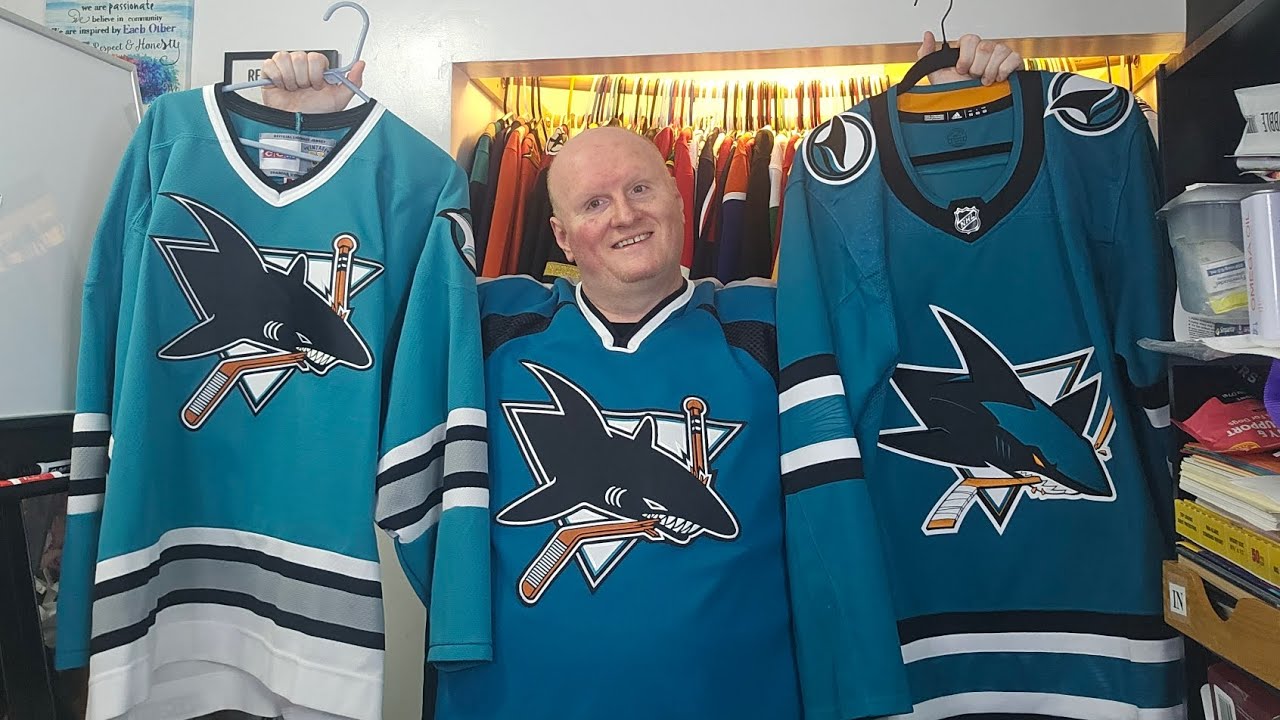
happy Sunday there everybody Sunday afternoon here is when I’m uh recording this uh of course yesterday was a lot of fun yesterday was a lot of fun went to the University of Minnesota Golden goer hockey game uh with my cousin who scored two free tickets in a uh in a raffle that he was in and uh so we got to go see the Minnesota golfers sweep the weekend Series against the Ohio State Buckeyes the golden golfers by the way coming into the weekend were number five in the country Ohio state was number seven ranked in the country so the golfers they might move up depending on how some of the other teams ahead of them did this weekend the golfers might move up so back to doing some Jersey comparisons and now this this is a jersey that I think is very underrated I have two versions of this I have two versions of this and I might actually do a part two comparing the two versions of this because there are differences for sure in the two versions of this so I might do a second part to this showing the two differences in the two jerseys of this that I have but what I wanted to do was I wanted to kind of compare I wanted to compare I wanted to kind of compare let’s we’ll start with this one the OG the OG San Jose Sharks this of course is the CCM vintage version this is I mean when when they came into the league in 91 and they adopted teal no nobody had really done it nobody had really done teal before and it looked fantastic absolutely fantastic the the shark fin was a was was an incredible Touch of course the logo you know the fierce looking shark and and it does this thing is just incredible this was a jersey that was so popular when it came out I mean when this came out yeah the team on the ice was absolutely horrid horrible I think they lost seven what they that fir first or second year they lost 70 games they were just awful but these on the ice they they looked they looked tremendous they sold out incredibly the striping is awesome the the the white and the black and the gray I mean you know it it’s definitely it definitely shows you know how a shark would be cuz you know you look at a shark a shark is you know a shark has that gray has that gray to it and it’s just amazing I mean the fin the fin on the shoulder is is is awesome I just I mean I always Li love the way they did the striping the striping is is absolutely incredible the logo absolutely gorgeous then they went through a couple of uh know they went through a couple of rebrands they obviously went from this to this one with the unique the unique striping and everything and definitely the unique uh the unique neckline uh going going from this style neckline to this where it literally you know makes you have to have to wear a shirt underneath because you know not to not to not to creep anybody out here but you know if anybody’s got a you know if anybody has like real hairy chest this neckline if you’re not wearing a shirt underneath oh yeah you could see that and yet no no not not something that you know I don’t think a lot of people really would want to see but getting back to the jerseys I mean this this is incredible I mean I mean it’s just there’s this is this is about as perfect of a jersey as you can as you could find the design the colors it is fantastic they went through obviously like I said a couple of redesigns they did they went to this then they went to the kind that they had during the rebock era which I might which I have that in the in the other closet out there which that one looked that one looked good but then of course you know Reebok you know we we we can’t have hem hemline Stripes so they completely change the way they looked the the way they did that which I need to find that one I to find that one because this San Jose is a is is one that I could probably do three parts of Jersey comparisons too two for sure three probably but you know it but then when they did the Rebrand again they did the Rebrand again and I think they got it right look at this beautiful look at this beauty this thing is an absolute thing I mean there’s one thing that this this jersey does not have that the original has I mean obviously the original the original has the gray in it this one does not but it’s it’s just it’s fantastic of course you have the added teal in the logo here in in the shark it’s a more updated looking shark and it just it’s both logos are fantastic both logos are fantastic and I I’ve heard heard a lot of people would love to see this logo on this jersey and and just go back to this which I I wouldn’t I think that’s that wouldn’t be so bad either but the but the other cool thing too with this is not only did they bring back the stripes the stripes that look fantastic of course you have the the the pattern the little wave pattern in the sleeves you have that same pattern down here in the uh on the hemline stripe but let’s look at the let’s look at let’s look at the Lo let’s look at the shark fin look at the updated shark fin that is incredible this is an absolutely beautiful Jersey this ended up becoming the main logo on their alternate and that is a beautiful Jersey too San Jose overall has really done well with their Jersey designs they really have I mean with the exception of eliminating the Hamline stripes on the you know on their the the second edition the the second edition of Reebok that they had it’s still was not a badl looking Jersey the hemline taking going away from the hemline Stripes I think and the the change in the shoulders I think it just it didn’t it didn’t look that great although the the different style I shark on the Reebok one on their second edition one looked really cool but I mean this is this is a this is a great look I mean this really is this is a great look I love this look and obviously too I mean I have I have this original one I have this one but I also have the Remake that they did of the original they did this I believe for their 20 is this their 20th anniversary 20th anniversary jersey I believe they did this and uh no 30 30th the 30th year 2021 I believe they did this and it’s this and this is a thing of beauty too I mean it is it is just it is literally stuff falling I mean it is it’s it’s it’s the same Jersey the teal is a little darker on this than on this but it still looks fantastic I mean the necklines obviously are different but I mean you’ve got the shark fin there looks tremendous the shark fin there looks tremendous I mean it just the way the way it pops and of course they did add it looks like they added a little black in the shark fin in the in the waves on this one compared to that one but they still both look fantastic and then of course you know youve got the current one which again is so nice the shark fin is incredible the logo is incredible the striping is just a thing of beauty I mean San Jose really did it well they really they really did they really did this well the orig the the the original remake the original the OG amazing the current one amazing I mean s just they they do they they do things well their design their design team did a really really good job with how they designed their jerseys over the years and then course even when they did this this was definitely unique for the for the for the late 90s this was unique and definitely not not a not a bad look but uh you know it was it had its it had its uniqueness but yeah the the OG the OG shark Jersey the current shark Jersey both look fantastic both are phenomenal Designs San Jose really does does know how to hit the ball out of the park when it comes to their Jersey designs and even their alternate their current alternate looks amazing and I mean San Jose is one of those teams when it comes to Jersey designs I I can’t say a bad thing about them I really can’t I mean I mean even I mean you you’re coming up with a team named the Sharks and they just they they from from the very start they hit it out of the park they hit it absolutely out of the park with the with the original design and embracing the teal color too that’s one of the main things that has been a n a a main stay in this team’s organization throughout their Jersey history is the teal it’s just it’s a gorgeous look absolutely incredible as a as a sneeze fit comes along that’s why I had to pause had to didn’t exactly want to sneeze on camera but uh but yeah San Jose embracing the teal from the very start they keep it going throughout their history incredible absolutely fabulous look and I mean again just incredible I mean such a nice look such a nice combination and I would love to to know what do you guys think do you like the original style do you like the current style H do you like do you like this style which one do you like which which style do you think is better and you know do you you know do you do you like the do you like the original shark fin do you like the the newer shark fin and just you know overall what do you you know which which one do you think is best the original style the current style or even this style let me know in the comments hit that like button that would be uh greatly greatly appreciated also to hit that subscribe button that would be awesome too and if you want to be notified Anytime Future videos are uploaded tap that little bell it will turn on notifications for the channel and anytime you a new video is uploaded you should get notifications of it and uh and yeah also share the video with uh with everyone that you know share it with your friends with your family you know tell your friends and family about the channel I would love to have every hockey fan in the world I would love to have you join me here on the channel and uh and yeah so OG sharks or or the current sharks which one do you think looks better which one you know which which one catches your eye the most or you know like I said even you know if you like this one you know let me know in the comments let let me hear your opinions in the comment section again hit like hit subscribe share the video with all your with all your friends tell everybody about the channel and uh and yeah embracing the teal and they have stuck with it throughout their entire franchise history it is one of the most awesome colors that you can have and uh and yeah so hit like And subscribe share the video I will see you guys later
The San Jose Sharks 🦈 throughout their history have always had pretty sweet looking jerseys with the occasional hiccup here or there. Their jerseys have been amazing designs and really embracing the teal color from the very start of the team in 1991. So between the OG jersey or the current one which is better?
Hope you enjoy the content if you do it would be greatly appreciated if you would hit like and subscribe if you haven’t done so already.
If you feel like sharing this video or any other videos from the channel go right ahead and share away with friends family or whoever you’d like to.
Check out the discord but be respectful and stick to hockey talk if you can’t do that then you will get booted.
https://discord.com/invite/QG5bFD4gpE
6 comments
The Sharks weren’t the only team to wear teal. The Seals were the first. But it doesn’t matter it’s a great jersey color!
the originals where the best i do like the current uniforms they have wish it had the gray but it don't look bad .
Go Gophers! Must have been a great game to see in person!
I’m actually not a fan of their current outfit. The logo is their best so far, but the original jersey is superior. The lighter teal and great contrast with the grey/white/black.
The current are pretty… boring. Too dark teal, too much of it and then the clunky font and numbers.
How did Snuggerud look at the game?
is this the american The Hockey Guy? LOOKS IDENTICAL down to the setup jersey rack and whiteboard ahaha to funny, but eh more hockey chnnels the better, shannons takes are insane in 2025 anyways🤣