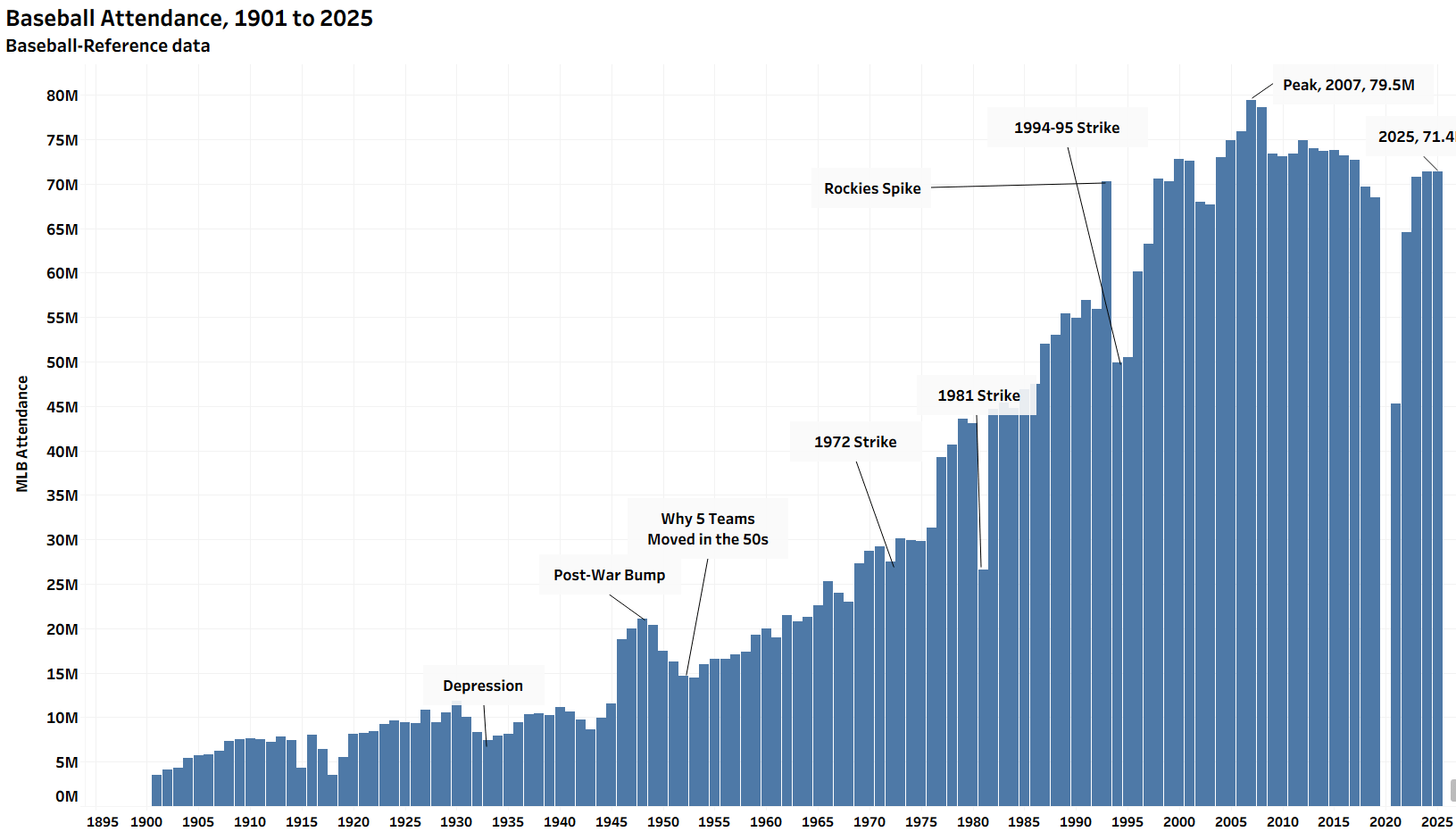
Baseball-Reference attendance data, with my annotations. Caveats galore, but with a common dataset, reasonable conclusions can be made.

Baseball-Reference attendance data, with my annotations. Caveats galore, but with a common dataset, reasonable conclusions can be made.
15 comments
What’s the Rockies spike about?
Man, such a shame that people just stopped caring about baseball in 2020
The drop in attendance is worse than this graphic suggests. In 2007, the USA population was 301 million. In 2025 it is 347 million. So we added 46 million people but dropped in attendance by 8 million.
The younger population isn’t as interested in baseball.
I can’t believe that many people stopped attending baseball games in 2020 just because Gerald Dempsey Posey III decided to sit the season out
So effectively flat since the 1993 expansion when removing the strike and its aftermath and COVID and its aftermath.
We should also keep in mind that total league stadium capacity has declined pretty significantly since 1993, with the Rockies, Padres, Giants, and Indians/Guardians alone reducing capacity by a combined ~115k.
For a few seconds I was wondering what could’ve caused the post-war bump. I am not a smart person.
Ironically, with the fact it costs a bunch of money for a ticket + concessions, you could argue that it’s one of the most expensive per hour games of sports around.
The least expensive has to be cricket (long form)
Never returned to pre-recession levels after 2008 hit
This is shocking to me tbh.
He gets a ton of hate from fans but Rob Manfred is making the game better to watch and it seems to be working
Can someone please explain to me “the Rockies spike”
I’m a 5 year international noob to the sport. What happened in 07 that accounts for that peak?
2008 economic collapse and the game just hasn’t figured out that they’ve priced many people out of attending.
Rob Manfred has been terrible for MLB viewership in younger adults
Kind of useless graph. Example: where’s the population comparison? As what percentage of the population? As what percentage of the country with baseball teams in a geographic area where attendance occurs? As what percentage of total seats available?