
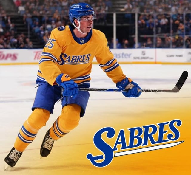
I keep seeing the Sabres use this logo on social media since the last couple years and had me wondering how it could look on as an alternate. I know the last time we tried gold, it was an abhorrent failure but maybe it looks a bit better with the royal blue and traditional striping? Perhaps a fauxback for our next Stadium game?
8 comments
Hard no. Too hard on the eyes and it feels like a very generic team font “logo”
I’m good, thanks
I could see it being used as a secondary logo e.g. shoulder patch, or logo on their pants/helmet but it shouldn’t be used as the main crest.
The charging bison with Sabres in it is a perfect alternate jersey crest. If/when they add another alternate I’d hope they go that route
Ew
Text-based logos in typefaces that look contrmporarily modern always wind up looking dated and even amateurish very quickly IMO- and they have to hold out for a LONG time to look good again at that point. It doesn’t look bad to me but I don’t like the idea in general
looks like a hot dog billboard
These look like they’d be sold in the Dollar General clothing section