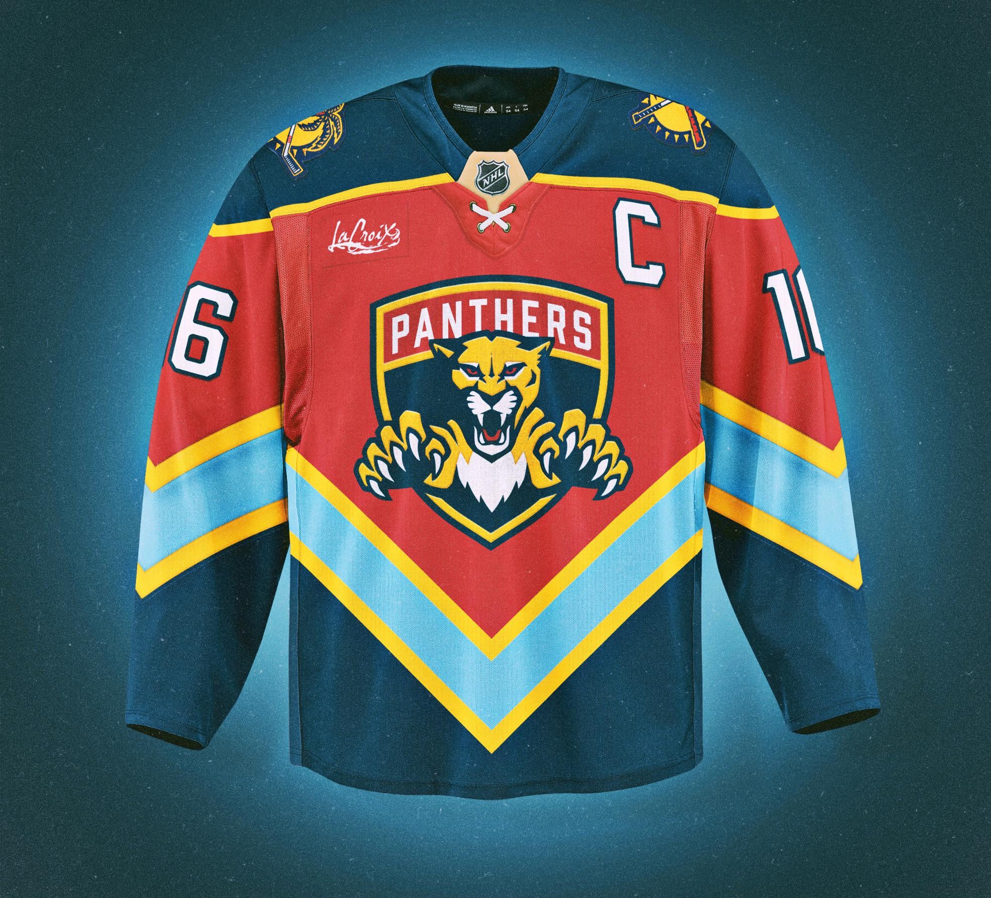
Little bits and pieces from all my favorite jerseys rolled into one.
8 comments
I like it! Well done!
I would buy this for sure lol
Omg, it’s hideous…I’ll take 3!
E: also, we’re making fan edit jerseys, wtf is the sponsor logo still there for?
This is pretty damn sick. Personally I think it falls into my “close but no cigar” category but I think you’re REALLY fuckin close to having a home run with this one. Not sure what I’d change or how to accomplish it, so I’m sorry for the useless comment but just wanted to say you’re barking up the right tree with this one and you should definitely make some more concepts and share them here I’d love to see more variations on this idea.
I fw this design
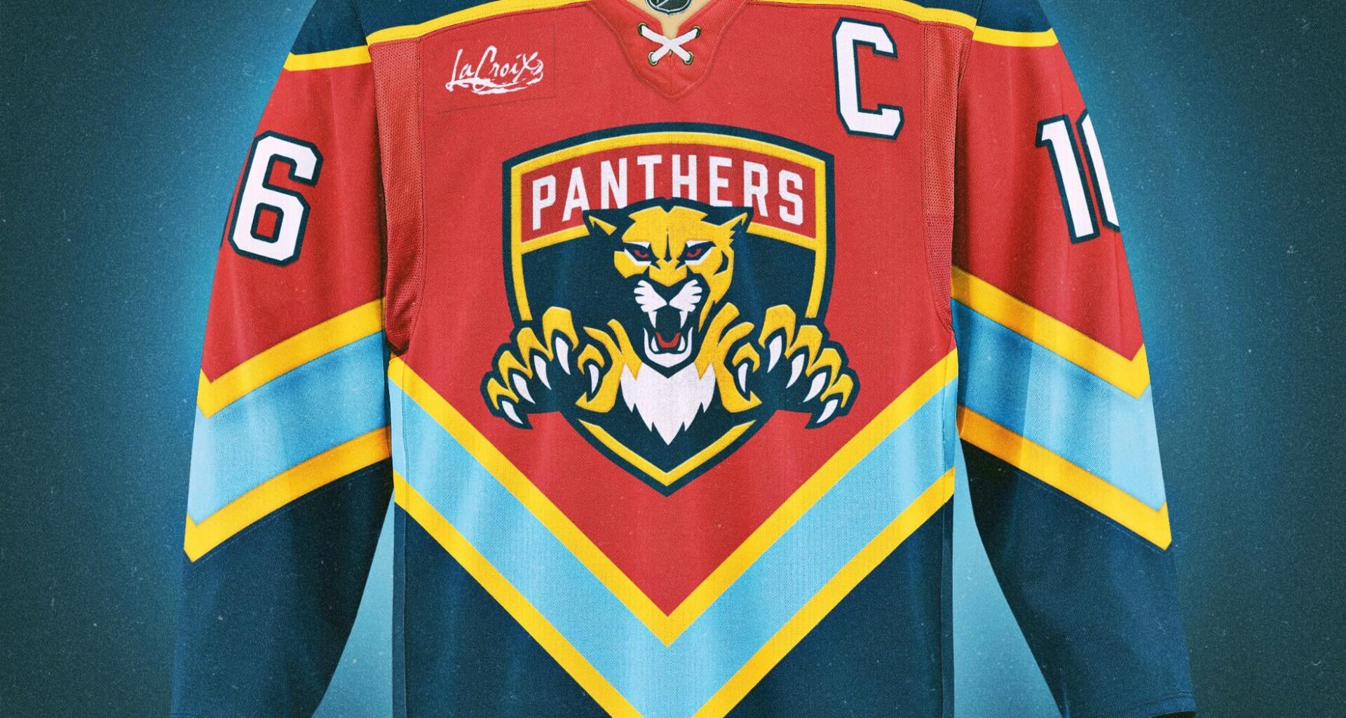
I don’t like advertising patches, but the LaCroix has always looked so clean
I want to like it, but the more I look at it, the more something is off. Maybe if the blue stripe on the body was straight across, my brain would accept it. Great work, though.

8 comments
I like it! Well done!
I would buy this for sure lol
Omg, it’s hideous…I’ll take 3!
E: also, we’re making fan edit jerseys, wtf is the sponsor logo still there for?
This is pretty damn sick. Personally I think it falls into my “close but no cigar” category but I think you’re REALLY fuckin close to having a home run with this one. Not sure what I’d change or how to accomplish it, so I’m sorry for the useless comment but just wanted to say you’re barking up the right tree with this one and you should definitely make some more concepts and share them here I’d love to see more variations on this idea.
I fw this design
I don’t like advertising patches, but the LaCroix has always looked so clean
I want to like it, but the more I look at it, the more something is off. Maybe if the blue stripe on the body was straight across, my brain would accept it. Great work, though.
Want