Cool history, but we won 6 Super Bowls with Flying Elvis so….
Nah flying Elvis is superior we just need better unis
I don’t think the Krafts will get rid of the Flying Elvis logo. It’s been the logo for our six Super Bowl trophies and it’s the most recognizable logo to people outside of the football world.
Although I’ll say we have to redesign our uniforms top to bottom. Besides the silver pants, it’s all hideous.
Yeah, let’s go back to when they sucked and had a poorly drawn cartoon logo. Good thinking.
I’m with you OP, Pat is a far superior logo.
Pat is bad and Flying Elvis is also bad. A new era deserves a new logo.
When I see that logo I think of Steve grogan
Get rid of both. Time for something new
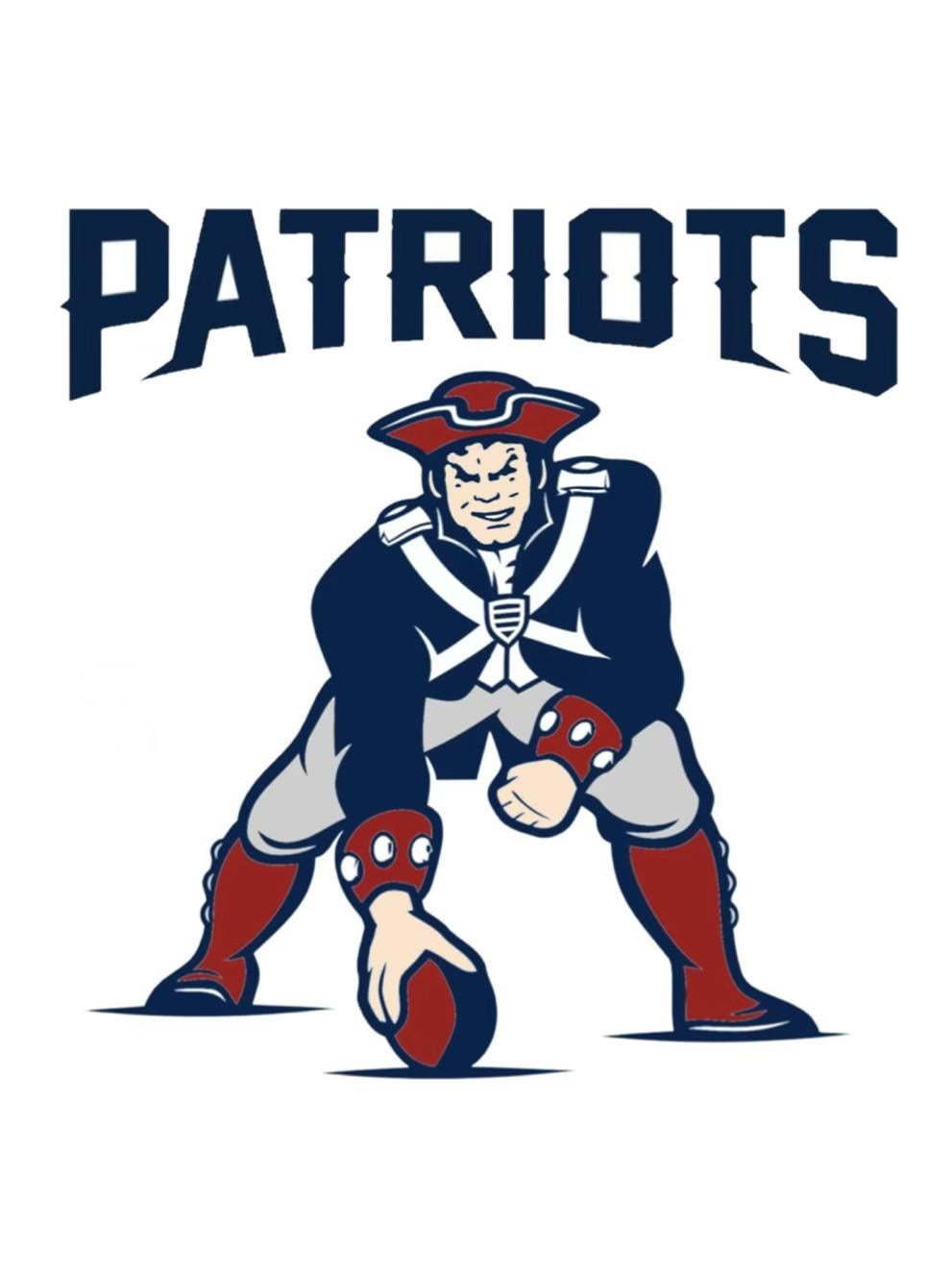
If an updated version of Pat Patriot was back but in a different pose, what should it be? The Notre Dame football specific logo made me think of this. How about Pat running the ball?
No way. Flying Elvis represents excellence. Pat represents a joke franchise.
bring back the mid 80s uniforms period.
He never went away
I like both logos.
What needs to go is that Pat Patriot mascot. He looks like he’s designed to scare children into being Jets fans.
Maybe hire Sam Minuteman from UMass. He has Sundays off and it would be novel for his to see what a winning football team looks like.

I appreciate what Pat in the 3pt stance means for our history, as do I appreciate the flying Elvis. But I really would like to see something more aggressive and dynamic. Something that comes to mind is a mid-charge, mid step, Patriot with a musket or sword drawn. A static football pose and a disembodied head don’t scream intimidating or dynamic or many pro-football adjectives. I really want to fire up my old Adobe Illustrator and make a few mock designs.
The logo of perpetual losing. No thanks.
Flying Elvis>>>
My middle school team in the 90s was the Patriots. This was our logo (I think it was the 70s version based on some image I saw here once) It’s got a special place in my heart. But i don’t think it’s coming back as a main stay.
Flying Elvis has too much brand equity.
We’ll continue to see Pat as a throwback / secondary.
This isn’t the original Pat though, right, where did this come from?
Pat works better as a secondary logo. Too busy. Flying Elvis is straightforward but effective. Was the logo the best era of the franchise, represents a modern identity. I also just think it looks better on a uniform. It’s flowing design flows better and is easier to make out in motion
I love the flying Elvis sooo much more. And it makes throwback games with Pat more special.

24 comments
Cool history, but we won 6 Super Bowls with Flying Elvis so….
Nah flying Elvis is superior we just need better unis
I don’t think the Krafts will get rid of the Flying Elvis logo. It’s been the logo for our six Super Bowl trophies and it’s the most recognizable logo to people outside of the football world.
Although I’ll say we have to redesign our uniforms top to bottom. Besides the silver pants, it’s all hideous.
Yeah, let’s go back to when they sucked and had a poorly drawn cartoon logo. Good thinking.
I’m with you OP, Pat is a far superior logo.
Pat is bad and Flying Elvis is also bad. A new era deserves a new logo.
When I see that logo I think of Steve grogan
Get rid of both. Time for something new
If an updated version of Pat Patriot was back but in a different pose, what should it be? The Notre Dame football specific logo made me think of this. How about Pat running the ball?
No way. Flying Elvis represents excellence. Pat represents a joke franchise.
bring back the mid 80s uniforms period.
He never went away
I like both logos.
What needs to go is that Pat Patriot mascot. He looks like he’s designed to scare children into being Jets fans.
Maybe hire Sam Minuteman from UMass. He has Sundays off and it would be novel for his to see what a winning football team looks like.

I appreciate what Pat in the 3pt stance means for our history, as do I appreciate the flying Elvis. But I really would like to see something more aggressive and dynamic. Something that comes to mind is a mid-charge, mid step, Patriot with a musket or sword drawn. A static football pose and a disembodied head don’t scream intimidating or dynamic or many pro-football adjectives. I really want to fire up my old Adobe Illustrator and make a few mock designs.
The logo of perpetual losing. No thanks.
Flying Elvis>>>
My middle school team in the 90s was the Patriots. This was our logo (I think it was the 70s version based on some image I saw here once) It’s got a special place in my heart. But i don’t think it’s coming back as a main stay.
Flying Elvis has too much brand equity.
We’ll continue to see Pat as a throwback / secondary.
This isn’t the original Pat though, right, where did this come from?
https://imgur.com/a/yabrIgv
Needs an update
Pat works better as a secondary logo. Too busy. Flying Elvis is straightforward but effective. Was the logo the best era of the franchise, represents a modern identity. I also just think it looks better on a uniform. It’s flowing design flows better and is easier to make out in motion
I love the flying Elvis sooo much more. And it makes throwback games with Pat more special.
KEEP FLYING ELVIS
Love the pat patriot logo