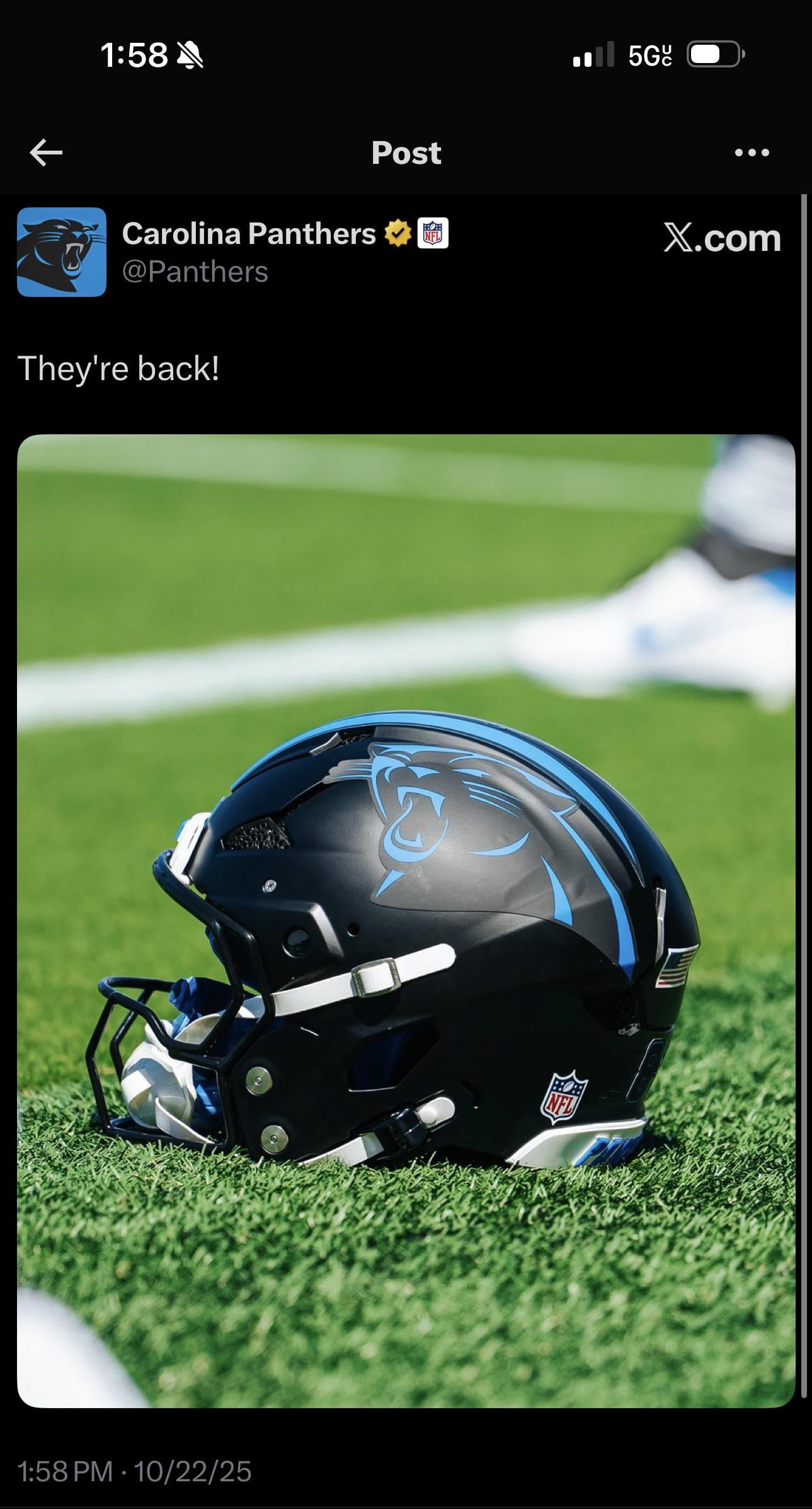
[Panthers] Black helmets confirmed against the Bills
October 22, 2025
[Panthers] Black helmets confirmed against the Bills
25 comments
It’s looking like they’ve become the “ Home” helmet
Black lids
Blue jerseys
Black pants?
Gonna be looking good while Rico and Chuba carve their defense up
The Bills are absolutely FUCKED now.
That logo looks like it’s barely slapped on and there’s a bubble in it. Idk
KEEP POUNDING
I will continue to shout into the wind that these helmets are aesthetically unpleasing and ugly.
NGL that sticker looks busted. You can clearly see the outline, it’s a different sheen than the helmet, and there’s a bubble in it. Love the idea but the idea execution is BS
I think they would look better if they actually painted the logo instead of using a sticker
I’d like to see the black helmet on the white jerseys.
WE WIN WHEN WE WEAR BLACK. LETS KEEEEEEEP POUDNING!
Pretty much seals the victory right there with this tweet.
We’re allowed four alternate helmet games per season, correct? First three with blue jerseys this year. So we can expect to see the black helmets with black jerseys once in the coming week?
Damn it I wanted Silver helmets with all blue
What’s everyone’s opinion on the matte finish?
I’m curious if the colors and logo would pop more with a glossy finish.
can we get the actual panthers logo on the helmet instead of this all blue nonsense? can we get a white outline around the logo or something to make it stand out? can we get rid of matte? other than that, sure, it looks good. lol. i can’t understand how so many people like this half assed crap.
I want all blacks
Blue helmets would be so tight
I hate these fucking black helmets
I miss properly painted glossy helmets, these look like some training camp shit
Time to make these the primary helmets 🙏🏻
God that looks terrible
Love it.
At minimum, the blue should be glossy with the black being matte. The matte decal on a matte helmet doesn’t work.

![[Panthers] Black helmets confirmed against the Bills](https://www.rawchili.com/wp-content/uploads/2025/10/e0k3p9utcpwf1-1289x1024.jpeg)
25 comments
It’s looking like they’ve become the “ Home” helmet
Black lids
Blue jerseys
Black pants?
Gonna be looking good while Rico and Chuba carve their defense up
The Bills are absolutely FUCKED now.
That logo looks like it’s barely slapped on and there’s a bubble in it. Idk
KEEP POUNDING
I will continue to shout into the wind that these helmets are aesthetically unpleasing and ugly.
NGL that sticker looks busted. You can clearly see the outline, it’s a different sheen than the helmet, and there’s a bubble in it. Love the idea but the idea execution is BS
I think they would look better if they actually painted the logo instead of using a sticker
I’d like to see the black helmet on the white jerseys.
WE WIN WHEN WE WEAR BLACK. LETS KEEEEEEEP POUDNING!
Pretty much seals the victory right there with this tweet.
We’re allowed four alternate helmet games per season, correct? First three with blue jerseys this year. So we can expect to see the black helmets with black jerseys once in the coming week?
Damn it I wanted Silver helmets with all blue
What’s everyone’s opinion on the matte finish?
I’m curious if the colors and logo would pop more with a glossy finish.
can we get the actual panthers logo on the helmet instead of this all blue nonsense? can we get a white outline around the logo or something to make it stand out? can we get rid of matte? other than that, sure, it looks good. lol. i can’t understand how so many people like this half assed crap.
I want all blacks
Blue helmets would be so tight
I hate these fucking black helmets
I miss properly painted glossy helmets, these look like some training camp shit
Time to make these the primary helmets 🙏🏻
God that looks terrible
Love it.
At minimum, the blue should be glossy with the black being matte. The matte decal on a matte helmet doesn’t work.
Sticker
just switch 🐈⬛