
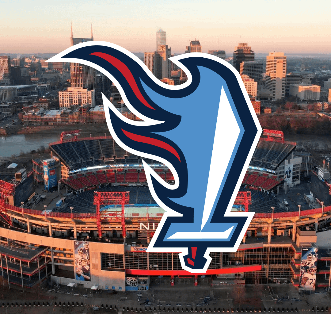
To preface, I am redesigning nfl logos for fun/project that I post on social media. As a fellow titans fan (who also used to be very active on this subreddit), I want to stress how difficult this process was. I have never been able to create a decent redesign, and I think a lot of that is because of my nostalgia for the current flaming thumbtack logo. I’d love to hear what you think about my redesign, if you hate it, that’s great, it won’t hurt my feelings.
11 comments
It’s cool but people would for sure make jokes about it looking like an L

No
Definitely need to flip it so it looks like a T.
I don’t think I’ve seen this particular style of flame/sword. Every other wants the sword to be on fire and stoic. But this implies motion and I love it. Not perfect but a good starting point.
You clearly have talent but take this one back to lab
The sword is in the shape of a T for titans and Tennessee.
No context it would be cool, but given context that it’s for the Tennessee Titans this would be a horrible design
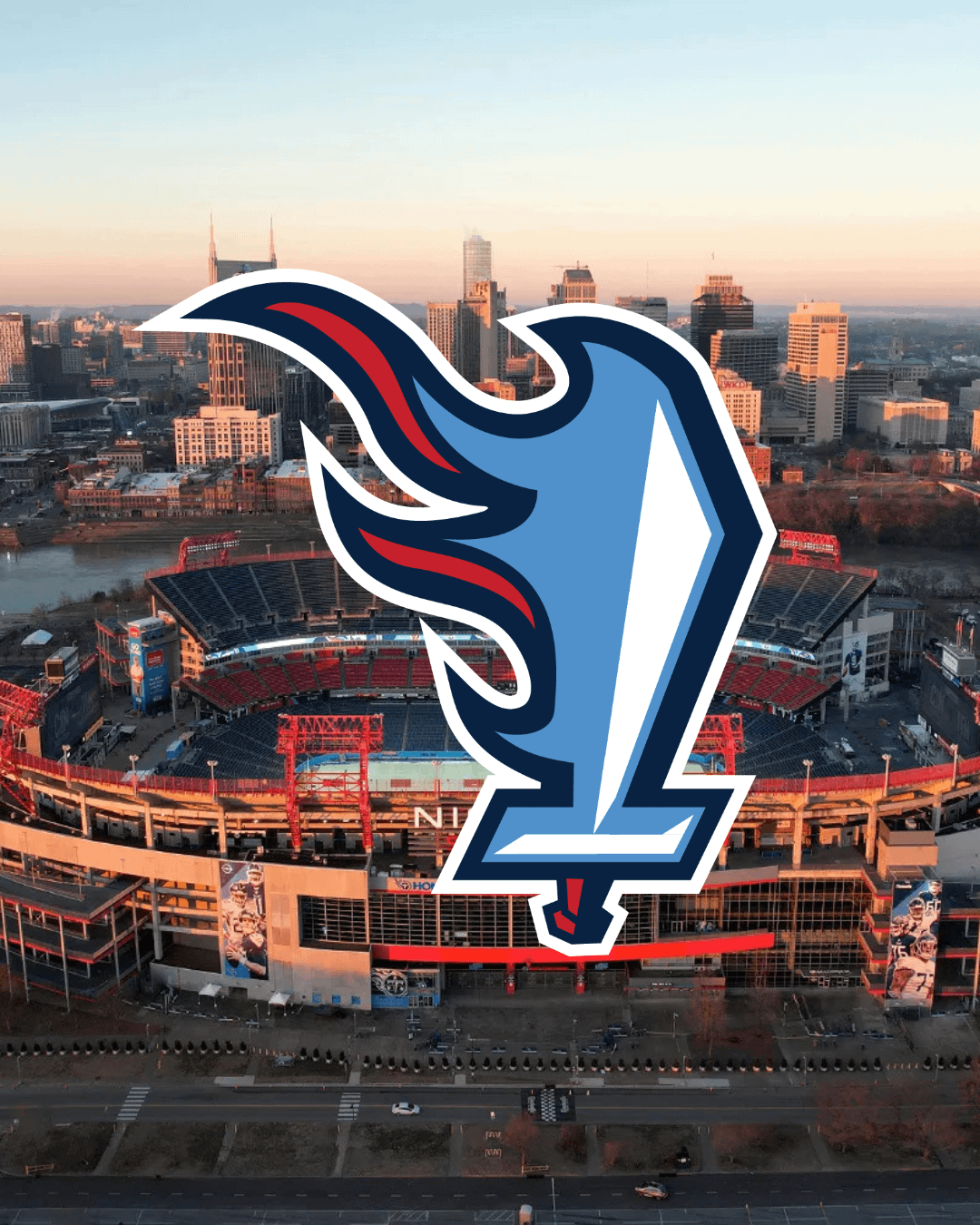
https://preview.redd.it/8m4mqkqd8bxf1.jpeg?width=1290&format=pjpg&auto=webp&s=fe25e7180d66b6783b7b73330705f40911c8cf95
Maybe move the flames below the sword?!?
It’s kind of cool. I think our logo right now is fine though.

Great logo since we always get Ls