
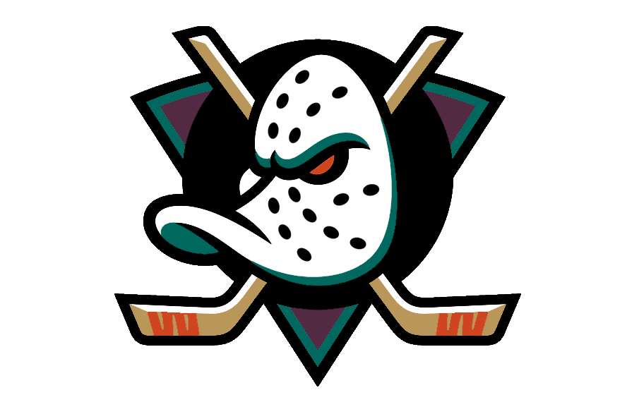
Watching a game, I was thinking how glad I am they went with an updated take on the original logo but I really wished they would have went for a blended color scheme with nods to both eras of the team. I pulled this together using both color schemes. Thoughts?
7 comments
I think it’s fantastic. The colors are not clashing, but working together. Absolutely love the placement of the colors.
The unfortunate thing that this is doing is minimizing the impact of the orange, which is probably the polar opposite of what the Samueli’s want with the color. The orange sticks and orange eye on the new logo pop, whereas they are kind of just an accent color in your work
Even as a Sharks fan I gotta say this absolutely slaps
I hate the orange in the current colors. It’s just so over used. The webbed D orange alternates were awesome since the orange was an accent. This is the logo they need.
Super clean. Love it
Maybe a little less jade and more plum. Otherwise always thought a blend like this could work.
Digging this.
Needs more Orange Country