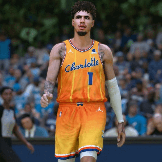
The Charlotte Hornets 2025-26 City Edition jersey appears to have been leaked by an NBA 2K modder.
October 29, 2025
The Charlotte Hornets 2025-26 City Edition jersey appears to have been leaked by an NBA 2K modder.
28 comments
It looks like ass
Jump to conclusion
What the absolute fuck? There is no fucking way this is real.
Ewwww
I like it. Kinda similar to the New Orleans Hornets color scheme which I loved. Super excited to see the court.
gross.
I like it. It’s different.
I can understand why people would dislike it but these jerseys are definitely going to sell well if it’s real.
Idk about the red and white stripes but I like these a lot
That’s an ugly jersey.
That yellow looks like piss.
This may be in the bottom 10 City Edition jerseys since 2017 if this is true. Nothing good about it.
We have my favorite color scheme in sports. Just do more teal and purple.
im gonna puke
Ugly AF and has nothing to do with Charlotte
They should just always have some variation of the mints as the 4th.
I see nobody in this thread saying it so I’ll just say it… these are Bobcats nods. The red, white and blue striping is actually navy and orange.
Dreamsicle kits!
Good lord the day Silver loses his job I’ll be there dancing in the street
Ugh man. no way
This is super clean. Idk what yall talmbout
Looks like ASS
The orange *could have* worked if they used purple (or teal) pinstripes and trimming, but pairing it with bright yellow is way too much of a visual assault.
Nope
Fuck it’s ass
fucking awful
I’m so sick of these shit ass jerseys Nike keeps shoving out
Mostly terrible and completely meaningless and insignificant color palette. The Hugo logo is fine though.
Did we give LaMelo artistic control or something?!