
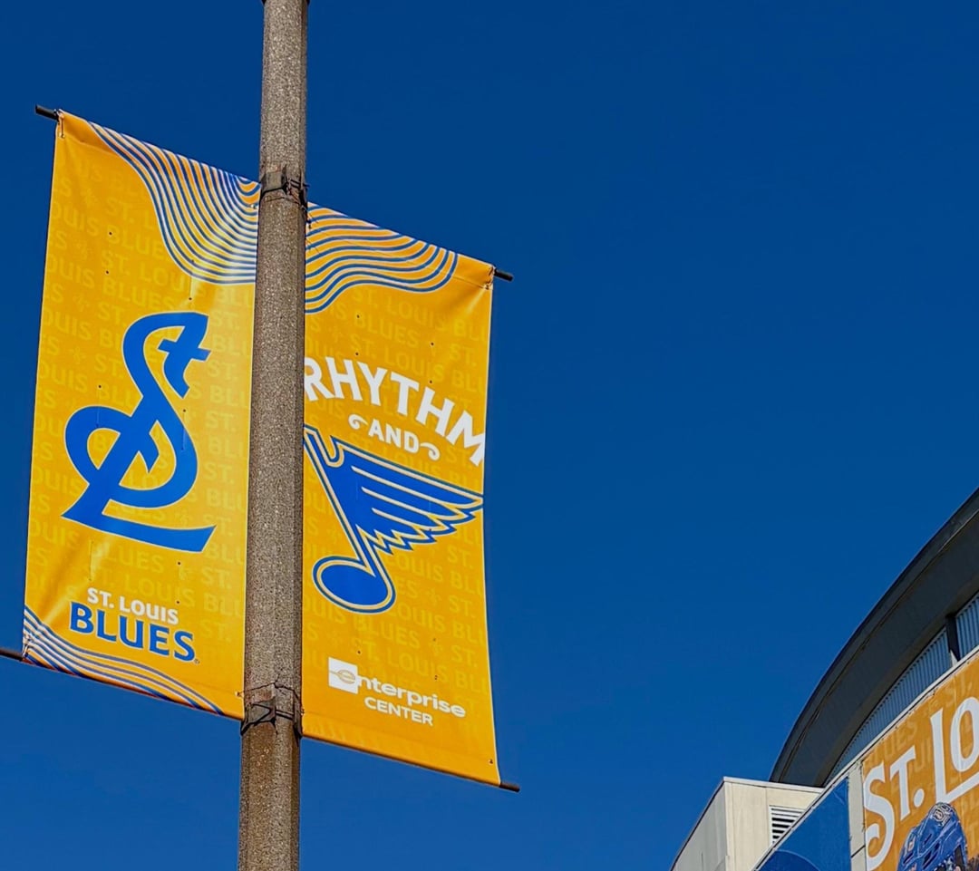
Does anyone else have this gripe with the rebrand or it just me? I've noticed the Blues are using a lot of yellow for graphics, posters and marketing. A yellow base for the logo. And I know it's the secondary color and it makes the logo more visible, but we are the St. Louis BLUES, not the St. Louis Yellows.
Our home jerseys have always been blue, let's keep it the graphics that way. Yellow can work in a pinch not too much. Leave the yellow for Nashville.
10 comments
You do realize we’re not named after the color, right? Our colors are Blue and Yellow, and they’re going to use Blue and Yellow.
Strange complaint
I’m guessing you also hate the red retro jerseys because we’re not the St. Louis Reds. Get over it.
I don’t think it is that unappealing. It’s not quite a complimentary color, but it works well together.
I don’t think it’s turning the team yellow, but they didn’t really leave themselves much room to make the blue note pop with no border. Thus, the note on a blue background just blends in. That’s kind of the sin of going with 2 colors.
I grew up with the home jerseys as white and for some reason I can’t make the adjustment even though it’s been decades since the league switched…lol.
I do love the Winter Classic blue and the new Note, but I could do without the shoulder stripes.
My complaint is that we’ve sucked since the rebrand
They’ve been using more and more yellow over the last 3-5 years. I’ve really liked it, I think the contrast is great.
I remember this argument for the St Louis Reds in the 90s
The team was never named after any color. I’m down with the yellow.
Perhaps some clarification. I don’t mind the color yellow. What I have a problem with is yellow being used as the base color of the background and the graphics being majority yellow