
I wish we would go back to the dynasty era uniforms. The away uniforms looked like they were literally wearing a plate of armor. And a home uniforms just looked elite, like we were a tier above the other teams.
Other teams with dynasties, usually just keep the uniforms from their dynasties.
I hate the blueberries with a passion, even when they wearing silver pants. We look like a freaking division 2 college team.
I love the red uniforms as occasional throwbacks, heck I would take the 90s light blue uniform uniforms (although we would look very similar to the bills), over these ugly, basic looking blueberries.
Now that we have an elite QB again, can we go back to wearing elite uniforms? We can dub these blueberries the Mac Jones era uniforms. I think it’s a perfect fit.
11 comments
Nostalgia is fine. But I’d prefer something new over something old. Recent uniforms strike me as very cookie cutter. Choose your colors, choose your font for the numbers, choose your shoulder/sleeve stripe.
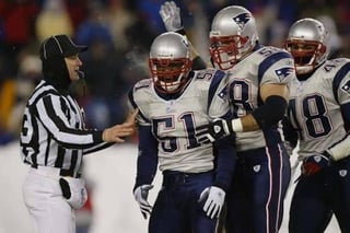
Low class move to dump on Mac with that last pic
Also, the dynasty uniforms aren’t great. You just have a positive correlation with them due to winning.
They need to ditch navy blue as too many teams wear that color and it’s boring as hell.
White pants, white helmet with the flying Elvis, red jersey like the throwbacks. Mix in some blue trim somewhere to keep red white and blue.
Alt unis can be all white or a some of red and white as primary colors with a touch of blue.
I feel like that would be a bad move for reasons other than aesthetics.
Regarding the lighter blue 90s uniforms, I understand that we are all individuals that have different aesthetic tastes and that no ones subjective preferences are less valid than anyone else’s, but those were ugly as hell and I personally hope to never have to lay eyes on them again (though I will note that I still lament on occasion the destruction of my Chris Slade jersey in a drunken fracas when I was 19 or so).
To put my biases out in the open, I’m a bring back the red Pat Patriot uniforms zealot.
The Dynasty Era uniforms will make their way back when the time is right. It was the right move to push the brand forward with new era uniforms when the Brady wra ended.
In my opinion, the current sets with silver pants are not that bad at all. Kinda a cheap shot at Mac with that picture you chose.
Am I still open to new uniforms in the neat future? Yes. But I am openly against changing to a white helmet with white pants. We’d look too much like the Bills. Silver is part of our Brand identity, and our helmet should remain untouched (exclusing alternates and throw backs) with Jerseys that break the cookie cutter shoulder stripe we see across the NFL and College.
I dig the red and white throwback and the 90s parcels/carroll era
BRING BACK THE 90s soccer uniforms !!!
I’d love to see them wear the dynasty era uniforms as a throwback
The current uniforms are easily a bottom 5 uniform in the NFL. So plain, generic. They don’t match the helmet because…… they weren’t designed together! Shocking. The shoulder stripes are hideous. The road uni’s look like 3 completely different uniform parts which makes them look like little kids dressed as football players for halloween.
Whatever people’s opinions are of the dynasty uniforms (i like them, love the whites), it was truly unfathomable for an organization to dump a 6 time super bowl kit for a gimmick color rush concept. From a branding perspective it’s the dumbest possible decision. It makes no sense. No other team with that amount of success does this. Who asked for this? Whoever was behind this decision should be one billion miles away from the decision making the next time they make decisions on uniforms.
It’s an insult to fans. We are the rare team with…. not one…. not two… but three uniform sets that are clearly better than the primaries. The 90’s blues would be an epic throwback. EIther the dynasties or the reds would be a clear upgrade over what we currently have. It’s a disgrace!
And whatever they do next…. Please don’t just don’t let NIKE go full NIKE on us. Every new NFL uniform rollout feels the same now. Players look like oversized crayons. Too many “storytelling details,” like a tiny zigzag in a shoulder stripe that’s supposed to represent the spirit of a city or some bullshit nobody cares about. Minimalism is killing modern uniform design. It’s sterile. Every team ends up looking like a template in a Nike PowerPoint.
So much nicer I wanna see drake may in a dynasty jersey
90s blue jerseys were peak. The red jerseys never sit well with me. Love the logo but red for the Patriots makes no sense. The revolutionary patriots famously fought against the red coats, why would we don the enemy’s color?
Would love a blue version with the classic logo, similar to how the NHL has done their reverse retros with new color takes on classic jerseys.
Your post made me realize I don’t really care what uniforms they wear, as long as Mac Jones is no longer on the team.