
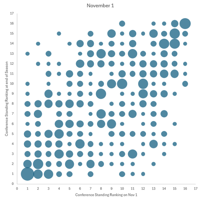
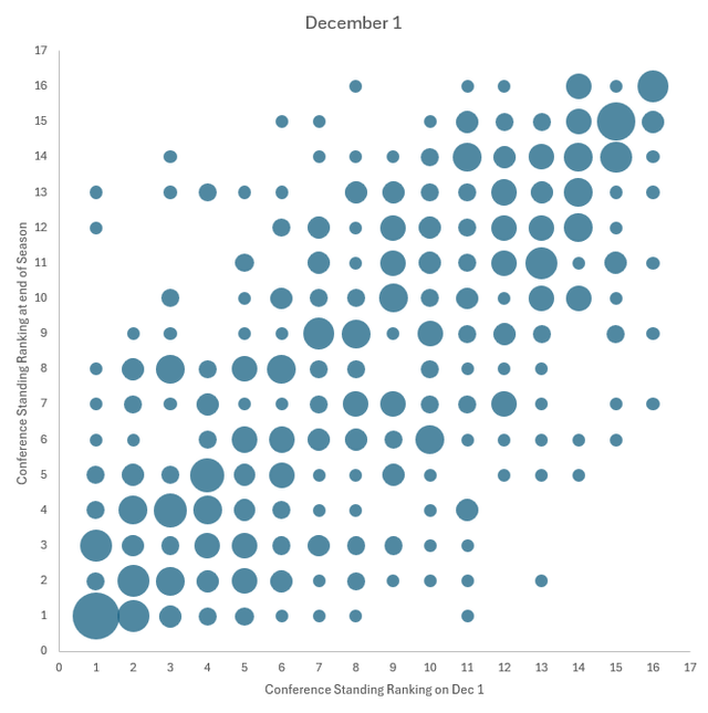
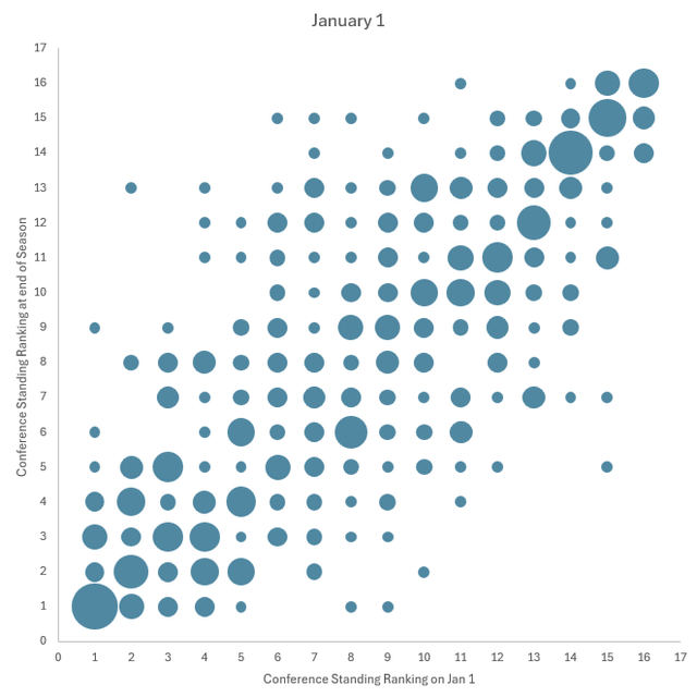
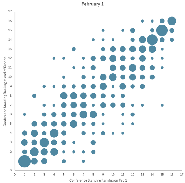
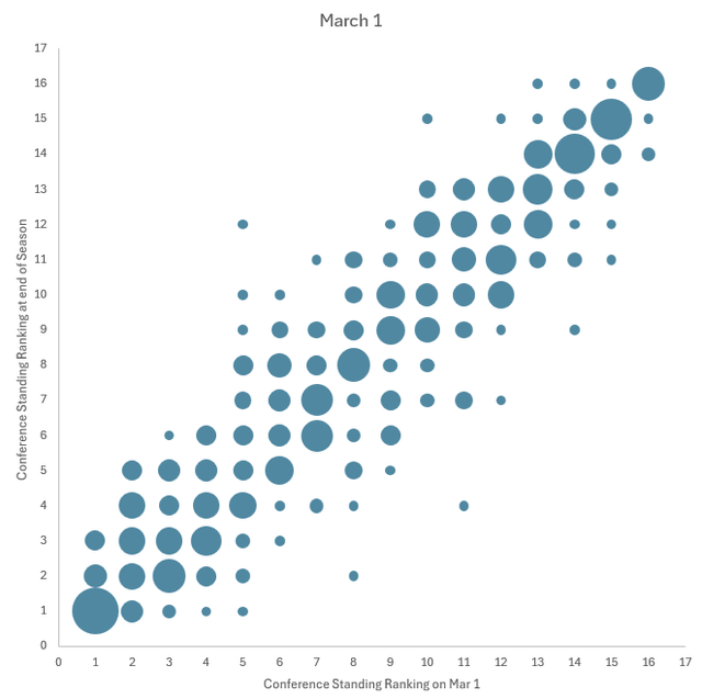
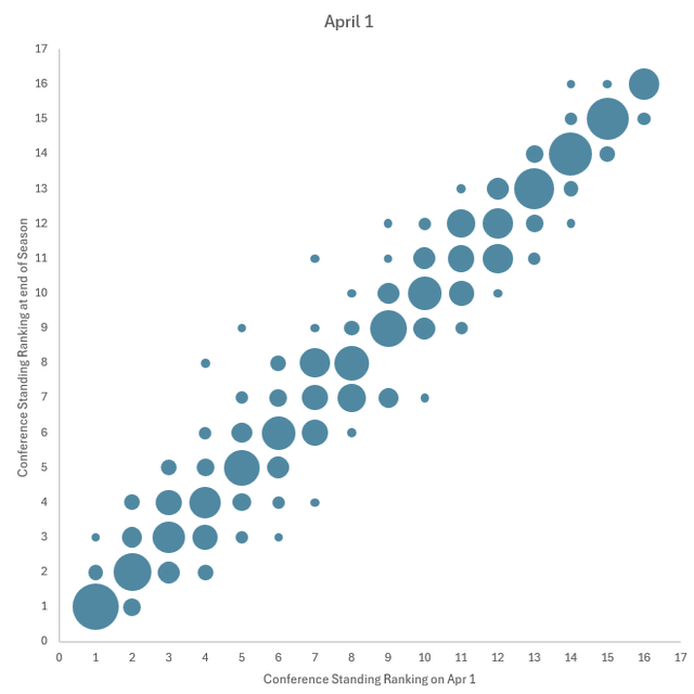
Hi all, I had some free time and was interested in a way to quantify at what point in the season you could say that standings start to matter (i.e. at what point do they tell you something about what the standings will look like at the end of the season). I saw a similar concept recently from the NFL (I would be happy to give inspiration credit but unfortunately it was a while ago and I forget where I saw it, if someone knows please let me know) and wanted to see what it looked like for the NHL. So what I did is for the past 15 full seasons (excluding the 2012-13 lockout shortened season and the two COVID years), I took each team's ranking in the conference standings at the beginning of each month and compared it to their ranking at the end of the year. The result is the graphs you see here. The bigger the bubble, the more teams are included in that spot. As you can see, November 1 looks more or less like a jumbled mess, but by March and April it has mostly coalesced into a straight line where teams finish the season in the same place that they were at the beginning of the month. As for my original question of when standings start to matter, I definitely don't see much of a trend in November, December is a little borderline, but definitely by January I feel like I see a good trend. Anyway, just thought I'd share in case anyone else finds this interesting.
21 comments
The all star break was the marker I and friends used to use as a season landmark for standings
The top and bottom start to take shape even in November, and at least by December, but middle is still unknown as late as February.
this all feels obvious but is cool to see regardless. thanks for making these.
like you said, it looks like in January it starts to get a bit more locked in
The graph is good, but IMO it tells more about the leaders and those lagging behind, while what’s no less important is what happens in the middle, and that is often decided up to the end of regular
American thanksgiving is a good gauge. 75%+ historically.
imagine reducing the beautiful game of hockey (win or lose) to THIS…i know you worked hard on this but hard pass here
So…Feb?
I typically take a good look around Thanksgiving and Christmas. If my team is buried by then, I start to think about trades and draft position. If my team is doing well, the The All-Star break is when I really start taking it seriously. That’s when I start to look at things like who they might trade for, and possible playoff matchups.
That’s why every game counts
Very cool visual
Which team is which
Interesting that we see the largest bubbles along the trend line even in November, especially in the tails.
This is so cool to see!
January 1.
Blues fans need to see this. It’s all doom and gloom and blow the team up and start over.
The 11th to 3rd in the Nov 1 graph is staggering. Especially considering the kitties are in 11th. Hate that
This seemingly supports my idea that a hot start is a lot less determinative than a bad start. A lot of teams at the top ranks early can fall off, but a lot less teams ranked at the bottom make it anywhere near playoffs.
The day after the All-star Break. That’s when you have to start paying attention to the standings
This is super cool, thanks for making this!
What metric could you use to evaluate each graph? Can you find a best-fit line, or calculate correlation for a graph like this? Is “eyeballing it” the best we can do?
Also [shrpsports.com](http://shrpsports.com) is a good site for looking at historical standings data.
Standings only start to matter after Christmas