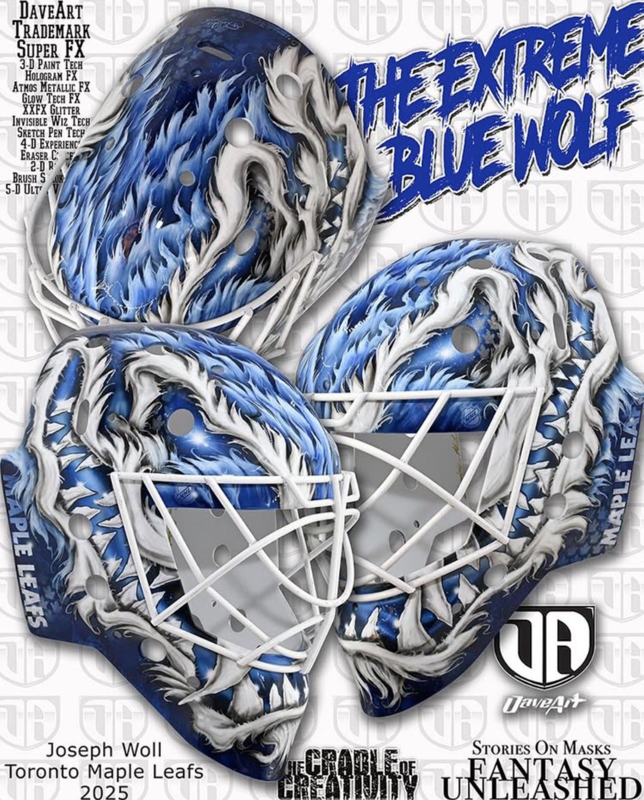
New mask for Woll – Credits: @DaveArt on Instagram
November 8, 2025
New mask for Woll – Credits: @DaveArt on Instagram
25 comments
He must of gotten that at the mask shop at Vespucci Beach in passive mode
Yuck
I loved the eagle wings mask he wore in his rookie season. This one is just another over the top DA slop.
Naaasty
gnarly
Joseph “Jonas ‘The Monster’ Gustafsson” Woll
If I look at this long enough, will a 3d picture appear?
DA is such overkill now. Sloppy, too. That particular Maple Leafs word mark hasn’t been used in a decade.
Radical man. I really like that

Dave Art is the AI slop equivalent to goalie masks.
I disagree with some of the comments here. I think it’s cool. It doesn’t need to be hyper realism art or just have the maple leaf stapled on the top. I like that it’s abstract and different.
Feels like Leaf goalies lean towards the ugliest masks in the league.
Nice mask, looks awesome 👌
Looks like Venom
There’s a lot going on with this mask but I actually think it’s going to look pretty good on the ice. It’s not my favourite thing as a stand alone piece of art but I think viewed from a distance and paired with the leafs jersey, it’ll look pretty good out there.
Aside from this mask, I’ve always thought it’d be cool to see one that incorporates a maple tree into the design. Plenty have featured leaves of some sort but I can’t think of many that played into the actual tree.
I think a wall would be more appropriate.
Not the worst of Dave Art’s typical “vomit on helmet” designs.
Cool mask. With the “Brick Woll” nickname that floated around for a while I’m surprised he didn’t just do a blue and white brick pattern.
Wish someone other than Dave Art did his mask. It’s cool up close but most of his art is doing way to much and from a distance on the ice you can never make out what it is. Way to busy
This is so good- it could be AI!
Is this supposed to a blue version of the berserk wolf ? A tribute in a non copywrite way ?

25 comments
He must of gotten that at the mask shop at Vespucci Beach in passive mode
Yuck
I loved the eagle wings mask he wore in his rookie season. This one is just another over the top DA slop.
Naaasty
gnarly
Joseph “Jonas ‘The Monster’ Gustafsson” Woll
If I look at this long enough, will a 3d picture appear?
DA is such overkill now. Sloppy, too. That particular Maple Leafs word mark hasn’t been used in a decade.
Radical man. I really like that

Dave Art is the AI slop equivalent to goalie masks.
I disagree with some of the comments here. I think it’s cool. It doesn’t need to be hyper realism art or just have the maple leaf stapled on the top. I like that it’s abstract and different.
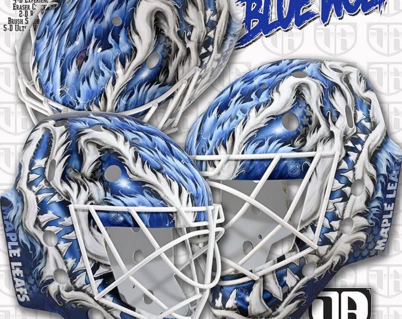
Looks like a callback to Potvin’s old lid. Fun!
8/10. Enjoy it.
Very similar to Cujo’s, not as nice
https://preview.redd.it/9g7rupkfc30g1.jpeg?width=1179&format=pjpg&auto=webp&s=5370f83e1b240cb0f87e1a905fa4a1a12ca5421f
Yesssss!
Feels like Leaf goalies lean towards the ugliest masks in the league.
Nice mask, looks awesome 👌
Looks like Venom
There’s a lot going on with this mask but I actually think it’s going to look pretty good on the ice. It’s not my favourite thing as a stand alone piece of art but I think viewed from a distance and paired with the leafs jersey, it’ll look pretty good out there.
Aside from this mask, I’ve always thought it’d be cool to see one that incorporates a maple tree into the design. Plenty have featured leaves of some sort but I can’t think of many that played into the actual tree.
I think a wall would be more appropriate.
Not the worst of Dave Art’s typical “vomit on helmet” designs.
Cool mask. With the “Brick Woll” nickname that floated around for a while I’m surprised he didn’t just do a blue and white brick pattern.
Wish someone other than Dave Art did his mask. It’s cool up close but most of his art is doing way to much and from a distance on the ice you can never make out what it is. Way to busy
This is so good- it could be AI!
Is this supposed to a blue version of the berserk wolf ? A tribute in a non copywrite way ?
https://preview.redd.it/mzcpsw2uw40g1.png?width=235&format=png&auto=webp&s=e099840f85a7e1518c255acbc4fbc62d18224c86