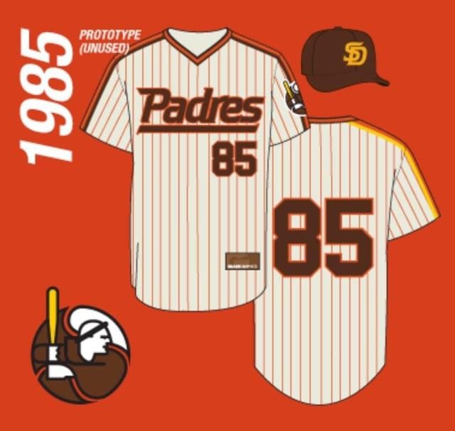
Fun fact, I was part of a Padres focus group about 6 years ago. We were asked to rate new uniform designs. One design was the brown and gold that we currently wear, the other was very similar to this design.

I want the hat with the logo
let’s print these
That Friar looks serious and determined. We need that same tenacity and attitude.
I think this with the city connect colors would be cool.
The hats, YES. The rest? NO.
I don’t care for the SD hat, but the concept art for the rest doesn’t look bad. Still could use some minor tweaks to the actual finished product though.
We gotta incorporate that Friar logo into our main uniforms/identity. Maybe give him a Padres cap/helmet.
Looks kinda like the white Sox logo from 76-90.
Serious Hawaiian Islanders vibe to these.
Where are these displayed In the glass case at? I like the friar design, the rest not so much.
Horrible!
The white spot on the friar logo needs work. Maybe fashion it into a wave
They actually tried to incorporate the P in the logo. Interesting!
I saw this beauty at at the 2016 Allstar Game at Petco Park.
Meh, not my cup of tea. I much prefer the current over these. Also, while I understand that it’s slightly different, the SD in this reminds me too much of USD.

17 comments
I’m actually a fan. These look nice
Fun fact, I was part of a Padres focus group about 6 years ago. We were asked to rate new uniform designs. One design was the brown and gold that we currently wear, the other was very similar to this design.

I want the hat with the logo
let’s print these
That Friar looks serious and determined. We need that same tenacity and attitude.
I think this with the city connect colors would be cool.
The hats, YES. The rest? NO.
I don’t care for the SD hat, but the concept art for the rest doesn’t look bad. Still could use some minor tweaks to the actual finished product though.
We gotta incorporate that Friar logo into our main uniforms/identity. Maybe give him a Padres cap/helmet.
Looks kinda like the white Sox logo from 76-90.
Serious Hawaiian Islanders vibe to these.
Where are these displayed In the glass case at? I like the friar design, the rest not so much.
Horrible!
The white spot on the friar logo needs work. Maybe fashion it into a wave
They actually tried to incorporate the P in the logo. Interesting!
I saw this beauty at at the 2016 Allstar Game at Petco Park.
Meh, not my cup of tea. I much prefer the current over these. Also, while I understand that it’s slightly different, the SD in this reminds me too much of USD.