I hate it. I wish I didn’t they would have been better off going with the original
Ehhh. Think that sums it up
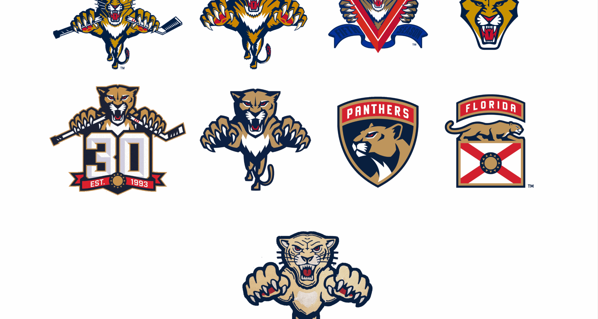
I think it’s hard to accept right off the bat because it looks different than what we already know and love but for the application I think it’s pretty solid. Looks like our leaping panther but more old timey which is the point.
Looks like a hairless cat to me
i dont mind it. there’s nothing offensive about it, just an old ass cat by design
The color could be better
I think it is a perfect olde-tyme Panther. The original stickless leaping is the best and the rebrand of that one is the worst.
Thanks, I hate it
It just needs the color of the others and it’d be great. The paleness of it is off-putting
The cat looks geriatric
Needed a more recognizable “vintage” design ethos. Like a rockabilly leaping panther, instantly recognizable but also very different.
It’s supposed to be an old school, mid 1900’s look.
I understand it, I’m ok with it.
I don’t mind it at all, like noted in here it’s change and it will grow on me, but so did the crest logo and I originally was just indifferent about it
This isn’t for the Stadium Series, its a Winter Classic. So the jersey is going to be more of a retro vibe than the Stadium Series would be. This is perfect for a leaping cat logo from the 40’s, and the rest of the uni pays homage to a Miami Hockey team from the 30’s, so overall its a great jersey, and the colors really pop around this logo.
Looks sick to me
I seem to be in the minority but I really like it lol
I love it. It’s meant to be a fauxback -a “what if” of sorts. If this team existed in the 50s/60s and they had this as their actual logo, we would all be asking for it as a throwback with this crest.
Is it aesthetically nicer than, say, the redesigned one in the 30th patch, or the classic with new colours of the Reverse Retro 1.0? No. But it does the job of conveying a vintage style really well.
Keep in mind we could have ended up with just boring letters or words, like St. Louis last year, Minnesota in 2022, Nashville in 2020…
I love it
Meh
Love it, kind of gives Simba vibes
the logo looks better here than on the jersey reveal for some reason(to me at least). maybe they’ll be better in person too? i don’t completely hate it, but don’t like it either
He wins big he moves up on my ranking.
If they just came up with it out of no where i would get the hate i’ve been seeing. But for a vintage look for the winter classic it’s perfect.
The only thing I would have changed was make the logo yellow like the rest of the jersey. But I honestly like the logo and jersey anyways
OG deff is better
But the idea of it being older era? I like
I think it would look better if there was some of the fur color incorporated on the jersey elsewhere.
The eyes could benefit from being another color
Sorry. I hate it. Maybe in person or in a few years? Why mess an original?
It’s too cartoony for my taste. Feels like someone watched Hannah Barbara animation and was like yeah that’s it. Simply put I’m not a fan. Was this suppose to be a concept art at one point of the organization?
I’m a shield/flag guy. It feels like it has more meaning now, I guess. I don’t hate the other’s, I’m just reminded of the dark years, and the shield/flags have felt like a new chapter.
ChatGPT generated it and you cannot convince me otherwise


30 comments
I hate it. I wish I didn’t they would have been better off going with the original
Ehhh. Think that sums it up
I think it’s hard to accept right off the bat because it looks different than what we already know and love but for the application I think it’s pretty solid. Looks like our leaping panther but more old timey which is the point.
Looks like a hairless cat to me
i dont mind it. there’s nothing offensive about it, just an old ass cat by design
The color could be better
I think it is a perfect olde-tyme Panther. The original stickless leaping is the best and the rebrand of that one is the worst.
Thanks, I hate it
It just needs the color of the others and it’d be great. The paleness of it is off-putting
The cat looks geriatric
Needed a more recognizable “vintage” design ethos. Like a rockabilly leaping panther, instantly recognizable but also very different.
It’s supposed to be an old school, mid 1900’s look.
I understand it, I’m ok with it.
I don’t mind it at all, like noted in here it’s change and it will grow on me, but so did the crest logo and I originally was just indifferent about it
This isn’t for the Stadium Series, its a Winter Classic. So the jersey is going to be more of a retro vibe than the Stadium Series would be. This is perfect for a leaping cat logo from the 40’s, and the rest of the uni pays homage to a Miami Hockey team from the 30’s, so overall its a great jersey, and the colors really pop around this logo.
Looks sick to me
I seem to be in the minority but I really like it lol
I love it. It’s meant to be a fauxback -a “what if” of sorts. If this team existed in the 50s/60s and they had this as their actual logo, we would all be asking for it as a throwback with this crest.
Is it aesthetically nicer than, say, the redesigned one in the 30th patch, or the classic with new colours of the Reverse Retro 1.0? No. But it does the job of conveying a vintage style really well.
Keep in mind we could have ended up with just boring letters or words, like St. Louis last year, Minnesota in 2022, Nashville in 2020…
I love it
Meh
Love it, kind of gives Simba vibes
the logo looks better here than on the jersey reveal for some reason(to me at least). maybe they’ll be better in person too? i don’t completely hate it, but don’t like it either
He wins big he moves up on my ranking.
If they just came up with it out of no where i would get the hate i’ve been seeing. But for a vintage look for the winter classic it’s perfect.
The only thing I would have changed was make the logo yellow like the rest of the jersey. But I honestly like the logo and jersey anyways
OG deff is better
But the idea of it being older era? I like
I think it would look better if there was some of the fur color incorporated on the jersey elsewhere.
The eyes could benefit from being another color
Sorry. I hate it. Maybe in person or in a few years? Why mess an original?
It’s too cartoony for my taste. Feels like someone watched Hannah Barbara animation and was like yeah that’s it. Simply put I’m not a fan. Was this suppose to be a concept art at one point of the organization?
I’m a shield/flag guy. It feels like it has more meaning now, I guess. I don’t hate the other’s, I’m just reminded of the dark years, and the shield/flags have felt like a new chapter.
ChatGPT generated it and you cannot convince me otherwise