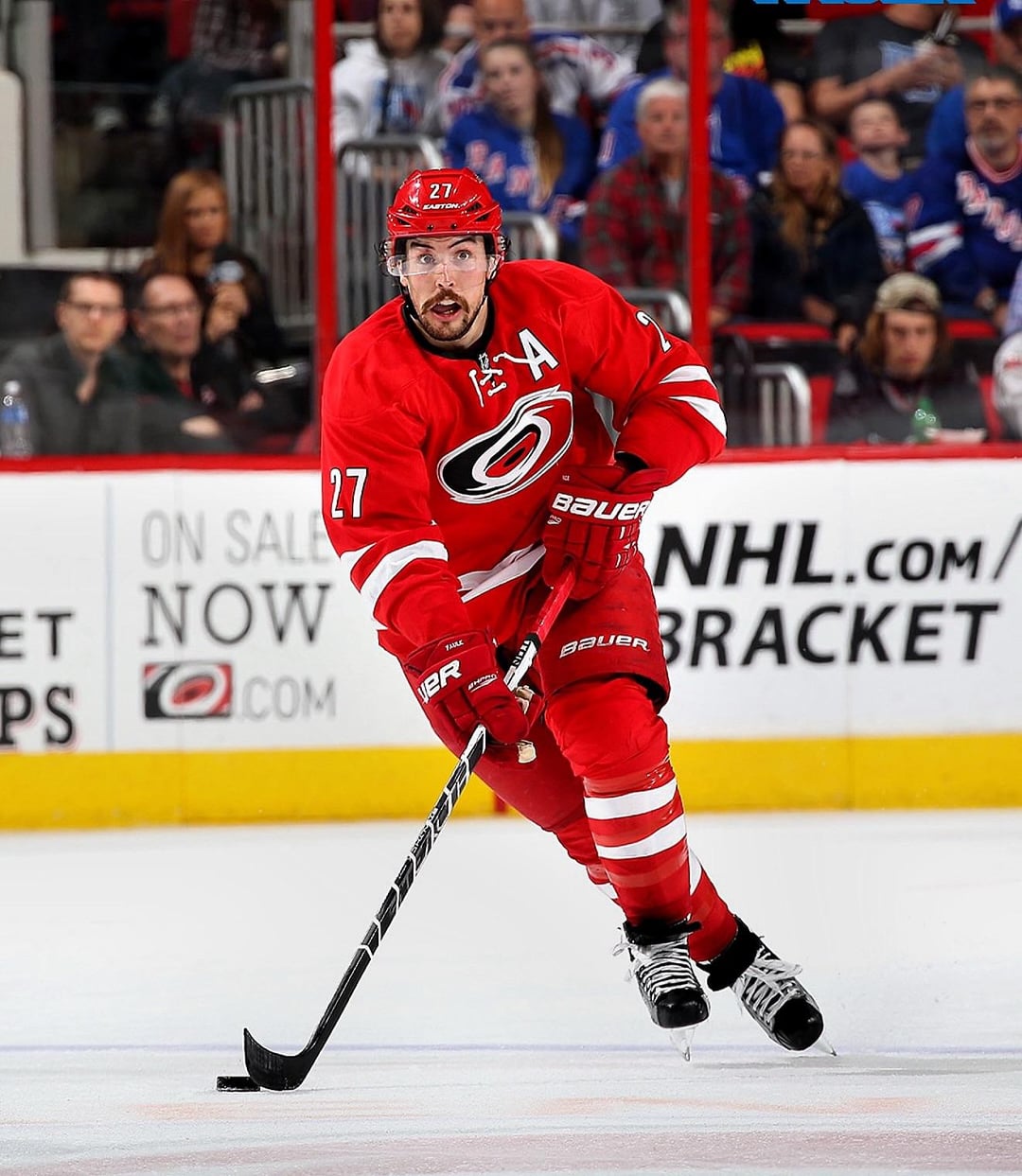
i know i am severely in the minority here😂, but something about these just got the point across with simplicity and effectiveness. Back when we actually looked like a NHL team.

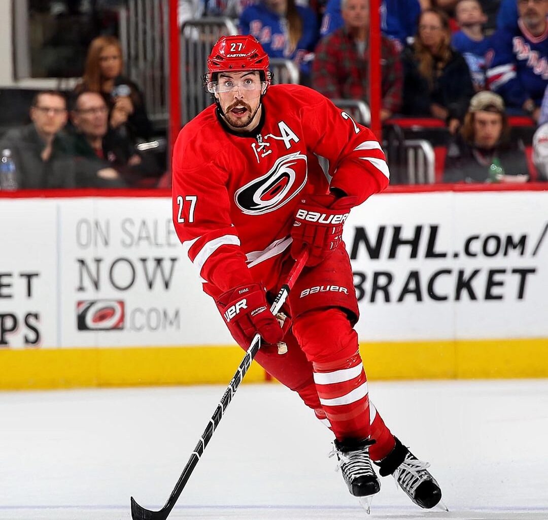
i know i am severely in the minority here😂, but something about these just got the point across with simplicity and effectiveness. Back when we actually looked like a NHL team.
28 comments
I love Justin Faulk
You are indeed severely in the minority
I don’t hate these aways. not a fan of the shoulders though
I don’t mind those aways. Not my favorites, but nothing really wrong with them either.
I do HATE those red home sweaters, though. It felt like we were just trying to be the mini-Red Wings. It doesn’t help, of course, that I associate those jerseys with the terrible Kirk Muller/Bill Peters era.
I didn’t know there was anyone who liked the Candy Canes. I sometimes feel in the minority because I really like the new whites, but now I feel normal (also because I still can’t buy one because they sold out so quickly)
Practice jerseys
Prefer these over the new ones they have
I always likes the whites here. Reds were meh.
The whites were amazing jerseys, I have a nostalgic soft spot for the reds too but objectively not a very interesting jersey and was definitely very of it’s era with the neck laces
The aways were better than any away we’ve had since then, but the reds were probably the worst regular jerseys the team has ever worn. They weren’t hideous abominations but they were completely uninspired boring. I do have a soft spot for the whites especially since that’s what they were wearing game 7 in Washington which is one of my favorite canes memories even up there with 06
Reds have a case for worst uniform in NHL history
Jay Harrison sighting
Just so brutally boring compared to what they replaced.
For my personal tastes, I would have been ok with the whites had they not had the red yoke. Makes it too busy for me.
What I really thought would have looked great was just the reds but inverted. White shirt, socks, knees with plain red stripes and shorts. Would be very simple and clean to me.
I don’t like the reds much. They either need to add black to the stripes, or imo the two-tone look would have been much better as black stripes instead of white.
Liked the whites, hated the reds
Both were too boring and stripped of all character or soul. The reds were particularly egregious, showing that black absolutely needed to be an integral part of the branding scheme going forward. The whites were decent, but the red on the shoulder going lower on the back than the front was always a weird choice.
An actual unpopular opinion!
I liked them at first but they grew bland on me, especially the home jerseys.
The roads are fine, the home is meh but not awful, just bad considering what we had before
They looked like Reebok (right?) designed all of the other teams first and used up any embellishments.
Not a fan of
I liked the whites. The reds were the worst jersey we’ve ever worn imo. Looked like we just copied the red wings. Super boring, no uniqueness to it at all
The funniest thing about these uniforms is that the checkers actually changed their branding to match us around the time we introduced these, but they added just a couple little small details that pulled the whole kit together more cohesively. Somehow our affiliate beat us at our own game lol
https://preview.redd.it/1drmudat493g1.jpeg?width=1517&format=pjpg&auto=webp&s=62ac0fdb34b28934c083ecfbb6cf30622e53f813
i liked the whites, but the reds are too plain, they work for Wisconsin tho
Better than the white base color sweaters they have for this season
Those are the worst uniforms in franchise history. It looks like some generic uniform you would find off the rack at Wal-Mart. Lazy uniform design.
I didn’t know I held a very unpopular opinion until seeing comments in this thread.
toronto, but RED
team canada jersey, but CAROLINA!
My only issue is the striping. Put the storm flags at the bottom and have the double stripe at the top like the 06 jerseys and they’re great.