I am down for this. I like the cup in the pain everyone is doing.
of course the only game I’m going to until the playoffs shai won’t play SMH
Ehhhhh
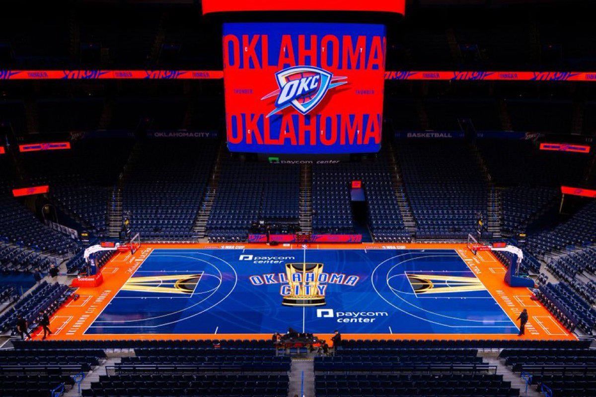
Better than ~~Mavs’~~ Wolves’ vomit green but man these NBA Cup courts are hard to look at… makes the watch more difficult too
Love the court. Would be cool for the promo picture for the scoreboard to use orange for the graphics instead of red. The red and orange in this pic really clash. But the court itself is awesome.
I love the cup courts when done right. I think most of them are cool. I don’t like the red, neon green or yellow courts. The Lakers absolutely pooped the bed on theirs. Their team colors are purple and gold. Purple might legit be the best looking color for the courts, the Utah court was awesome. To have purple as a choice and go with piss yellow is so stupid.
I hate them all, but at least this one isn’t the worst.
I actually kinda like this one. Rare for the cup courts.
Not the worst of the bunch, but they’re all obnoxious, it’s an awful gimmick
Why is there a high school 3 point line on the court?
From our best alt court to our worst (still not terrible)
i hate that the trophy is so massive in the middle. I think they should only do that for the Vegas games. It’s overselling the cup games at this stage
This is one of the best of all of the awful, awful courts for the cup games. My wife walked by when I was watching a game, maybe Sac?, and she actually got angry that they would make something so terrible looking.
They all mess up my rods and cones!
It’s the wrong shade of blue and almost the same as like 5+ other teams outside of the outline.
nice court for the first 30+ points match from AJ
These courts look so silly. Then for the finals they literally do NOTHING
The cup courts have aura, even if they are hard to look at, I’d say instead they just keep the traditional floors but keep the trophies at the ft lines and center then it’s perfect

19 comments
Could be worse
I actually like the orange outline.
I am down for this. I like the cup in the pain everyone is doing.
of course the only game I’m going to until the playoffs shai won’t play SMH
Ehhhhh
Better than ~~Mavs’~~ Wolves’ vomit green but man these NBA Cup courts are hard to look at… makes the watch more difficult too
Love the court. Would be cool for the promo picture for the scoreboard to use orange for the graphics instead of red. The red and orange in this pic really clash. But the court itself is awesome.
I love the cup courts when done right. I think most of them are cool. I don’t like the red, neon green or yellow courts. The Lakers absolutely pooped the bed on theirs. Their team colors are purple and gold. Purple might legit be the best looking color for the courts, the Utah court was awesome. To have purple as a choice and go with piss yellow is so stupid.
I hate them all, but at least this one isn’t the worst.
I actually kinda like this one. Rare for the cup courts.
Not the worst of the bunch, but they’re all obnoxious, it’s an awful gimmick
Why is there a high school 3 point line on the court?
From our best alt court to our worst (still not terrible)
i hate that the trophy is so massive in the middle. I think they should only do that for the Vegas games. It’s overselling the cup games at this stage
This is one of the best of all of the awful, awful courts for the cup games. My wife walked by when I was watching a game, maybe Sac?, and she actually got angry that they would make something so terrible looking.
They all mess up my rods and cones!
It’s the wrong shade of blue and almost the same as like 5+ other teams outside of the outline.
nice court for the first 30+ points match from AJ
These courts look so silly. Then for the finals they literally do NOTHING
The cup courts have aura, even if they are hard to look at, I’d say instead they just keep the traditional floors but keep the trophies at the ft lines and center then it’s perfect