
NHL Dallas Stars NEW Alternate Jersey! It’s Back (kind of) !
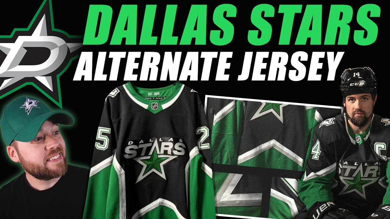
Hey everybody, Neil here from Post to Post. Hello to the Dallas Stars fans specifically, but jersey collectors as well. This was a very interesting release in the NHL that just happened with the Dallas Stars. They released their new alternate jersey. It is the Star jersey or a variation of the Star jersey and it’s widely loved, I mean by Stars fans and by not Stars fans. However, it didn’t come without its controversy because I posted something on Twitter and there like I decent I I’ll say the whole fan base, but a decent amount of the fan base kind of lost their minds a little bit. So, we’re going to talk through that a little bit. I’m going to clarify a couple of things. I think I could have worded things a little bit better on my part, but uh we’ll walk through that here in just a little second. I want to show you what the actual jersey looks like. So, let’s bring it up. And you can see that in all its glory, like it is an amazing jersey. The collar is super interesting with the split color that is very cool. I actually really like that a lot. You’ve got the logo that everybody loves. You’ve got the the jersey designs that everybody loves. Is it the exact color combination and layout that uh maybe a lot of jersey collectors wanted? Uh probably not. But is it nice? Absolutely. It’s an amazing jersey. I’m so glad that they brought this back even in this specific variation. I think it’s a wonderful decision. I would have preferred just to see the colors inverted. I don’t need the gold in there. Okay, I’m fine with no gold in there. I’m fine if you want to put the silver in there, that’s cool, but just inverse the colors and I think it would be a stronger jersey, but again, that’s just an opinion. Uh, and speaking of opinions, I will show you what I posted on Twitter that made people lose it a little bit. So, I’ll bring that up. And here’s what I said. I just quoted the Dallas Stars release or tweet and I said, “Dallas, these are nice. No question.” So, the first thing I said was positive. Very nice. I said, “But I don’t think the majority of fans wanted Reverse Retro 3.0. 0 because that’s basically what this is. It’s a combination between reverse retro one and reverse retro 2 put together and it’s of the original kind of well now retro jersey but it’s been swapped a little bit color so it almost by definition is reverse retro. What I meant by that is jersey fans and jersey collectors because if you follow the channel you guys know that I don’t just talk about the Dallas Stars. I don’t talk about the Montreal Canadians. I talk about all NHL teams. I talk about teams from other leagues. I talk about jerseys specifically because that’s my passion and design and collecting and unboxing and all that stuff and I’m I’m a hockey fan at heart. So, I think the wording on my part was poor here. I should have said, but I don’t think the majority of Jersey fans/colctors wanted Reverse Retro 3.0. I was not specifically trying to talk as the Dallas Stars fan base here as a collective. I thought that was obvious in my head, but apparently it wasn’t. I said no innovation, no tweaking, no color swapping. What I meant here is no innovation required, no tweaking required, no color swapping required. Referencing the photo below because the photo below was from the Zub appreciation night from a couple of years ago. This was an Adidas basically same as Fanatics is now other than the perforations on the shoulder. So, and then I said it was uh I guess I made a grammar mistake there. Uh it was the easiest and best decision. Um and I I still think that’s the case. I think the easiest and best decision would have been to bring that back. However, I understand the no innovation, no tweaking, no color swapping section of the tweet. Some people might may have read that thinking that I was referencing the one that they released, not the one that I posted below. So, two little forms of miscommunication there, I think, on my part regarding the wording of fans and also that uh that middle section there. But a lot of people kind of lost their minds a little bit in the Dallas Stars fan base. And it’s just like, listen, I’ve been making videos on YouTube and about hockey since the beginning of 2017. So, we’re coming up on 9 years across two channels. I think it’s over 30 million views. So, like I’ve been talking about hockey and jerseys for a long time. And I’ve said some many controversial things when it comes to jerseys. And even when I was talking about hockey on a day-to-day basis, whether it was trades, hits, players, rosters, whatever, those are very polarizing topics. I’ve had many intense conversations with people. I’ve had many people be critical of, uh, you know, opinions of mine and some of those topics, deservedly so. I don’t think I’m right. I just, you know, share my opinion. That’s the entire point of this platform. But I cannot remember at least in recent history in the last 5 years where a jersey has released and I have given my opinion and I relatively fair opinion like the first thing I said was that it was nice and I just added a little bit of criticism there. But I have in my memory never received the specific uh I guess I don’t want to call it hate. It’s not really hate. just I guess I felt like there was a lot of thin skinned people maybe in the Dallas Stars fan base at least on Twitter. Not all of them, not even the majority of them, just some very vocal. I’m not going to post their tweets. I’m not going to call anyone out by name. It doesn’t really matter. It doesn’t matter who they are. It doesn’t matter what specifically they said, but they were very upset. Uh and I think mostly they were upset that they felt like I was speaking from the Dallas Stars fan base as a as a collective as a whole. That was not it at all. Well, I didn’t even think of that when I was typing the tweet, but regardless if I I replied and I said that I’m not talking on behalf of you, I was talking to Jersey fans or collectors. They just they doubled down. They like they wanted they they wanted to hate. They wanted to piles and that’s fine. You know, whatever. And there were a couple of very specific insults thrown my way, but uh that’s okay. I didn’t really respond. I apologize to any Dallas Stars fans that I offended with my tweet. I meant no ill will. Okay. I love the jersey. Let’s move on to some other images. This next one here, you can see the whole uniform. So, little bit of an awkward shot because he’s, you know, Ben’s bent over. You can’t really see the bottom of the jersey, but I think the arms look very good. I think the transition on the arms is excellent. Goes from white to the silver to the green. Really good contrast there. And down into the pants. Pants look like they’re going to be black. And the top of the socks are black as well. Move on to the next image. It shows us a little bit more. And we’ve got black to white to green to black on the socks. Doesn’t totally match the jersey, but I do kind of like the socks. uh really good uniform transition from top to bottom, from the helmet all the way down to the skates. I think uh designers that don’t take into consideration the entire uniform when thinking about a jersey, I don’t want to call it a mistake, but I think it’s really important. I think it’s really important and I whoever designed this jersey, whether it was the Dallas Stars or working for the NHL or Fanatics or whatever, it doesn’t really matter. Whoever designed it, I don’t care, but I think they did a really good job. And I guess that’s the the other weird thing about this is like I really like this jersey and I really like this uniform and the amount of hate that I was getting for it on Twitter was just like I like the jersey. I like the jersey. Like it’s just not perfect in my opinion. Uh next you can see the goalie kit here looks very good. The logo as well I think and specifically right in the middle that looks so good that the light just shines off it so nicely. And the kind of outline that we see or we saw sorry on reverse retro 1.0 know where the jersey itself wasn’t like pure white but the logo was I think or was maybe was the opposite way around but you could tell that like there was a different material kind of around the logo area and here it is the same but you don’t notice it as much the black really blends in uh much nicer so I think that’s excellent here’s another photo that they uh released it’s called the 99 jersey which is pretty cool and they released some info here so championship collar the inside collar features three 1999 paying tribute to the triple overtime victory that secured the 1999 999 Stanley Cup. Very cool. And they’ve got another photo here. They say, “Bridging the eras. The star stripe design connects the iconic look of 1999 with the identity of today.” It that’s like it’s a it is a really good bridge jersey. They teased this a little bit by posting some jerseys from the past all kind of lined up hanging in a little bit of a locker. And we kind of knew it was coming. We just didn’t know specifically it was going to be this. But I I think they did do a really good job. I think the numbers look good as well. You can kind of see that uh on the bottom right as well. And they’ve got another one here. So they’ve got logos reimagined. Legacy logos are reinterpreted through the current colors blending past tradition with modern energy. That little Texas stay outline logo is incredible. I absolutely love that. You can see the silver just showing off that as well. And then the green in the middle. I think they did a wonderful job with the logos. Uh another graphic here. Uh you know, it’s it’s available Friday, November 28th at 5:00 p.m. on their official team store. So definitely go grab it if you get the chance. And then they did something that I love. They actually released their jersey schedule or alternate jersey schedule. So they’re the first game is against the Utah Mammoth on the 28th. All the rest of the games are there. That’s a lot of games for an amazing jersey. So I’m very excited and I’m very happy that they’re wearing it this much. Sometimes teams release alternate jerseys and they wear it four times or five times or whatever. Dallas is going all in a little bit. So that’s pretty cool. And I just want to bring up the actual jersey that I referenced in my tweets and referenced at the beginning of the video. So, this jersey was uh used as a as a warm-up jersey during the Zub retirement, not Zubov retirement, Zub appreciation night. And it’s essentially a replica of the jersey that they used back then. And it it’s beautiful. I love it. I think this is the best jersey. If you’re going to use the star jersey, I and based on all the thousands of comments that I have read over the nine years, tens of thousands of comments, okay? We talk about jerseys all the time. I I collectively know how people are feeling. It doesn’t mean that everyone feels that way, but I collectively know how people are feeling about specific topics, whether it’s Chicago, Toronto, Montreal, it doesn’t really matter. I get that good insight from all of you every time that you comment. And it’s it’s all living up here over the years. And collectively, the majority of people absolutely love this jersey and would love to see it come back in its exact form as we see here. That’s really what I was referencing in that tweet. The jersey that they just released isn’t bad. It’s not even close to bad. It’s incredible. It’s amazing. It’s just not perfect in my opinion, but some people, they need you to say it’s perfect. You cannot say anything critical about it, but it is what it is. So, we’re not going to get this. That’s totally fine. I don’t need this. I’m just saying how amazing it would be to have it back. One thing that I think would be cool is if they did an inverse of their the new jersey that they just released. I think that would be very cool. Not saying go back fulltime home and away with these, although that would be cool. But I think an an inverse version would be pretty neat. Inverse as in white or away, but in the same breath, I also do mean inverse. Literally putting the green inside and the black down below. But anyways, let me know what you think down below in the comments section. I’ve heard lots of opinions on Twitter, but I would love to hear yours down below in uh in the comment section of this video. Obviously, not everyone is going to love everything. There has never in the history of the NHL or probably any other sport where a jersey was released or a uniform where every single human or fan likes it. That it just doesn’t work that way. Okay? You have to be a little bit open-minded and accepted to other people’s viewpoints. If you don’t like the jersey or the one that they just released, that’s fine. If you love it, that’s fine. If you don’t care anything at all and you’re kind of in the middle, you don’t love it, you don’t hate it, that’s fine. People need to relax, okay? This is a fun topic. We watch hockey because we love it. We collect jerseys because we love it. We talk about jerseys because we love it. This isn’t this isn’t politics, okay? This isn’t religion. If you’re getting so upset at someone on their Jersey opinion that you need to swarm them. Go outside for a walk. Find a nice cute dog, pet the dog. Get calm by petting the dog. Okay? Get an ice cream. Have a couple licks of a nice ice cream. All right? Go to the park. Smell the flowers. Look up at the sky and see all the nice fluffy clouds. Reward yourself with a nice drink. Have a yoohoo. Whatever you need to do to calm yourself down, if you’re that opinionated, that you’re being severely offended by something hockey jersey related, please just take a step back and cool down. It’s just a hockey jersey, okay? I’m obsessed. I love hockey jerseys. I have hundreds. But at the end of the day, they’re still hockey jerseys, okay? So, deep breaths. Deep breaths. All right, guys. Let me know what you think down below in the comments section. I appreciate you watching. Doesn’t matter if you’re a Stars fan. Doesn’t matter if you disagree with me or agree with me. I appreciate you watching. Thank you so much. I hope you’re having a wonderful day. And I have an update, by the way, and another package. I have an update for the Fanatics, in case you’re wondering. The Fanatics box that I got that was crushed. We opened it earlier in the I guess it was last week or earlier this week. I don’t remember. But I have an update and it is actually a very, very good update. And not just for me, not just like compensation wise or whatever, but I mean for really everyone. I had a I had a personal conversation on the phone with someone at Fanatics, not a regular customer service rep, and we had quite the conversation about Fanatics and shipping and reliability and all that stuff. It was a very good conversation. I was very impressed that Fanatics did reach out and were willing to talk. So, I have uh I have more to share on that, but I will do that in this video where I unbox this. So, you’ll likely see this on I think Saturday or possibly Sunday. So, tune in. This is a hat that uh a team that I do not own as a little bit of a hint. And it’s a bit of a funky design. So, I’m very curious to get into it and see. So, thank you again for watching. I appreciate it. Hope I can see you again in the future. If you’re new, please consider hitting that subscribe button down below. Even if you are a stars fan and you hate me. All right, we’ll talk to you soon. Adios. Heat. Heat.
Episode 1803
Supporting the channel can be done here:
YouTube Membership: https://www.youtube.com/channel/UCnWUMMlROKuT3roikjMp9TQ/join
Monthly Patreon contributions: https://www.patreon.com/Post2Post
Direct contributions: https://www.paypal.me/Post2Post
DEALS:
Save on jerseys by **FIRST** going to https://www.coolhockey.com/post2post and then using code “POST2POST” at checkout! This will save you 10%.
Save $20 off your first purchase at https://seatgeek.com/ with code: POST2POST
Save 10% off any template at https://sportstemplates.net/ with code: POST2POST
Want to submit YOUR jersey concepts to get reviewed? Please watch this video to find out how: https://youtu.be/fb_h_mB19fo
Play games with me on Twitch!
www.twitch.tv/post2post
PO Box: Unfortunately, the PO Box is now closed.
Find us on Social Media here:
https://www.Instagram.com/Post2PostShow
Tweets by Post2PostShow
Have a business inquiry or want to send me a fan video intro?
E-mail me here: productions@post2postshow.com
*Due to the amount of e-mails, a response cannot be guaranteed*
#NHL #Dallas #DallasStars #Stars
36 comments
Tweet mentioned in the video: https://x.com/Post2PostShow/status/1993447418940236146
This was like their Stanley Cup
NHL 26 won’t add these jerseys in the game until the end of the season I bet. They have yet to add the Kings and Penguins 3rd jerseys
Sooooo put new logo on it, put green in the star and black at the bottom
100% agree.
Not bad for a RR 3.0
Not as good as if they had just re-released the old one.
I’m a die hard stars fan. Most of the fan base is insufferable. Good jersey tho.
I rather this version than the original inverted one
Need something to get mad about now that theme nights are gone lol.
Not upset about you tweet but I think I’ll still take your advice and go pet a dog
I think the modern colours but with the green and black swapped would have been better.
That said the jersey is an amazing jersey
I highly disagree on one thing personally…the silver pops way more on the black and the jersey looks much cleaner being majority black.
Also I will always prefer a teams alternate be a different colour then the home or away.
Should wear it against the wings 😩
love it
Way to kill the tinsel thread phase in the NHL Dallas Stars. This sucks. You suck.
Stars fans are a special breed of insufferable. They act like beating the Avs in the playoffs every year is equivalent to winning the Stanley Cup.
I'll take winning the Cup 3 times versus beating a specific team in the early rounds and getting beaten in the WCF every year…and one Cup that was tainted by "No Goal".
i was a Fan of the original jersey the color changes i think make it work more then the original it to me looks better with the lighter green and silver and the logo update make it work for me . i do like they swapped around the black and green if they end up making this the home in what 2 years the white all have to do is swap the black and white and the bottom of the jersey is green . and they could keep the current home as the 3rd i do like how the logo has the Star with the wordmark on top of and some how that works more then most logos . i am a Flyers fan who loves hockey and jerseys i been hoping this jersey design came back some how
if theres one positive to come out of this I hope it brings you more subs 😂
Typical Dallas sports fans can be entitled and obnoxious
Don't take anything personally. Keep doing what you're doing! Every fan base has their fair share of thin skinned assholes. I'm a life long Stars fan, and I can't stand my fellow Stars fans, or fans of any team, that can't take criticism. I agree with you about the inverse of the primary colors. I think that would have looked better. I personally preferred the Blackout alternate jersey from the past couple of years, but these new alternates are very cool. Great video!
These are amazing and should replace their current set. The Stars current jerseys look like green Chicago Blackhawks knockoffs.
Stars fans love this!!!
Here come the Avs fans to make it about them…
Fair point. But I bet most Oiler’s fans are wishing there alternate was closer to RR 2.0
I thought you were going to tell them to kick the dog. Love these jerseys, get rid of the current ones.
I feel like i might be in the minority and dont get me wrong this is a fantastic jersey but I like the previous alternate (that I own btw) better i loved the neon the modern flair the ties to their city idk just excites me more gonna miss it on the ice but this is a sweet uni no doubt
Niel you're out here responding to the controversy like a political scandal 🤍 love to see the fanbase growing
Don’t apologize to Stars fans. They’re Texans. They’re insufferable for the sake of it. I’m not sure why we still let them be a part of society.
The majority of fans and collectors don't want a rr 3.0? That's a huge lie and you gotta know that because the jersey's outcome is what many would've wanted. It's great all around man
Saw the twitter-rage…dear god some fans are ultra precious.
Anyone who follows the channel knows how you feel about that hockey jersey design.
Some folks need to grow up.
And the jersey is bloody lovely. I have a thing for putting green jerseys in my collection. I shall be trying to get hold of one here in the UK.
Long time fan of your channel and a diehard Dallas Stars fan. Few things from my perspective:
-The Stars fan base at large is extremely fair weather and borderline niche when they’re having a bad season, so the majority of the ones taking offense probably weren’t even fans during the OG Star jersey era.
-I’ve found my most meaningful interactions with other Stars fans is on Facebook more than any other social media (yes, cue the generational gap). Twitter is a cesspool.
-I honestly think Tom Gagliardi is the main factor in preventing the coveted OG jersey from re-releasing, which is completely fair since he saved the franchise and it’s been his team for some time now. When he unveiled the new Stars logo and jersey back in 2013, he was adamant about no gold.
-With that being considered, I think this newly released ‘99 jersey is the perfect compromise and I honestly love it. Does it beat the OG though? Hell no.
Im a dallas fan and im kind of eh about it. I love the old jersey but i wish it was a new design not a retro. Its cool but i wish it was something new not rr1+rr2=rr3
How long before Dallas go back to this logo/branding full time?
The hype video was 🔥
I liked there were no leaks and we're just mad at a post on twitter X. I do love this jersey even if it reminds me of the cup heist in Buffalo. If they had the current brand back then this is close to what the jersey would look like but in reverse.
Amazing jersey, but I could also agree with you that they could've swapped the black and green, that would also be nice. I do like the Victory green more than the original green so it's nice. Also, I like the silver more than the gold/yellow. What they should've done though, is to match the sock striping with the jersey line hierarchy. So, green in the bottom with a silver and a white stripe before the black. What actually stands out as a bit weird to me is the logo. That's more like the Texas Stars logo. I like it, but it feels odd.
And yes, people REALLY need to relax. This is a subject just for fun, it doesn't affect anything in reality. Jeez, peeps.
Twitter was ridiculous on you with this. Something as subjective as a jersey, and they went half feral. Not a great look on their fanbase imo.