
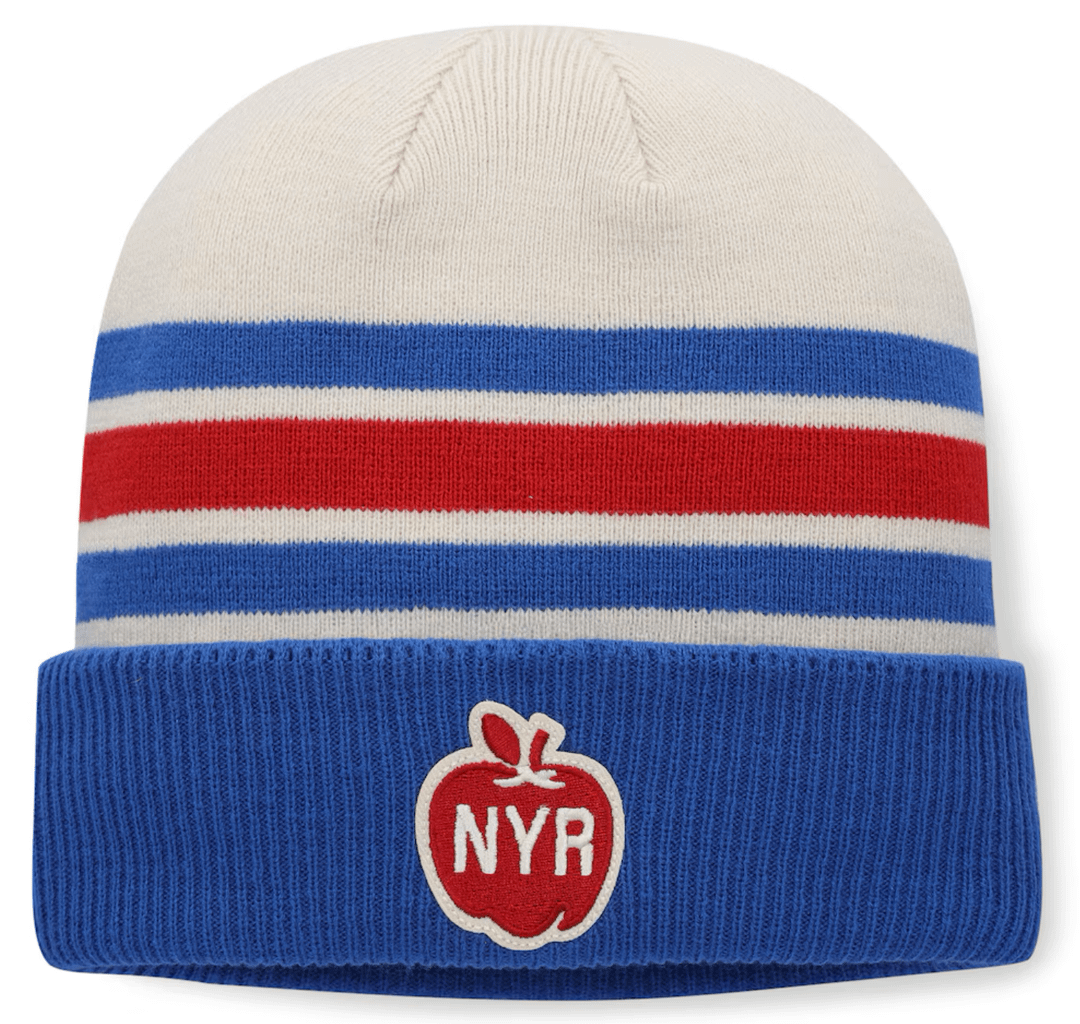
Saw this hat yesterday at MSG, initially excited about the design. Unfortunately on the back, there's the big, ugly 2026 Winter Classic Miami patch, plastered, larger than the apple on the front. I very well may be in the minority here in my dislike. I know the apple logo is born out of the Winter Classic, but I don't think any given Winter Classic has enduring appeal. The moment the game is over, a hat that could be timeless is suddenly dated. Despite the shameless marketing and desperate desire to profit, I guess it drives more sales than it does turning people like me away.
17 comments
Probably because it’s a hat for the winter classic
Make it timeless after the game. Buy it when it goes on clearance after the game and put a different patch over it.
bc it’s for the event. the apple on the front is absolutely perfect
I don’t understand the purpose of a Winter Classic happening in Miami in a stadium that has a closed roof. Kind of defeats the purpose as hockey is played under a closed roof for every other game.
Unless I’m missing something here, F*ck Miami they have good weather all year. The Winter Classic is for those areas that don’t get Beach weather all year.
I have the women’s version (aka Pom) I’ll be making sure the Apple is front and center.
Both ugly , ugly all over
Pop the stitches and remove it.
I agree with you that this hat would be much better without the other patch.
I can make u an apple patch!!!
https://preview.redd.it/fg3lb1o20h4g1.jpeg?width=3024&format=pjpg&auto=webp&s=76ba69d1e07fc9c52cf64d33ed85209942bfe8e8
It’s like a pimple on the ass. You know it’s there but you can’t see it. I wouldn’t worry too much about the patch…
https://www.neweracap.com/products/new-york-rangers-vintage-ribbed-beanie?variant=45644835881187¤cy=USD&utm_medium=product_sync&utm_source=google&utm_content=sag_organic&utm_campaign=sag_organic&utm_source=paidsearch&utm_medium=google&utm_campaign=VM_NEC_BrandShopping&gad_source=1&gad_campaignid=17190509168&gbraid=0AAAAADwVHaeQry0zpM8P9wu3lwS4ffvR5&gclid=CjwKCAiA86_JBhAIEiwA4i9Ju3H5T6mvisGaHRPie4ENEmKRsvmAigmPVW1TUzAvWQNaSj7-vVyG-BoClTwQAvD_BwE
Here’s a hat with the rangers shield like the same as this basic ass one that took me 1 minute to find.
Is it just me or is fanatics just shit quality. Why is the NHL isn’t fanatics?
The apple is a Mets thing.
Misplaced on NYR merch.
They could have put that patch on the Tech shirts for the Winter Classic instead of releasing plain/boring designs with no indication that they were for an event
The jerseys are beautiful but all of the merchandise has been underwhelming to me. Fanatics is terrible.
Ugly team,Ugly patch
Fanatics gonna fanatics