
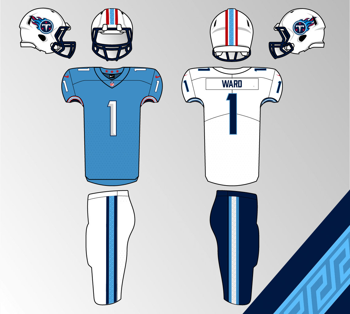
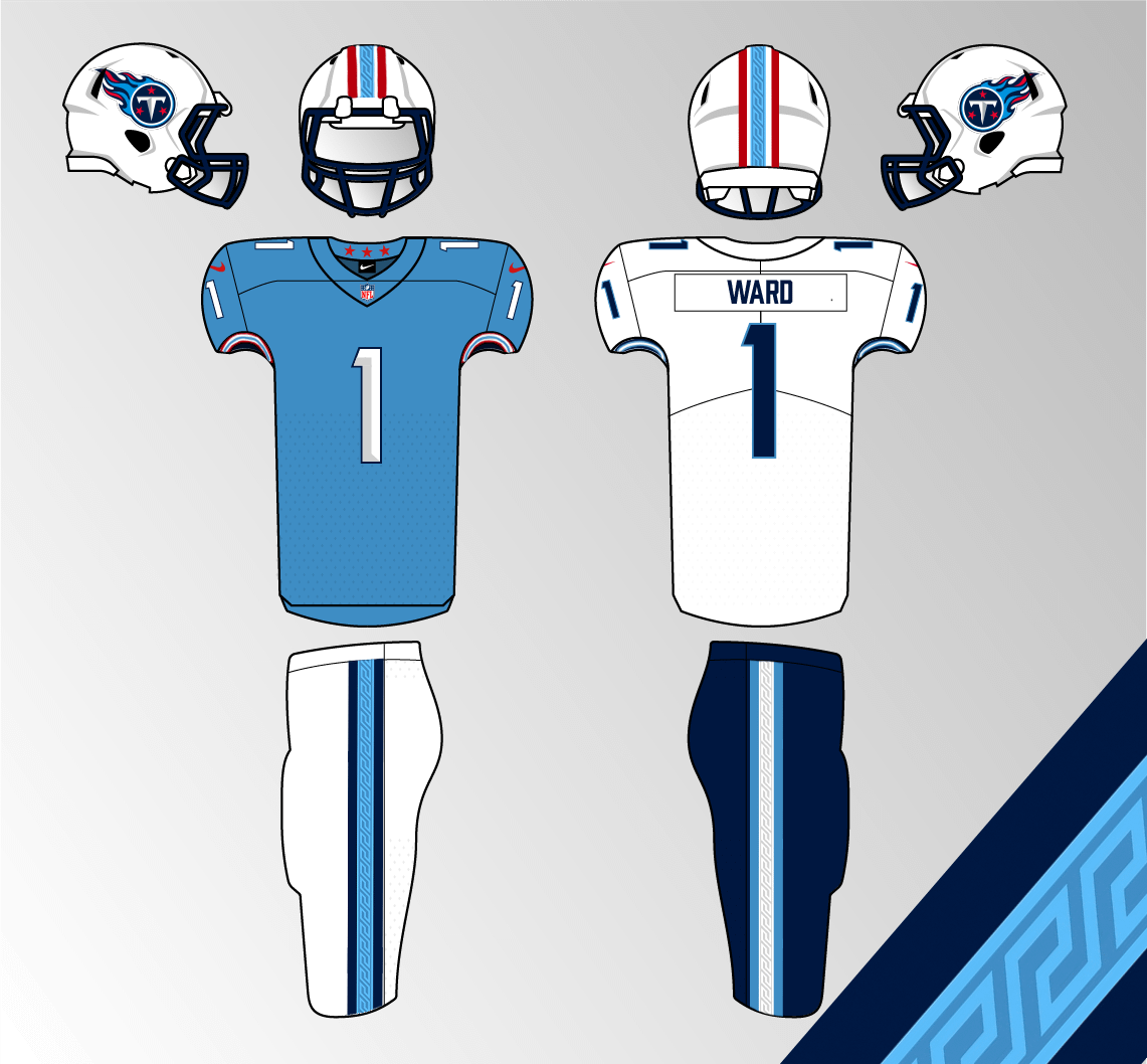
Its rumored that we will have new uniforms for 2026, but I wanted to create my own concept for what I think a nice kit would look like. I tried making the Greek pattern match the shape of Tennessee, and even though I’m not the biggest fan of leaning into the pattern look, I think if it is subtle enough, it could work. This would be a mix of past and present titans uniforms. anyways I’d love to hear your thoughts on these. (Not pictured is a hypothetical light blue pant option)
26 comments
I’m into it, I’d be excited for this look.
i’d like to conceptualize us some wins first
I like it I just really wish we’d ditch the flaming thumbtack for the sword logo
We won’t have new unis in 26. We are only getting a rivalries uniform which is confirmed to be something navy. There is a rumor that we will be getting new ones for 27.
Almost exactly what I want to see next year
No, boring.
Numbers are too gimmicky. This is an unserious uniform. We cannot be a Super Bowl contender with this style font for the numbers.
This would be the easiest home run for the franchise to make. It’s what we want, it’s what everyone wants. If there’s one simple thing this org can do to make all of the fans happy, it’s by giving us the oilers colorway with titans branding. We’ve got the colors, let’s use em. I’m done with the dark navy/white and blue unis. I’d like to leave them behind and not see them anymore. I guarantee if you polled the fanbase the overwhelming majority (+90%) of us want this. Or something like it. I’ve been beating this drum for years.. GIVE US THE OILERS COLORWAY!!!
https://preview.redd.it/vy65gdi6in4g1.jpeg?width=214&format=pjpg&auto=webp&s=514a8ca1070d4d50a1e300f97b8ebbad45491c71
No I prefer the one we have, with better combos. Instead of what we’ve been getting all season.
I love the style of it, I do wish we used our Alt logo more. I’m not sure what NFL regulations are for that though
Numbers are wayyyyyy too slim
sometimes it feels like Vrab’s was behind the Oilers legacy push. its pretty much gone now.
could be wrong tho maybe its just because were bad lol
Would red jerseys be too much?
https://preview.redd.it/xiej8nobrn4g1.jpeg?width=1024&format=pjpg&auto=webp&s=480961556884f3233bd5d11c272fa29f39a6f0bc
How about some truth in advertising
Something like this is exactly what I want them to do
I like the helmet and the pattern usage but for me the jerseys are a step back. There is nothing on there, just a color and numbers/letters. I mean if you like simple I guess. Just not my cup of tea.
I actually really like this concept. I’d prefer the home/away to just be light blue and red, with the two tone blue being reserved for an alternate. But I think the Greek pattern is cool without being too much
The stripes on the helmet along with the stripes on the pants throw the entire concept off.
I just want the Oilers unis to be permanent
This looks good although I wish the numbers were a bit thicker. Looks like the combo of old Titans and Oilers that I’d want in a new jersey!
Don’t hate it but too much Titans color IMO. I think Navy blue needs to take third uniform spot and the Oiler blue/candy red combo take center stage in the palette.
I think it should be essentially an Oilers uniform for 2025 with navy blue as their accent where necessary
It’s a good idea. Minor tweaks. I’d do solid pants and reduce the logo on the helmet somehow.
i think the aways need a tad bit more red and itll be exactly what id want
When your team is so ass you’re taking about uniforms week 12
Pants need red to tie it all together.
I’d be happy if we even just got a white helmet. the current navy helmet goes good with nothing but an all-navy fit
i think a red uni to match the state flag has potential as well