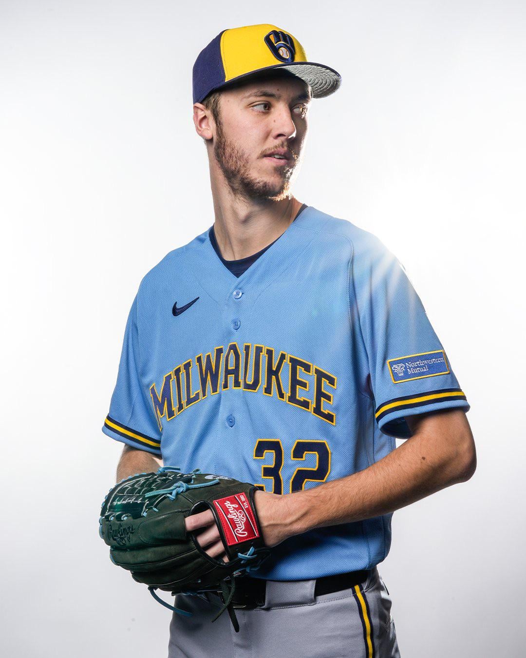
I don’t hate it. Honestly pretty good, just the fact it doesn’t match anything else…
Still a nice throwback.
Cmon internet, let’s bully them into changing the pants to blue.
That just looks wrong. Like each of the three alone look great (hat, jersey, pants) but together it makes no sense.
Sort of half-assed by pairing it with gray pants but the jersey itself is great.
what are we doing? light blue with light grey pants? please no.
Ooooooft
Miz lookin 🔥
Glad it’s not replacing the navy uniform. I know some people don’t like the “boy scout” uniform, but it’s my favorite. I also don’t mind that the pants are gray. I feel like sometimes when a uniform is all one color (besides white), it can look like pajamas.
As someone who is not a fan of the gray jerseys, I’m very thrilled with these
I want the script Milwaukee, like on the old school ones. Still cool though
Just win some baseball games, fellas. I don’t care what you’re wearing.
Pants should be blue too!
Pants should be blue as well
My hope, maybe Nike didn’t have powder blue pants ready for the photo shoot?
Fingers crossed that they’re coming….
This seems so…….. disappointing
I really don’t mind the gray pants. All blue would be overehelming. Brewers fans and having complaints…my god…

27 comments
Personally, I’d have the pants match the jersey with blue too. Still cool though.
Huge miss pairing it with gray pants.
Meh. Wrong font! I loved the cursive script.
seems like a missed opportunity if they’re not also doing blue pants to go with the jersey, but still looks good
Looks like they just scrapped off the Brew Crew from the last ones and slapped Milwaukee on it. Not terrible but not amazing
Hat and pants don’t match. Hate it. Could have been incredible but they missed the mark here
We need the blue pants
2 bummers: gray pants, and it’s replacing the current road grays.
Big ole swing and a miss.
Pretty disappointed. Two big negatives for me:
1. They really should have made this a full powder blue look, like what the [Blue Jays](https://img.mlbstatic.com/mlb-images/image/private/t_2x1/t_w1536/mlb/wmcu93mh1soh0na0sdig.jpg) are rocking. This feels a bit half baked. And powder blue on top of grey just looks…idk, icky.
2. Just go with the classic [Milwaukee script](https://d3631dqpbz5qlb.cloudfront.net/monthly_2024_04/IMG_1224.jpeg.d12e02bf5e2fe8c184e016e78bfbf36a.jpeg) for the chest. Come on, man, let’s not overthink this.
I don’t hate it. Honestly pretty good, just the fact it doesn’t match anything else…
Still a nice throwback.
Cmon internet, let’s bully them into changing the pants to blue.
That just looks wrong. Like each of the three alone look great (hat, jersey, pants) but together it makes no sense.
Sort of half-assed by pairing it with gray pants but the jersey itself is great.
what are we doing? light blue with light grey pants? please no.
Ooooooft
Miz lookin 🔥
Glad it’s not replacing the navy uniform. I know some people don’t like the “boy scout” uniform, but it’s my favorite. I also don’t mind that the pants are gray. I feel like sometimes when a uniform is all one color (besides white), it can look like pajamas.
As someone who is not a fan of the gray jerseys, I’m very thrilled with these
I want the script Milwaukee, like on the old school ones. Still cool though
Just win some baseball games, fellas. I don’t care what you’re wearing.
Pants should be blue too!
Pants should be blue as well
My hope, maybe Nike didn’t have powder blue pants ready for the photo shoot?
Fingers crossed that they’re coming….
This seems so…….. disappointing
I really don’t mind the gray pants. All blue would be overehelming. Brewers fans and having complaints…my god…
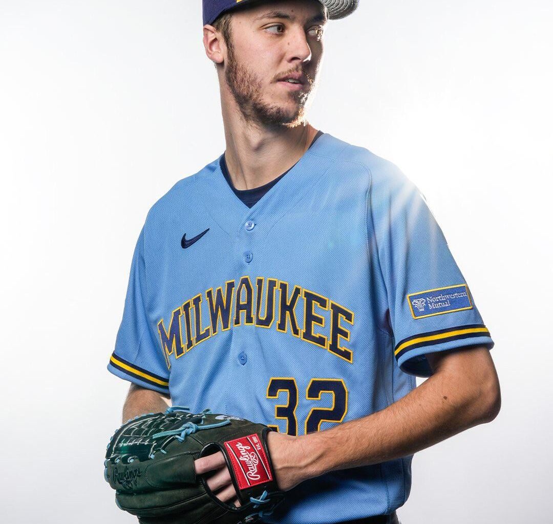
The hat and pants clash with it.
Meh