Visiting Pirates fan here!
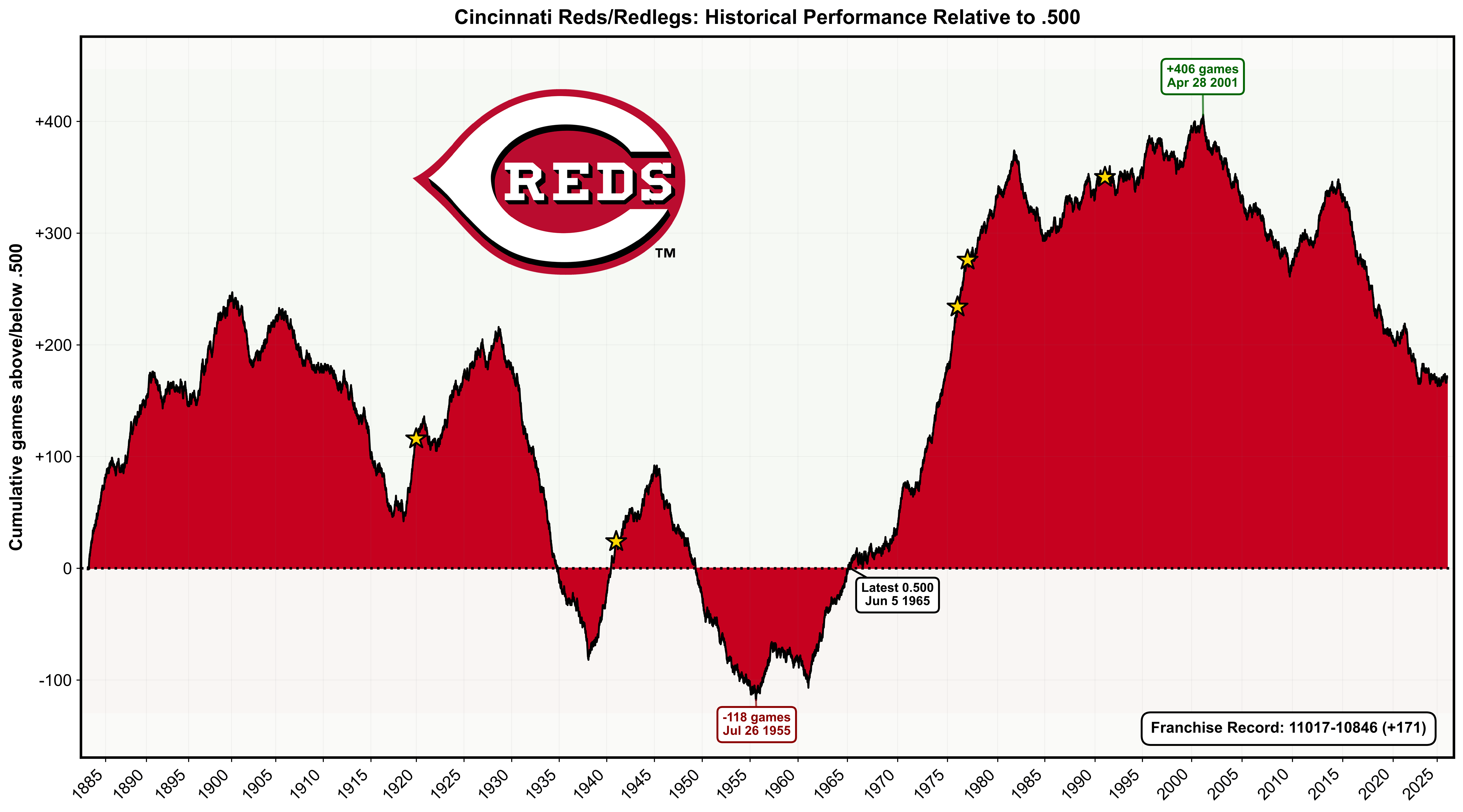
During the offseason, I'm creating a graph like this for every MLB team. It tracks each franchise's cumulative record relative to .500 (equal wins and losses) throughout their entire history.
The annotations show the franchise's all-time peak, lowest point, and most recent time at exactly .500.
The complete album can be seen here. I also made the NFL and NHL charts (before the current season).

![[OC] Reds' franchise historical performance relative to .500](https://www.rawchili.com/wp-content/uploads/2025/12/vcw8a2a5fh5g1-1920x1024.png)
8 comments
The difference between 2006 and 2025 is telling. I wonder what happened that year…
Damn we’re undoing all the work set forth in the Riverfront era
And here I always thought the Crossley years were good for the Reds, guess not really
I feel this
It’d be great for someone to highlight changes in ownership on the same graphic
Send this to the owners, lol.
Interesting graphs, thanks for sharing. Cool that you put the evolving logos and any location changes.
I know this is the Reds sub, but holy shit did the Pegulas kill my NHL team (Sabres). Line goes the same direction the Reds one goes when the Castelinis bought the team. Mind if I share it to the Sabres sub (will credit you)? Or if you want to post it there? I’m sure it’ll get everyone riled up. r/sabres
Awesome job! Can’t wait for the Dodgers to drop, but for now let’s all go look at the orioles in pity.