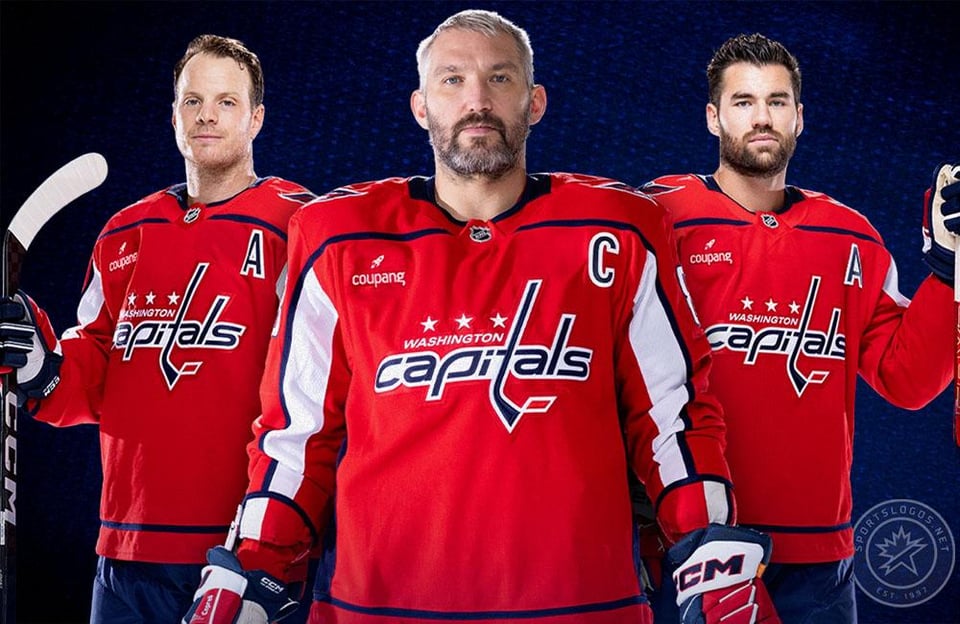
Why do the caps still use these script uniforms/logo when they have the screaming eagle sitting right there? Even the capitol building is a better option than just “Capitals” spelt out

Why do the caps still use these script uniforms/logo when they have the screaming eagle sitting right there? Even the capitol building is a better option than just “Capitals” spelt out
38 comments
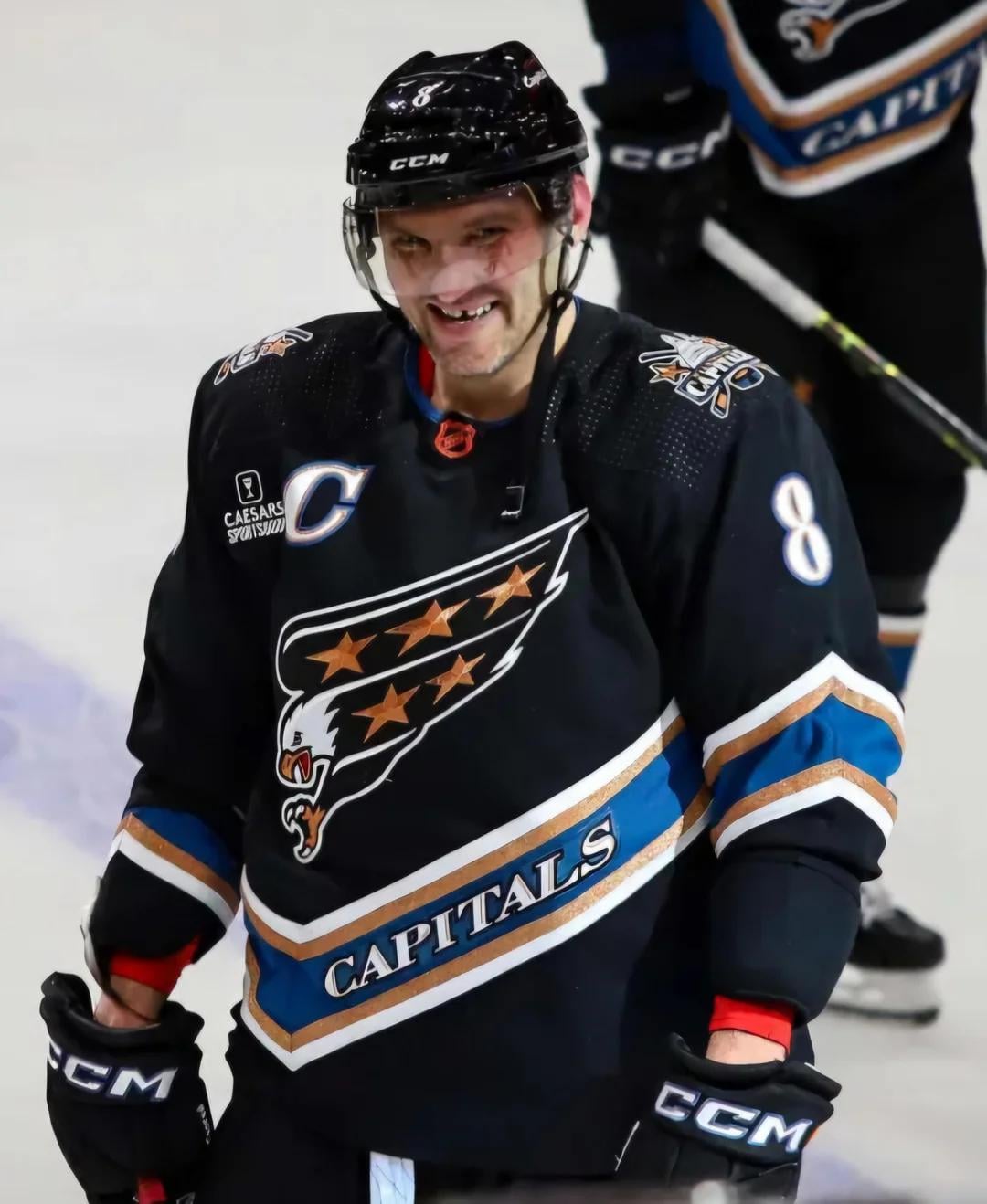
They will probably keep them at least until Ovi retires
And spelled out *in lowercase*
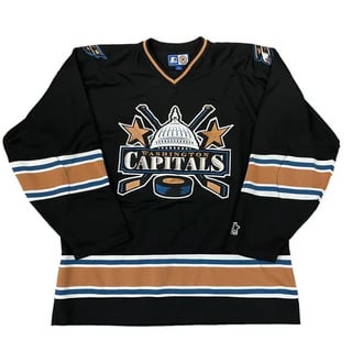
The original 70s-tastic one is still the best
I like the capitals spelled out the best. I think the screaming eagle is shit.
The Eagle logo was always been a personal favorite with The Capitol one is my least favorite of their logos, but that’s just me.
All those logos are terrible IMO. I know a lot of people like screaming eagle, I hate it.
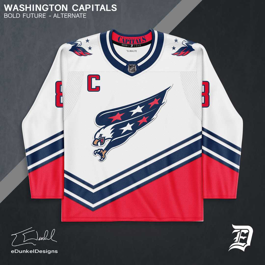
The one that I do like is the eagle over the Capitol, that logo is sick and should be their primary
It’s because they won the franchise’s first cup with them. Expect those jerseys to be honoured for a while
Ask Ted
Likely because the screaming eagle looks like a tattoo a fascist would have on their chest.
It should have been their shoulder logo.
But ya know opinions are like…
……. To sell more jerseys
Merica
Ovi’s Soviet-era brutalist sensibilities are influencing the logo design. Nothing more.
/s
This picture made me realize the hockey stick is the T and not the L. I hate it. capilalas. Although….I do like capilalas…
Honestly fuck the caps and fuck Tom Wilson but I have also always wondered this. The red jerseys with the screaming eagle would go hard. Or the darker colour and the eagle would pop off. Maybe I just like the eagle. I might just be a bird person.
I actually like them the most.
They look way better than the eagle to me
The eagle is not that sweet.
Proud to be an Americannnn Capitol,Eagle and Russian Ox.
The better question would be why they went with lower case letters when clearly they are all caps.
The eagle jerseys look amazing in red, white, and blue. Not sure much in the other colors.
Easily the worst in the league
Good question. I never liked the left-leaning lower-case wordmark on their original jerseys although I thought the rest of the jersey was fantastic with the shoulder yokes and alternating stars. I dislike the current wordmark even more. I would prefer either the screaming eagle or the eagle over capital on the red jersey over this version.
I don’t know but somebody needs to make something to rival the annoying Ducks’ badass logo. It’s like the hardest logo ever and I hate them
If you haven’t noticed. The “t” is a hockey stick in the spelled out version.
Why does it matter so much to you?
What is even more strange is “capitals” isn’t even CAPS! its all lower case.
Script is my preferred uniform of theirs
Washington has the worst branding across all four sports by far
I like the red jerseys, but yes I usually agree that some of logo is always between than just spelling out the team name. There’s a few teams I like the logo from one era on a jersey from another. Like the current lightning logo on the 2004 jerseys.
They also won the cup in these . That extends the life expectancy for jerseys
The more versions they have, the more jerseys the team sell$
No love for the Caps, but I like all of those.
Capitals with a big picture of the CapitOl is a bit weird, though.
Better still why isn’t it the Capital. It’s DC there’s only one capital. Or even the Capitol for the capitol
The building one is awful. Nobody wants to be reminded about those people in there.
Screaming Eagle is one of my all time favorites, from any team.
I absolutely love it. The blue and gold accent colors are wonderful together.
I know Ovi started his career in the screaming eagle, and since he’s near the end of his career now, I think that’s why they’re bringing it back as their alternate so he can sorta end his career in it. I think once he actually retires they’ll enter a rebuild with Wilson as captain, and they’ll do a rebrand at the same time.
IMO the blue and gold color scheme is much better looking than their current one