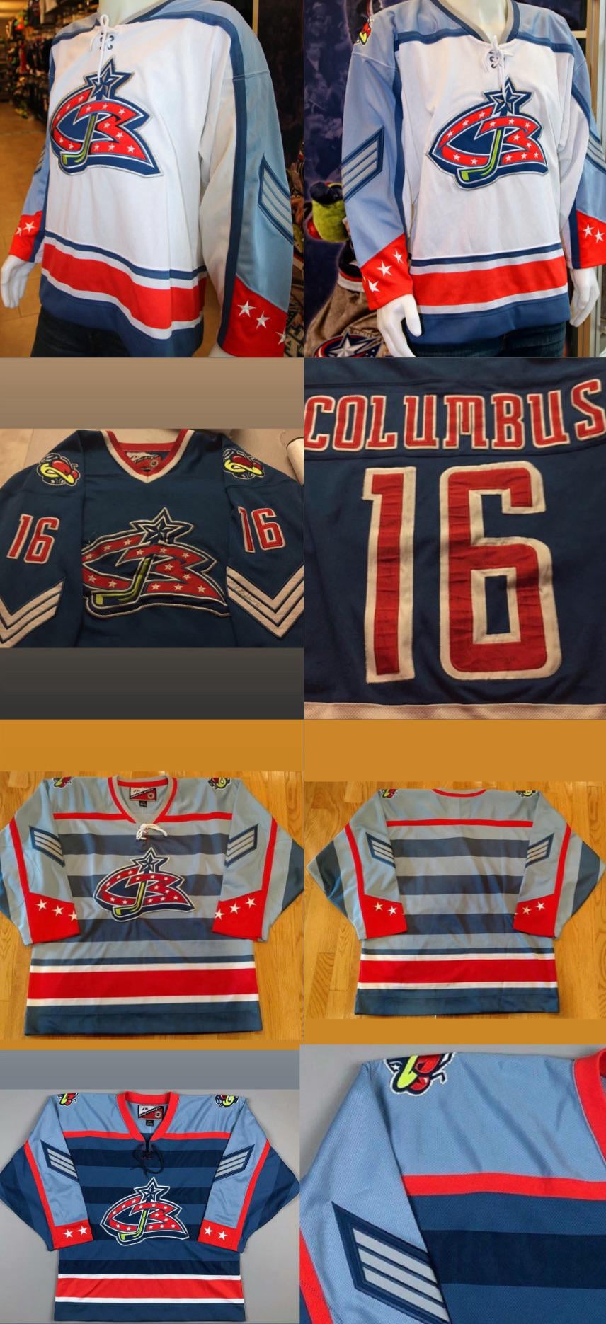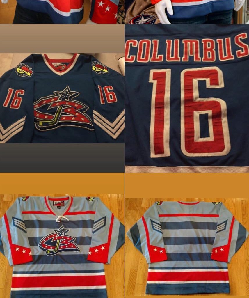
I think they nailed it with the chevron on navy blue with neon stinger logos but I doubt we’ll ever see it come to light. Funny how similar our stadium series ended up being to these. I have to think they referenced these designs and have been trying to put a chevron into a CBJ jersey for a long time.


12 comments
Interesting designs, seems like we kind got a hybrid of #1/2. That said, I think I have seen enough of #3/4 for my lifetime.
I would be cool with the very top 1 being like a reverse retro 3.0 jersey
Buzz’s sweaters…WOOF!
Visualize trying too hard

The stupid bug should never had been a thing ever.
I like the number font but that’s about the only nice thing I can say lol
I’ve always liked the old logo
Holy 2000s Batman
Top two would have been pretty good. 3 and 4 are fine ig
it’d be cool if they did the Captain and Alternatives only with military style chevrons. Man I love that graffiti logo though. Such a period design.
Love the second one, and I’d really like the top one of the white parts were also light blue.