
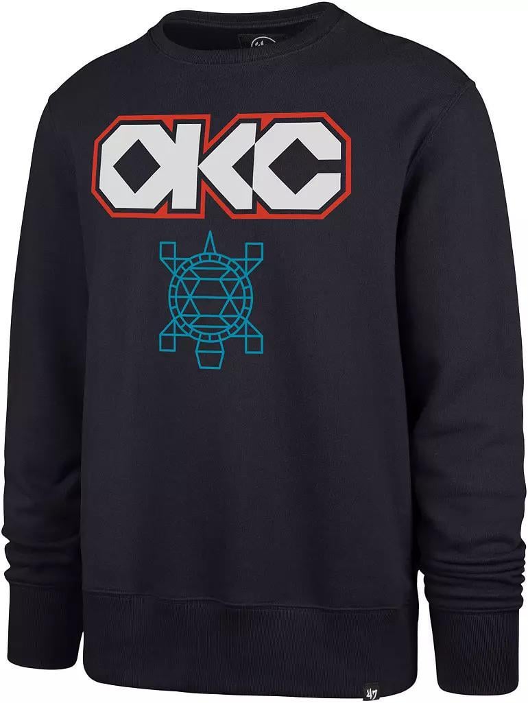
The design they rolled out at the Dallas game last night needs to be the Thunder’s primary logo. It’s clean, modern, and actually feels like Oklahoma. The geometric turtle motif is one of the strongest cultural tie-ins the team has ever used, and the OKC lettering instantly looks more professional than the outdated shield we’ve been dragging around since 2008.
And the best part is it already works. It looks incredible on merch, they’re selling it, and fans are eating it up. They’re basically test-driving a rebrand in real time.
You could even keep Rumble as the mascot, just update his look to reflect this design language. It all fits together way better than the current identity.
At this point the team is halfway there. Just make it official. No one would complain.
26 comments
Shield logo isn’t dated, it sucked when it came out.
I bought a hoodie with this logo in 2018? When it first came out and I’ve thought it should be the official logo since then
I agree, it rocks. Should have switched like 4-5 years ago, but you know what they say about good money moves – best day to start was yesterday, second best is today.
The best part (for me), is that being Native American myself, all of the tribes love it. OKC treats the culture and heritage with respect and it doesn’t feel forced. I see so many kids and adults wearing this everywhere. It needs to be the primary logo.
Couldn’t agree more. Make it happen!
The jerseys and court might be the best combo we’ve had. I’m for it 100%
Orange jersey has the best OKC font
I love it…if they don’t make it our official logo then I look forward to the away game version!
There a link for this sweatshirt?
Couldn’t agree more. Love this design.
I would spend an irresponsible amount of money on stuff with this branding.
The regular logo is fine in my opinion but the native jersey needs to be kept in the rotation permanently
Link to the shirt?
Yep this should be the new branding. It’s unique, it fits, it looks amazing.
For me, the City unis look so good they even distract me from the hideous Love’s logo.
Replace the turtle with a bison, and I’d agree.
I really do love these. Only thing I would do is make it more clear it’s an O. It boarders on looking like an a lol
1000%
The OKC TURTLES? Uh…
is there a story behind the turtle design? i know there are alot of turtles around OK just curious bc ive grown up here and never heard of them being a part of the native culture.
Does the bottom say thunder
I love how we all seem to have a pretty solid consensus on stuff like this is good, Doris Burke is bad
Thunder would have a difficult time trademarking the OKC letters by themselves, hence, anyone can make shirts like this but a very specific style maybe. But all anyone would need to do is change up a few things. City names or abbreviations are notoriously hard to trademark. Soooo many businesses using OKC long before thunder existed
Disagree 100%. Love the thunder shield and colors. This logo looks exactly like an alt jersey and color way used sparingly. Exactly what it’s for.
Everyone complaining here that the OG logo was good enough for your grandpappy, so it’s good enough for you, needs to post pics with their Oklahoma City Basketball Club gear from 2008.
If you wanna claim OG, be OG.
No way. Not the primary logo