Visiting Pirates fan here!
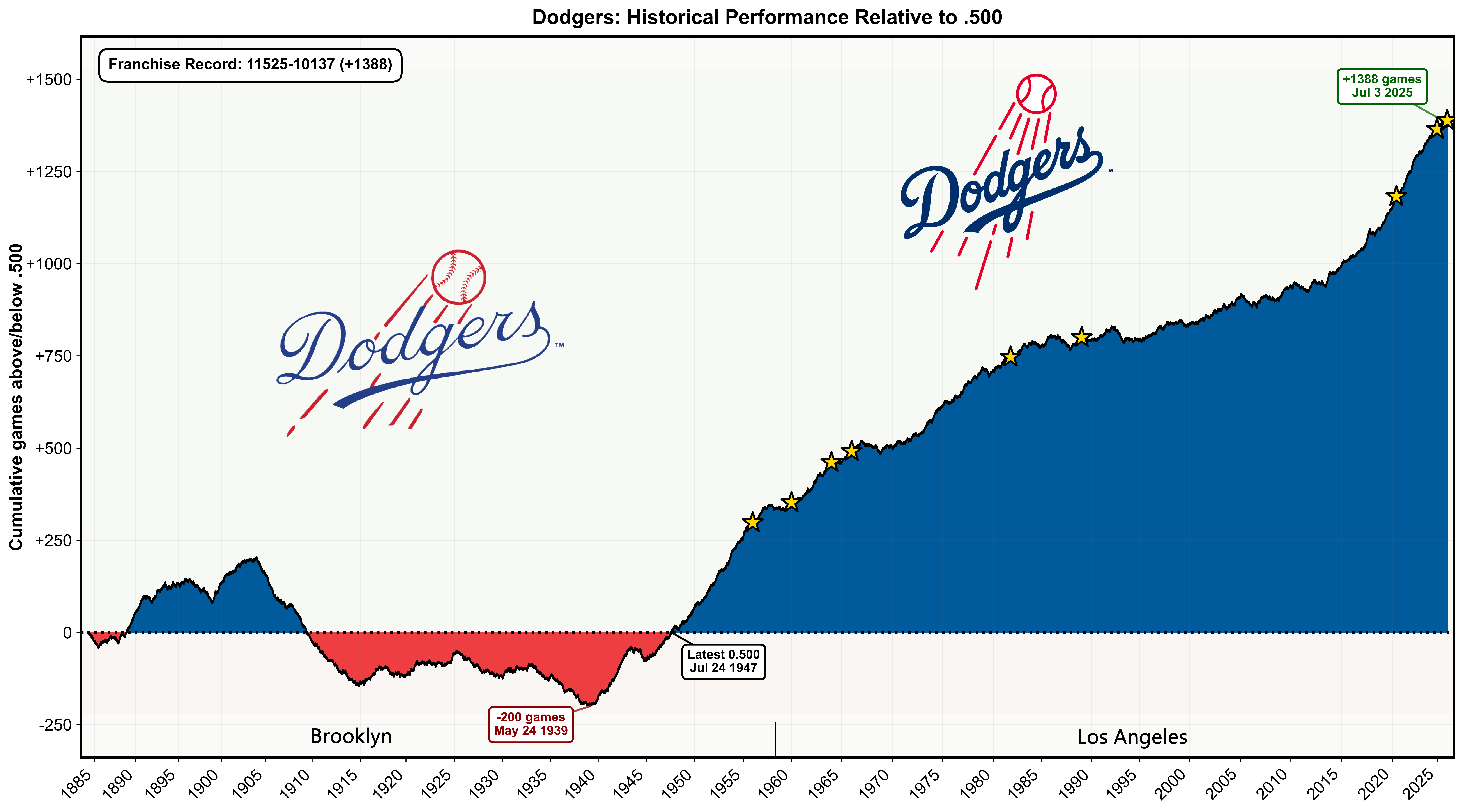
During the offseason, I'm creating a graph like this for every MLB team. It tracks each franchise's cumulative record relative to .500 (equal wins and losses) throughout their entire history.
The annotations show the franchise's all-time peak, lowest point, and most recent time at exactly .500.
The complete album can be seen here. I also made the NFL and NHL charts (before the current season).
The Los Angeles Dodgers (without Brooklyn) have a 5901-4857 record (+1044).

![[OC] Dodgers' franchise historical performance relative to .500](https://www.rawchili.com/wp-content/uploads/2025/12/z9u4dnpyas5g1-1920x1024.png)
20 comments
“That does bring a smile to my face – Thanos”

Very cool, thanks! If it’s easily available, do you have the two other .500 dates?
Thank you!
Even during the hell that was the McCourt Era my boys in blue always showed up.
Excellent work, thank you! Love the little stars marking the championships as well XD
Legend.
I would have expected it to look something like that. Team wasn’t really successful in Brooklyn but left during a good era within a few years of winning their first championship. Brooklynites may whinge, but the greatness of the franchise was built in LA.
Love this, and quite the ascent the last (10) years under the Doc Roberts era.
Thanks for your work. I have said that we are currently in a golden age of Dodger baseball and this chart proves it. We have never seen the Dodgers perform as well as they have now. The only comparable is the “Boys of Summer” era when the Dodgers (1954-1974) where the Dodgers won four World Series, though none were back to back.
Curious to see what teams like the Rockies or White Sox look like.
The upswing coincides with Jackie Robinsons’ rookie year in 1947. Was Jackie the turning point?
We really were “dem bums” in the Brooklyn days.
Which team’s historic curve is more objectively depressing: the Pirates or the A’s?
Wow, quite the perspective on the champs. Nice!
This is a great graphic. This is real cool if you to do this. Way to go.
Are you going to post more in other team subs? I ask because my uncle is a Braves ran and would love one for the Braves too.
Edit: just checked your profile, duh. Found your Braves one. Already sent to Unc.
Again, nice job and thanks for sharing. 🍻
Very nice graph, and information.
BTW – pitchers and catchers report in 64 days, 6 hours, 12 minutes, 22 seconds
Very nice. Don’t see the graph for your Pirates.
The Cubs graph surprised me, so much time above .500, but few Championships to show for it.
To the moon!
Thank you OP, this is very interesting to see!
Looks like betting on each game to win is a good strategy over the long run?