
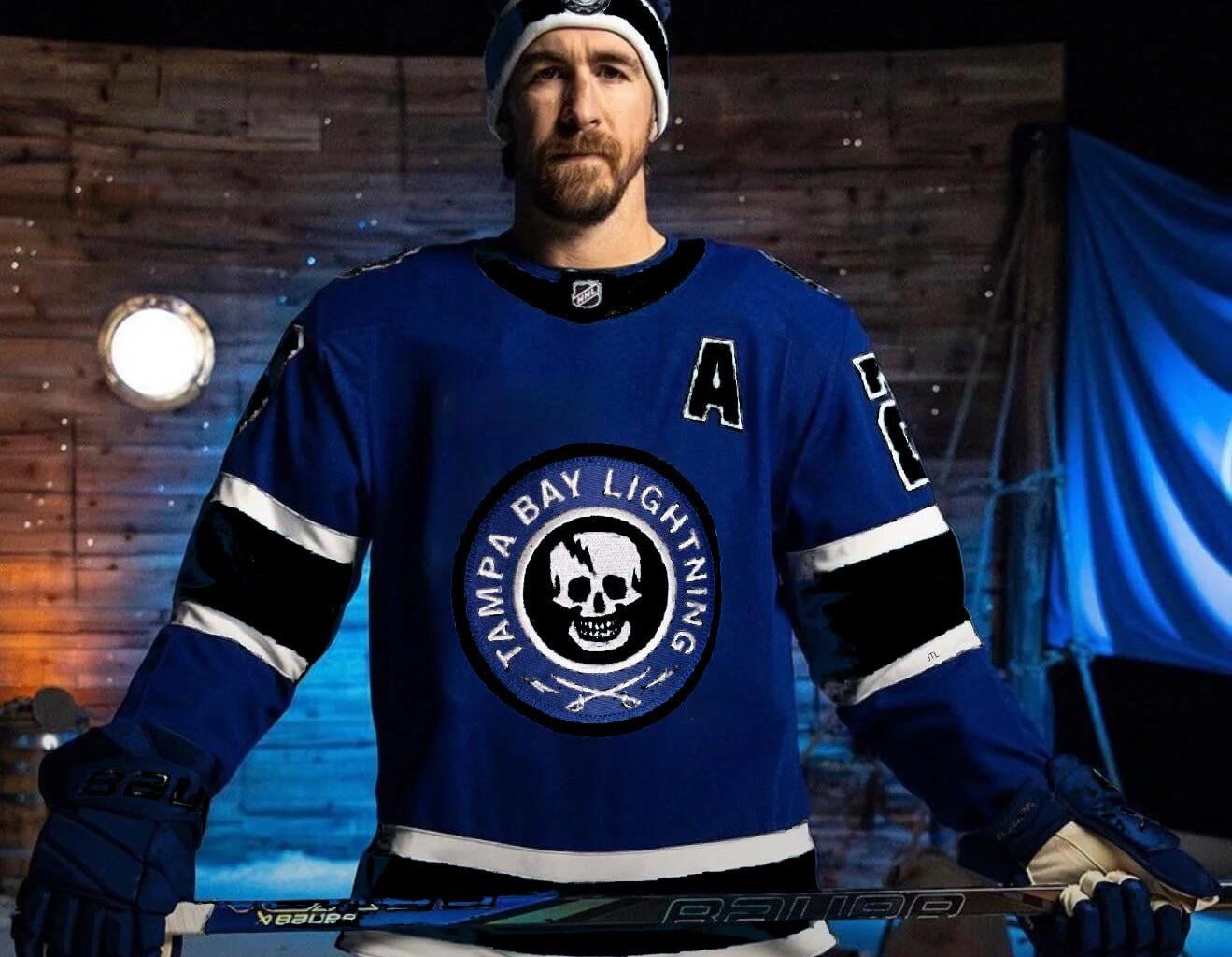
The baby blue works as a color scheme but to me it just doesn’t look like the Lightning because it’s not one of their colors. Plus the TBL logo is… not great.
I didn’t spend any time trying to make the details look great but to me this at least looks like the Lightning.
14 comments
now do one for him in a rangers sweater so i can be really depressed
That is so ridiculously cool.
That pirate logo needs to stay. It’s a super unique identity that’s untapped in the NHL.
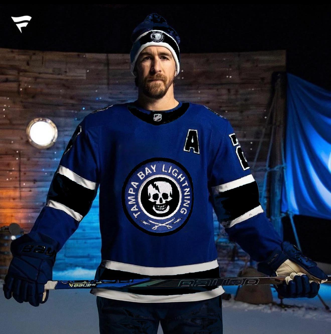
Yeah, this is much better.
Logo looks better but I love the sky blue on the jersey 🤷🏾♂️
Could be used for next expansion team: Astoria Goonies
I really want the Lightning to reincorporate black into their uniforms. Right now they’re just too similar to the Leafs
The lightning have so much untapped brand potential. Pirate patches, lightning bolts, ocean blue/electric yellow/white/black colour schemes.
Shame all they get are recycled ideas from the generic NHL lost and found bin
This kind of sucks too tbh
Honestly, you could even incorporate that lightning background as well. Instead of the black centre circle under the skull, put that lightning background in. Maybe black for the outer ring so it matches the white/black/white that’s on the arms and bottom.
They aren’t the pirates. Or the skulls.
I want this, but keep the baby blue, and have the logo have the same lightning bolts in it as the TBL does.
They let corporate minimalism win again.
The swords on the bottom give Buffalo Sabres vibes.