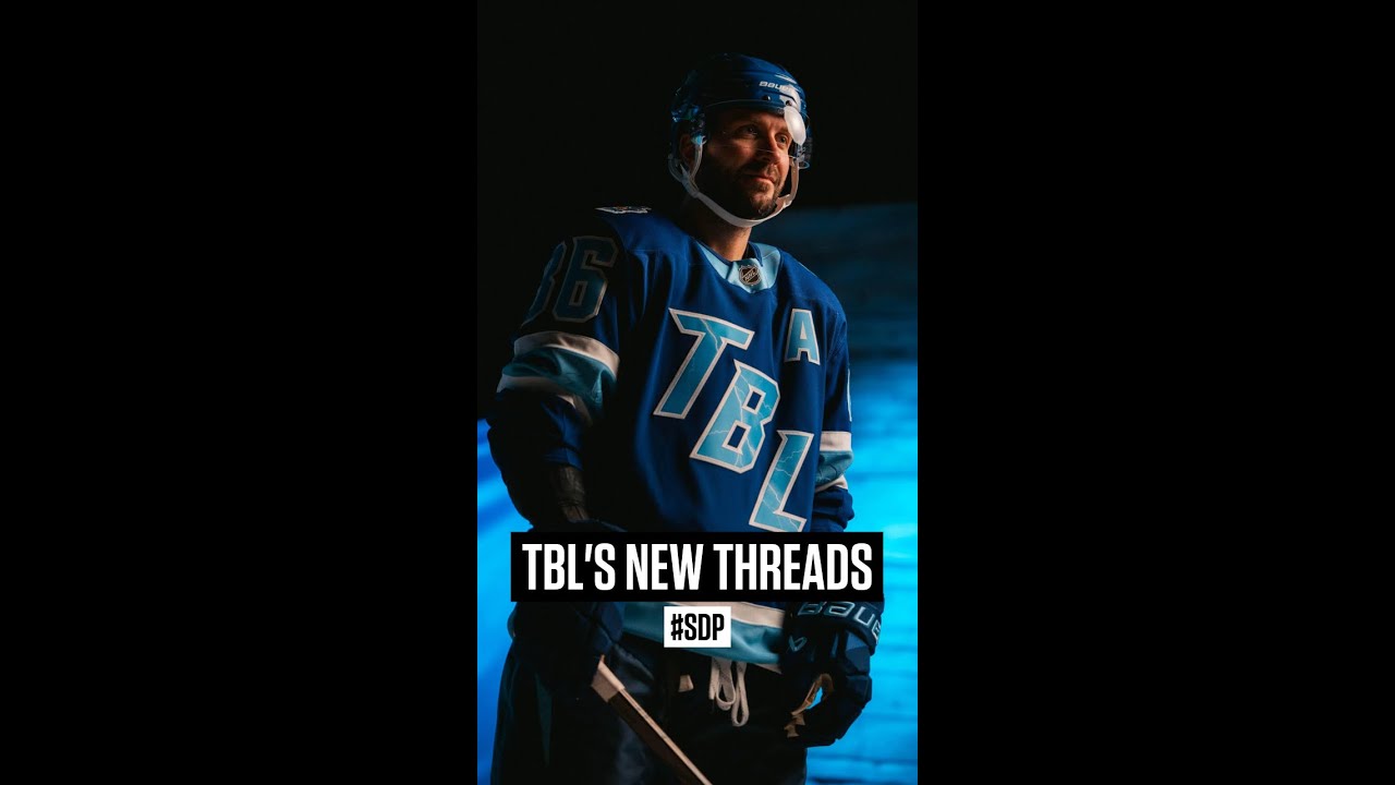
The fellas can’t agree on Tampa Bay’s new Stadium Series jerseys. #SDP #lightning #nhl
Both teams came out with them, but this is the Tampa Bay Lightning. They have released this to the public and expected people to buy it, which I think is a very bold choice. It’s not Yes, it is. I do not have the same sentiments about this jersey. I actually kind of like it, Jesse. That’s the most Beerleague ass jersey I’ve ever seen. Like, if you wore that in beer league, people would chirp the out of you. I don’t think so. So, people are like, “What if we swapped the shoulder patch onto the front of the jersey?” No, but then this is literally the Penguins jersey. Oh he’s right. Like what? Oh, let’s make the old Winter Classic Penguins jersey. That’ll be great. Instead of doing something new and kind of fun with the TBL, let’s just recreate the Penguins jersey. No, this is garbage.

31 comments
Ugly as sin
"new and fun" "TBL"
That is fire
Should become their defaults honestly
I think I need more of it, and hopefully better photos before I make a judgment but from this, it seems very basic. The shoulder patch is cool but not noticeable usually, the TBL is kinda boring. Colors are fine.
The shoulder patch is vastly superior. Jessie is just flat-out wrong.
TBL = Tampa beer league
Shoulder patch is literally a Pirate Harry Potter.
Both jerseys are the ugliest god damn things I've ever seen
Hes right, you can have that jersey but dont expect anybody to go crazy for it
Gotta agree with Adam here. That is not a very good jersey
Dogshit jersey, honestly.
And a white maple leaf with nothing else on the front is the pinnacle of design?
It’s Florida. This looks like a can of Bud Light.
They’re going to make millions
If you can like this jersey you can like any jersey
Start with Montréal Canadien => MTL rearrange the 3 letters TML = Toronto Maple Leafs and replace the M with a B => TBL Tampa Bay Lightning.
I'm with Adam. That Tampa jersey is garbage
Jesse is taking a fat L with that take. 😂😂
Jesse is wrong. But someone has to be wrong in this discussion so take it for the SDPN team. That Jersey is nice, much much better than that Jersey that a Grade 1 kid design.
adam stays winning
Looks like a high school jersey… And that's even being generous.
Ugly AF
Love how the shoulder patch also pays homage to their division rival the Buffalo Sabres
Awful jersey
Adam is a magget
Terrible!
It's okay, the Bruins jersey is a thousand times worse.
I live in Ft Lauderdale. Panther fan. I have wondered why all the Lightning jerseys are always subpar, boring, too simple. Been this way forever. In Battle Of Florida games Panthers always win on appearance.
The skull jersey is better.
If I was running Tampa I'd ditch the black and white, and I'd steal the Miami Vice light pink and blue. I guess it isn't even stealing, not like the cats play in Miami – Yeah, remember those gorgeous Miami Heat Miami Vice jerseys?
Why not a sail with a lightning bolt striking it, there's no pirate team to worry about being mad and they're in a bay, I think it'd be neat but wdik