I know we all have nostalgia and associations with the logos. Whether that be based on wins, growing, etc. But I am curious about the looks, what calls to you.


I know we all have nostalgia and associations with the logos. Whether that be based on wins, growing, etc. But I am curious about the looks, what calls to you.
34 comments
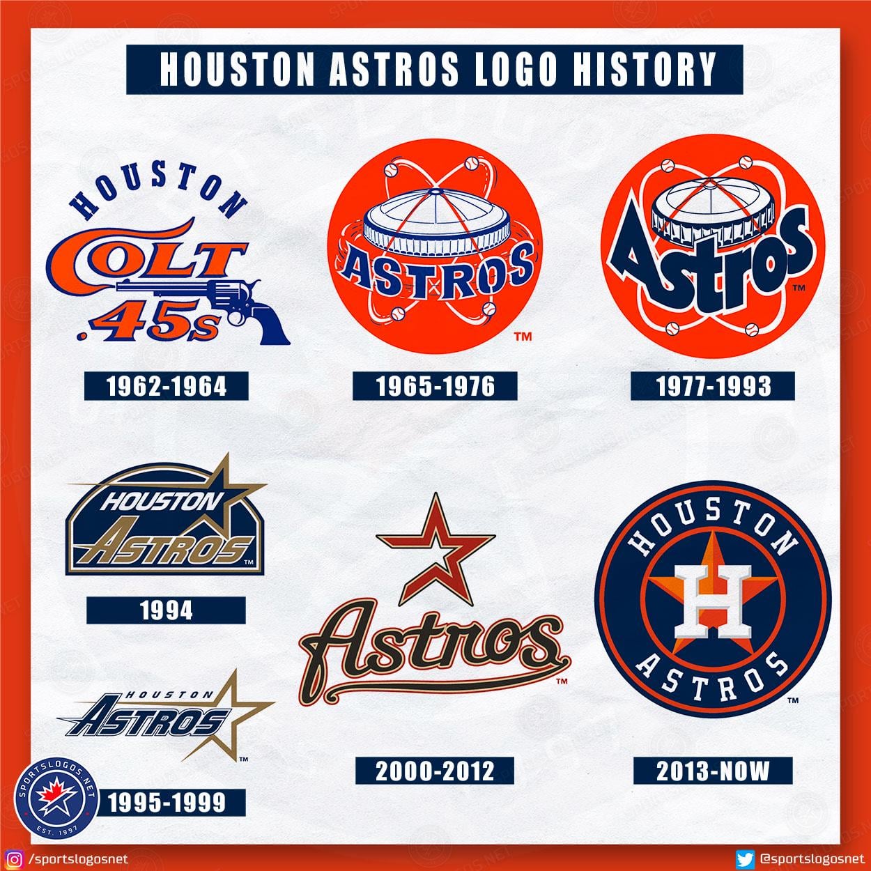
1995-1999
95/99
It may show my age but I’m 100% for ’77-’93.
The OG – Colt 45s
95-99
77-93 then 95-99 and then the current day.
The 77-93 is sports logo perfection–the typeface is unique and iconic, it incoproates the stadium in a natural way, It used a bold orange, and it was just perfect.
Gotta be ‘94 for me.
95-99
#’77–’93, easy
2000–’12 was largely what I grew up with, but coming off the mid-/late-90s rebrand, it never really did much for me.
My favorite is 77-93, but that’s also the era I grew up in.
95 to 99 will forever be my bae.
1995-1999.
95-99 my childhood logo… Just got that hoodie during black Friday sale
70s to 90s
But modern is a close second
77-93 is perfect. I don’t mind the current one (The H on the star is simple but effective), but it’s just a boring reminder that everything is going minimalist. Seems like almost a third of MLB (including 4 of the 5 AL West teams) has the exact same logo design.
95-99
Current
On looks, the current one. On nostalgia, 1977-1993 (the one I grew up with as a kid)
Blue and Gold
I’m all in on 1977-1993
‘65-‘76 IMO
95-99.
95-99
Top right.
https://preview.redd.it/ibgtunvkql7g1.jpeg?width=266&format=pjpg&auto=webp&s=eb6ffcfd365af6ff7ae34475fb1d23fce6a1ce45
NOT a fan of the 1994-2012 logos, OR the uniforms for that matter, OR Junction Jack.
The current logo and uniform designs I think are the best they have ever had. The only thing I would change is replacing the navy blue alt jerseys with a tequila sunrise version.
I like the one we have now. It’s simple, elegant and timeless.
I’m in the major minority that likes 2000-2012 but that’s what I grew up watching and will always be connected to 🤷
But our current logo is definitely the cleanest and best logo that feels right for the brand
95-99
I’m fine with the current one.
First and current
Anything except the 90’s – 2012
Colt 45.