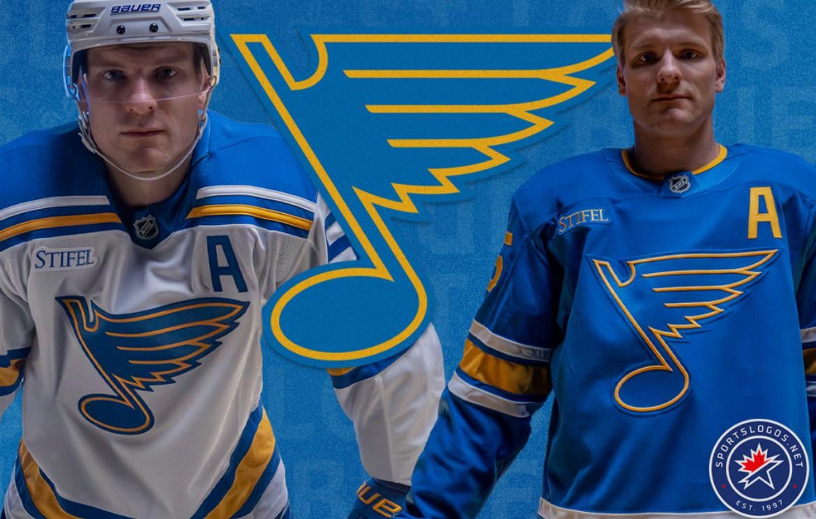
Thoughts on Logo/Jersey Change? I LOVE our away jerseys
December 18, 2025
Thoughts on Logo/Jersey Change? I LOVE our away jerseys
28 comments
The new home jerseys are cursed.
This logo change is:
1) too subtle to fucking matter.
2) stupid to publicize so much.
3) a fucking moot point when we’re playing like God damned dog shit.
4) stupid.
It doesn’t help that the change is paired with a terrible season. If these came out while the Blues were a championship contender, more people would probably feel better about them.
The Blues performance aside, I think these are wonderful all around. Previous jerseys were great, but I do love these.
I hate the single color numbers. The Blues entire history is three color numbers. It looked so much more complete with them. Otherwise, I think they’re nice. A shame they lose in them all the time.
I wanted them to make the original winter classics permanent ever since I saw them on the ice for the first time. My only complaint is the solid blue numbers and letters on the away jerseys look weirdly cheap.
It’s too bad they suck, because they look great.
I don’t know if there’s any precedent for this but I’d keep our new white fauxbacks as the away set, return the navy trim/pants to the usual home slot, and elevate the retro red clown set to the roughly once-per-month usage for special home games. The fauxback baby blues can take a rest for a while in my book.
I think I am in the minority but I HATE it. I have since they released it…it looks so cartoonish! The colours look soft. The older one was so sleek, the colours were on point. Not a superstitious guy so I don’t think the team is losing because of the new logo/colours though lol
The design is good. The quality is cheap as hell.
I think they did a great job with the rebrand. Love the more retro vibes while still being modern. The softer blue isn’t everyone’s cup of tea, but it’s uniquely us and pops on ice a lot more than the navy jerseys that look black at times.
When it was announced I was kinda hyped but honestly?
I miss the royal blue. Not exactly sure why
It seems to be trying hard to be relevant. Seems to be a bit of “hey look at this shiny object even though we didn’t do anything to actually improve the team”. It’s like the im not like the other girls girl wearing a nirvana shirt in the cafeteria. Retro is becoming so popular it’s uncool again.
Last year, maybe two, they leaned into the blues music thing wayyyy too hard. Now they are going with this “old school” thing. It’s a novelty. Nobody wants this to be the permanent look. It’s fun to have a retro alternate. But it will get old extremely quickly.
If you want something that looks old don’t commit to it, because it will look exactly how you want it to… old. And now they can’t go back to the previous version because it would be a regression. And there’s only so many ways you can design the color blue and a music note.
I really don’t like them as our permanent jerseys. The road ones look better than the home jerseys, but they both just feel like they should be alternates. Our old jerseys were elite and we should return to them full time. I really hate this rebrand, aside from the new StL logo. That thing is amazing!
Numbers need piping
The bluenote still looks worse. And rotten Stifel completely ruins anything it’s plastered on.
I like the new away jerseys, but hate this light blue color for the home set. Agreed with others saying it just looks soft and cartoonish…Feels much more like an alternate that you pull out just a couple times a year. I also find the whole notion of a “rebrand” super gimmicky and it just feels like a money grab.
If I’m in charge, they return to the home jerseys of last year, and try this new note, but with the old color scheme with the royal blue. Take off the stupid Stifel ad and just be a hockey team!
I would love to see how these would look with the previous colors instead of the lighter blue
They are for all intents and purposes a slightly updated version of their original jerseys. For those of us who were alive in 1967 and grew up with the Blues during the golden era 1967-1970 seeing the boys skate onto the ice suited up like Red Berenson and the Plager brothers is kind of magical. Unfortunately they aren’t a very good team at the moment, but they look good.
Probably get hate for this, but I think the away whites are the best away jersey in the league. I don’t get the hate for the multi colored/layered numbers, but I understand how people would want that. The colors just pop for me and that is asking a lot for a white jersey. Unfortunately the season isn’t treating these jerseys well.
The names and numbers look like they’ve been heat pressed on.
Love them both. They would look nice in a playoff run.
The SWEATERS arent the problem. The SWEATERS are fire.
Away jerseys are great. Home jerseys are ok.
Make the single numbers two color and add some white around the blue note on the front and you’ve got perfect sweaters. The new logo and colors are fantastic
I love both jerseys but LOATHE the non-bordered numbers and the fact they are Crapnatics brand.
Really like the rebrand.
I much prefer our old jerseys. I don’t hate the new ones but the darker blue and piping just fit so well. I genuinely thought they were best in the league. C’est la vie I guess.
I think they’re perfect and anyone that disagrees is wrong
Hot garbage 🗑️ aways are fine but I think the last away jerseys were better. This may be an unpopular opinion but it’s just how I see it.