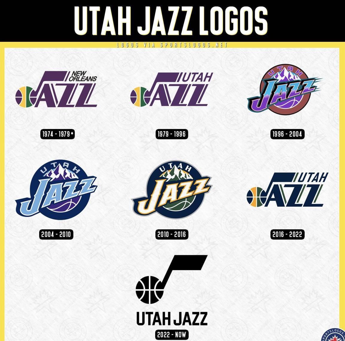
Still need one that incorporates both the mountains and the note.
I’ll always be partial to 96-04 because that’s the one I grew up with and we went to two finals with.
04-10
16-22
Jerseys from 04-10 were solid though. Love the minimalism and how good it looked
I like 1979-2010, all three were solid
Pretty much in order from oldest to newest, except the NO and first Utah logos are tied for first, and the 2010-2016 logo and s my least favorite.
Incidentally, while that logo was officially the “primary” logo during those years, the team mostly used their “secondary” logo, which was just the music note without the other letters, in the color scheme of the 2016-2023 logo.
The all black 2022-Now is pretty solid! Not gonna lie.

10 comments
#6 2016-2022
96-04
Still need one that incorporates both the mountains and the note.
I’ll always be partial to 96-04 because that’s the one I grew up with and we went to two finals with.
04-10
16-22
Jerseys from 04-10 were solid though. Love the minimalism and how good it looked
I like 1979-2010, all three were solid
Pretty much in order from oldest to newest, except the NO and first Utah logos are tied for first, and the 2010-2016 logo and s my least favorite.
Incidentally, while that logo was officially the “primary” logo during those years, the team mostly used their “secondary” logo, which was just the music note without the other letters, in the color scheme of the 2016-2023 logo.
The all black 2022-Now is pretty solid! Not gonna lie.