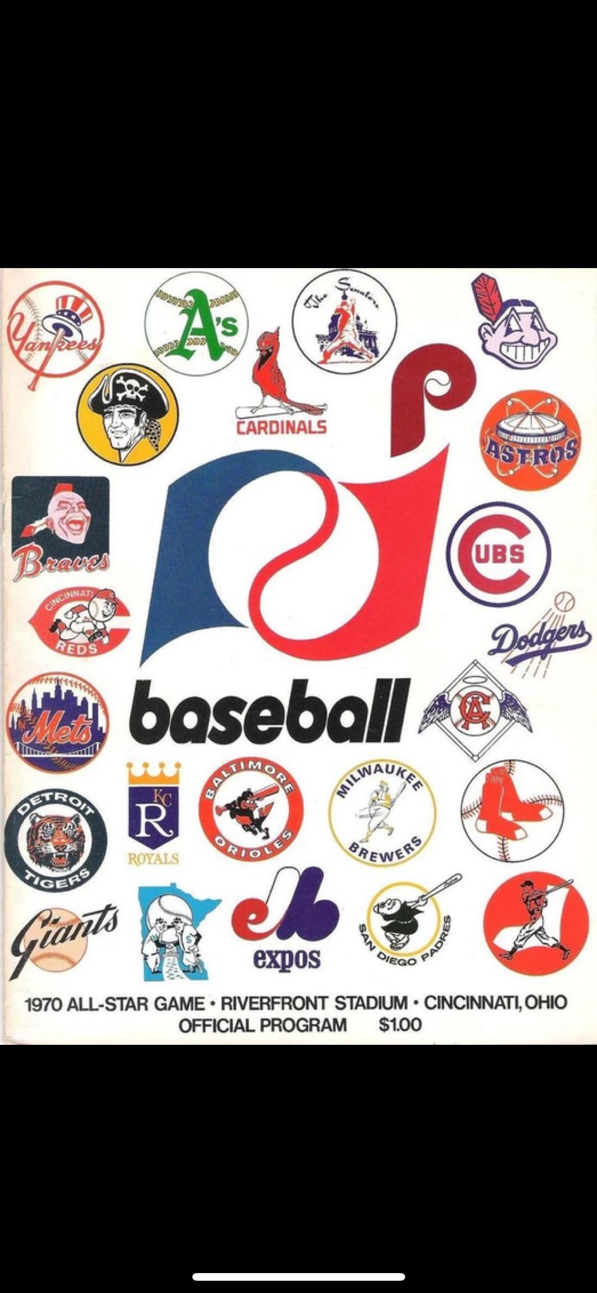
That Pirate looks like he’s straight out of a 70s cigarette ad.
That off-center Sox logo is pissing me off.
I like Washington Senators(Current Texas Rangers) logo
Why is the baseball for the Giants one off-center? Usually when I see that logo, the ball behind it (if there is one) is centered. That just looks…lopsided.
Pete Rose-Ray Fosse game
Isn’t that the current logo? Or is it the baseball outline that is different
The Cardinal for St. Louis looks like it it just saw the AZ Cardinals record
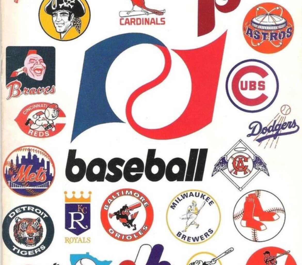
Why is this an uncropped screenshot? Why not just post the image?
The Mets have done a lot of things wrong since 1970, but they have managed to not fuck up that logo.
I know it hasn’t even been that long but having not seen the braves or Indians logo really made me realize how jarring it was.
I’m glad that those caricatures are retired and it feels like a much lesser deal than people let on when the debate was raging. I can’t remember the last time someone asked for chief wahoo to come back
BRING OUR EXPOS BACK… please
I’d love to see the Angels in throwbacks using that logo but I’d guess if they did use it, it would be the LA original version, not the CA one.
Bring back the Devil Rays!
Fun fact: most people don’t realize the Yankees’ top hat logo is technically their primary logo
Wow that Cubs logo feels wrong. The current one is so perfectly balanced with the UBS to the C in comparison to this. (And the thick blue border circle as well.)
The Royals logo just screams Cigarette logo to me
I’d pay to have that “baseball” logo on a shirt.
That tigers logo crack me up everytime
I have a soft spot for the old school tigers logo
That Tiger has seen some shit
That Phillies logo is awesome, I hate that they switched away from maroon- it was unique and just better on all accounts.
I’m so happy that society has progressed to the point where we no longer find it acceptable to depict tigers with circular pupils.
How far we’ve fallen
The Brewer popped up.
The Padre struck out.
The White Sox hit a double down the line.
The Oriole is readying to homer a meatball
Every design is better
The Tigers logos over the years are a mix of insane & really sharp so I think they’ve probably got the best overall history. That Angels logo is underrated.
All the best Detroit logos feature the Cocaine Tiger

43 comments
Houston Isotopes
I really like the Detroit one.
Bring back the Expos you cowards!
May just be nostalgia but bring most of these back!
Especially the Expos!
I always read Montreal’s log as the **elb** Expos.
Bring back the Expos!
Always cringe for me when I see the laughing Braves logo.
Montreal always looked like elb to me, made me think elbows.
goated Oriole logo imo
Honestly, some of these are just better
Seems like a poor design choice for the White Sox to use a red circle in their logo
it’s crazy that the White Sox used red socks in their logo /s
Tigers forever
Classic Indians
Padres logo here is great
[Back in the day, even the logos were on greenies. ](https://news.sportslogos.net/wp-content/uploads/2018/09/Tigers-vs-Cardinals-1968-Logos.png)
That Pirate looks like he’s straight out of a 70s cigarette ad.
That off-center Sox logo is pissing me off.
I like Washington Senators(Current Texas Rangers) logo
Why is the baseball for the Giants one off-center? Usually when I see that logo, the ball behind it (if there is one) is centered. That just looks…lopsided.
Pete Rose-Ray Fosse game
Isn’t that the current logo? Or is it the baseball outline that is different
The Cardinal for St. Louis looks like it it just saw the AZ Cardinals record
Why is this an uncropped screenshot? Why not just post the image?
The Mets have done a lot of things wrong since 1970, but they have managed to not fuck up that logo.
I know it hasn’t even been that long but having not seen the braves or Indians logo really made me realize how jarring it was.
I’m glad that those caricatures are retired and it feels like a much lesser deal than people let on when the debate was raging. I can’t remember the last time someone asked for chief wahoo to come back
BRING OUR EXPOS BACK… please
I’d love to see the Angels in throwbacks using that logo but I’d guess if they did use it, it would be the LA original version, not the CA one.
Bring back the Devil Rays!
Fun fact: most people don’t realize the Yankees’ top hat logo is technically their primary logo
Wow that Cubs logo feels wrong. The current one is so perfectly balanced with the UBS to the C in comparison to this. (And the thick blue border circle as well.)
The Royals logo just screams Cigarette logo to me
I’d pay to have that “baseball” logo on a shirt.
That tigers logo crack me up everytime
I have a soft spot for the old school tigers logo
That Tiger has seen some shit
That Phillies logo is awesome, I hate that they switched away from maroon- it was unique and just better on all accounts.
I’m so happy that society has progressed to the point where we no longer find it acceptable to depict tigers with circular pupils.
How far we’ve fallen
The Brewer popped up.
The Padre struck out.
The White Sox hit a double down the line.
The Oriole is readying to homer a meatball
Every design is better
The Tigers logos over the years are a mix of insane & really sharp so I think they’ve probably got the best overall history. That Angels logo is underrated.
All the best Detroit logos feature the Cocaine Tiger