
Over the last few years as I have watched the Cardinals flounder, I have begun to also grow bored of the uniforms. That isn’t to say that uniforms are bad or anything because the uniforms they wear are iconic to them, but I’d rather the Cardinals spice up the uniforms a little bit as I’m just a hair tired of them. My plan here is to make a handful of small suggestions to not reinvent the wheel but spice up and tweak the current uniforms.
Suggestion 1:
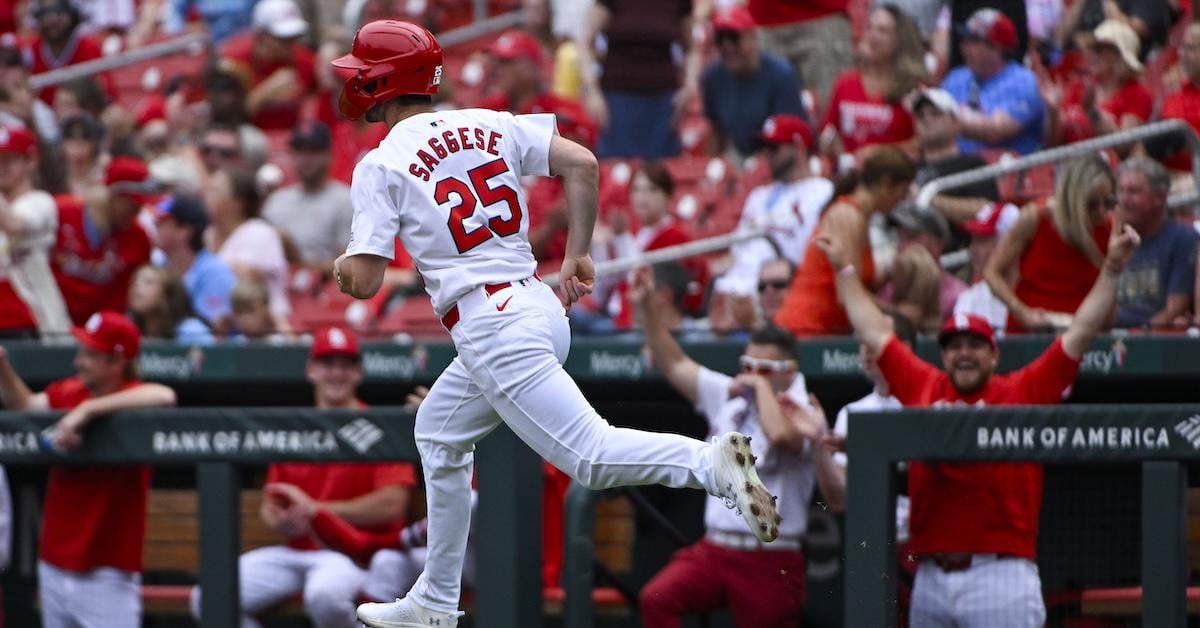
https://blogs.fangraphs.com/wp-content/uploads/2024/10/USATSI_24215489.jpg
Take note of this image of Thomas Saggese. He has no sleeves or accessories, no high socks or colored shoes. It makes the uniforms look bland and plain.
One of my first suggestions would be to create an in-house rule about high socks that would require players to wear the high socks in scenarios where their spikes are a certain percentage primarily white. I feel like this would help break up the monotony of the all-white and help the players not buy new cleats. It’s a small change that would help breathe some life into the uniform and break up the sea of white.
Suggestion 2:
My second suggestion is to bring back the trouser piping stripe the Cardinals wore for decades. I went through a website that kept a relative database that had all their uniforms, and as far as I can tell, the Cardinals had a trouser piping stripe from as far back as the late 1930s until the 1990s. This change would once again help break up the monotony of the white, as well as add an extra historical flair back that has been absent for the last few decades. This would be applied to both the “Home Whites” as well as the “Road Greys”
https://www.si.com/mlb/2016/09/16/classic-si-photos-stan-musial
In this link, you can see Sports Illustrated has a series of images of Stan Musial with the piping strip on the trouser seam. I’m thinking the relative thickness of the stripe should be around what is currently on the Saturday uniforms.
Suggestion 3:
Bring back the navy cap on the Road Grey uniform. I feel like most people are keen on it as it adds a little bit of extra difference between the home and away uniforms.
Another part of this suggestion is related to the Home Saturday uniforms (which are my personal favorite). Replace the standard red home hat with a two-tone navy cap with a red brim. Hall of Fame weekend 2025 did that and while many weren’t a fan of the fake bird they used on the cap, the two-tone colors made the cream jersey pop. I’m thinking we reuse the interlocking STL hat we have for warmups and batting practice and we get a new hat for that as those hats change every couple years anyways.
Conclusion
In conclusion, these changes do not have to be made because at the end of the day they are strictly cosmetic. Not to mention that the Cardinals have much greater issues to deal with currently after the administration change from Mozeliak to Chaim Bloom. Either way I think these changes would be a nice change of pace.
17 comments
The navy cap on the road grey was such a cool look and I still love the way the navy looks with the cardinal red
You can’t require high socks, you would have to change the uniform code. They do have pipping on Saturday uniforms. The navy road cap is a definite though, it was stupid when they made that change.
I’m so behind #1 that there aren’t words for it.
I remember when teams would unveil their City Connects and they’d have a guy like Paul Goldschmidt standing there, in pajamas, basically– pants down to the floor, etc. a.k.a. the most basic and boring iteration of the uniform possible.
this used to drive me crazy. why on _earth_ would you not take a shot or two of what the damn uniform looks like with high socks????? how is it a uniform debut if you aren’t even showing off all of the uniform?
anyhoo, I much prefer the long-socks look. even if a player isn’t going to go full-on knickers, I should see _some_ sock down there.
Growing up I never liked how the navy hat was the only road hat – it never felt like there was enough red when I’d watch them on TV. I wouldn’t mind going back to navy on the road as much if they gave it a red brim, like they wore during the ‘40s into the mid ‘50s. That was a dope look, and it would look good with both the home and road uniforms.
My controversial uniform take is to drop the home whites altogether – tweak the cream jersey to say Cardinals instead of St Louis, and I think it’s just about perfect as a primary home set. They could even alternate red hats and navy hats for weekdays and weekends, or something like that. There are only a few teams which use a cream jersey as their primary home (Giants and Brewers), and I think the Cards could absolutely pull it off too.
Love the idea of piping. I’d prefer the two tone cap with red STL logo and red brim for the road. It’s crazy we don’t have that combination on a hat when it is such a classic look. Much better than full navy IMO too.
https://preview.redd.it/eupwabimcbcg1.jpeg?width=1200&format=pjpg&auto=webp&s=f089e302dea39c6ce26848b130c2acf2940a87f9
https://preview.redd.it/lrirxfbqcbcg1.jpeg?width=1500&format=pjpg&auto=webp&s=9bd2242ef863ea611a117cb23184f0f87858ae7c
This is what we need to go back to
https://preview.redd.it/pzmzgu24dbcg1.jpeg?width=1170&format=pjpg&auto=webp&s=b0db2dfe0c06d4ee0585b40d0e0cfcb8c65e983d
Better version of the victory blues.
Also for the love of god get the nike swoosh off our uniforms
Slow offseason lol
When the city connect is retired after this coming season give us a red uniform that isn’t god awful
The navy road caps 100% need to come back.
When they relegated them to seldomly used alternates, there was a poll in their website and the option to keep them as the road hat 100% of the time won overwhelmingly…the team decided to ignore the results.
Get rid of the Saturday jerseys. Alternate jerseys every once in a while are fine but a team with the history of the Cardinals shouldn’t be trying so hard. Our basic uniforms are so classic, like the Yankees and Dodgers. Red hat at home except for Sundays and get rid of the Sunday cap helmets. Navy cap on the road. Stop with the yellow accessories as well.
One thing I would do is switch to the script St. Louis on the road grays and then put the Cardinals script on the Saturday cream jerseys.
https://preview.redd.it/dys12ifb8ecg1.jpeg?width=3840&format=pjpg&auto=webp&s=8baa1d234b80ad77b8cc996616556313b9609384
OP is onto something. I live in the DC area and people went crazy over the Nats City Connects with the cherry blossoms. Even my daughter from Texas asked for one for her birthday in July and I couldn’t find one and nobody was willing to give theirs up.
Regarding the piping, we could go the Laura Ashley route and go with broad alternating pipes (why go halfway). Of course, in the LA theme, we have to pair the stripes with flowers so, which is it, Red Haw or Paw Paw?
Damn I miss those Paw Paws.
God, no
It’s weird when people do this.