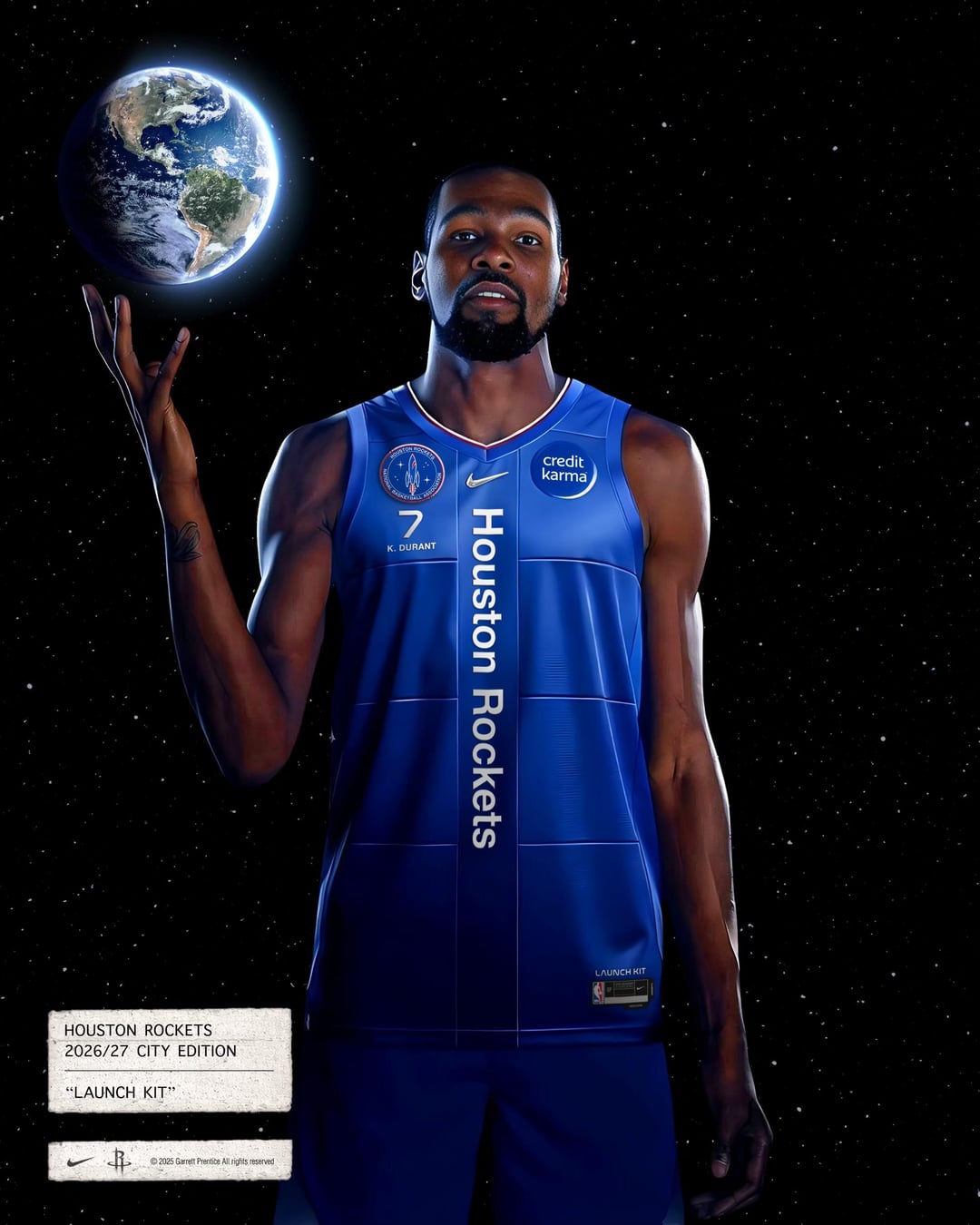
A City Edition concept built as a complete system, from uniform to arena.
Developed during my interview process with Nike, drawing from Space City and aerospace-inspired design.

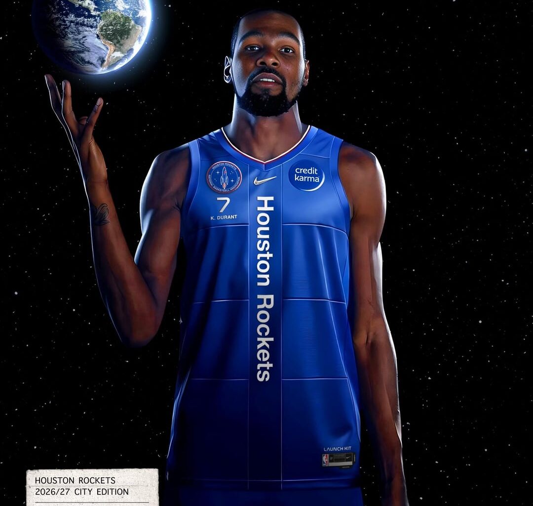
A City Edition concept built as a complete system, from uniform to arena.
Developed during my interview process with Nike, drawing from Space City and aerospace-inspired design.
46 comments
rockets soccer league jerseys??
No thank you
Yeah these are fucking slick don’t listen to the slack jawed yokels.
abysmal
space suit vibes. cool concept. i dig the logo. nice job
These are the most Houston space themed jerseys I can remember seeing, honestly pretty cool. Only thing i don’t like is that there’s like no red haha
I think it’s dope
that patch is cool

A white jacket, with red letters saying”RKTS” on the chest would be dope
Is this real?
Is this official? Or just a mockup?
Swipe right
The astros had a really cool similar space city themed uniform recently. you should check that out.
Those jackets and long sleeves are killer!
The space concept is dope, but imo non-navy blue just feels wrong
Doesn’t work for Rockets, maybe another team would suit this template
the shirts/jackets are dope but the jerseys need more work imo
Nice.
The jackets are neat, the jersey is uh not for me.
Ignore the haters, I think this looks sick and would buy this day one.
The current jerseys are stale and for good reason. Change is needed and I welcome something quite new.
No
Jerseys are horrible. Patch is well done.
I was just thinking after playing two red teams (portland and the bulls) that we need our mustard back. We need to embrace the yellow! I spent a couple of plays in the portland game wondering who the new guy was-I was rooting for the wrong team!
edit: I thought this was an actual team concept. While I prefer tradition, I do think it’s pretty cool and well done. I would try to work the ‘Houston Rockets’ text into a rocket, but be careful to make sure it doesn’t look like a dick.
Jackets and seaters are amazing 👌
Thank you! At the end of the day I wanted to make something innovative and thoughtful that doesn’t fall in like with the norm. I like it and that’s really all that matters.
Ignore the miserable haters here, yes I agree, needs to go from blue to red and jerseys could use more work, but so much is slick, i wish I could buy those towels right NOW.
Yeah man, these are sick. Nice job.
The court is cool but that jersey is so bad that I’d have to find a different team even though I’ve been with the Rockets since the Ralph Sampson era
I like the concept of making it look like an astronaut jump suit, particularly the players jacket came out really well.
I think the patch is dope AF
Hell no to the jersey. The patch is cool though.
The players jacket goes hard, but if we’re gonna do blue, I’d prefer it be Houston Blue. Too many teams rocking American RW&B as it is.
Let me guess, using ai for this sh*tt* design 😀
He gonna be traded by than
when did 50 cent make it on the team
Love the patch logo and the jackets but those jerseys are no bueno.
Very clean, looks better than the pajama era
Seeing us in full blue feels cursed for some reason…
The red player jacket looks cool. I would buy it if it said “Houston Rockets” instead of just “Rockets”. The patches on the left arm look nice.
I like their jerseys except for the placing of the name. Dope color scheme though and patch !!
The centered vertical text is bothersome, but this is heavily inspired, and I really appreciate it. Having that font running down the side would really make a difference for me.
To all the haters, I understand where you’re coming from but it’s just an idea. If you don’t like it, I would like to know why and possible solutions. Let’s be solution oriented on here, not just negative for no reason. This is supposed to be fun lol
No idea why you got roasted in top comments. I thought this was a real product announcement for a minute.
NASA x Houston Rockets feels like a collab made for each other, it’s a great theme. Only caveat may be that it steps on Air Jordan’s shoes ..? Heh
How did the interview go?
Great pitch deck. Fully understandable and simple
The jerseys look very European which is probably what throws most people off. Soccer jerseys in general are just kinda ugly and associated with ads.