
I shared these awhile back and got some valuable feedback. Made some changes, and short of updating a few teams to more current logos I am happy with how they came out! Hope you like them as much as we do, ready for spring training and the season!!

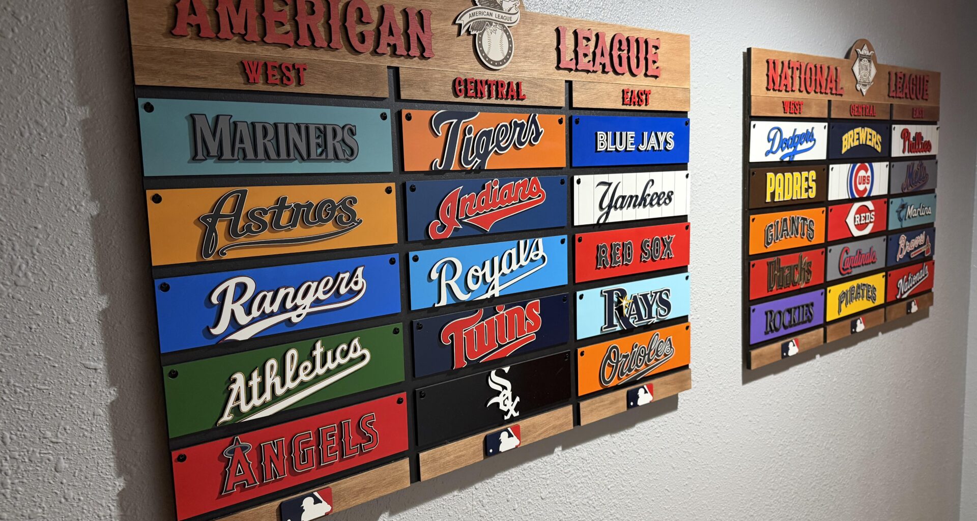
I shared these awhile back and got some valuable feedback. Made some changes, and short of updating a few teams to more current logos I am happy with how they came out! Hope you like them as much as we do, ready for spring training and the season!!
35 comments
A little behind on an update for Cleveland. Beautiful stuff, though
this is pretty cool actually! are the teams removable (asking because that would be a REALLY cool way to keep up with the standings lol)
Man this is cool
awesome 👏
Did you set them up in what you’re predicting to happen??
You should really mail this to me so I can do a closer inspection
[removed]
Nice work! Can’t wait to see the Royals make their comeback with those logos in tow!
At least you don’t ever need to move the pirates one
That’s dope
That’s really cool. Beats the Dairy Queen sundae helmets and cardboard with cutouts I had in the 80s.
So like are you taking commissions or…
Sweet I need one
Damn I wish I could do cool stuff like this
You selling these??? I want to buy!!!
Just make sure to remove and replace the White Sox and Rockies every once in a while or they’ll just end up fused into those spots.
What was the total cost to make this?
I did something similar for my dad for big ten football then the conference started adding teams and it got to the point I’d have to re-do it every few years. We leave it up as a reminder of simpler times.
I only say this because the first thing I thought is…that’s going to be a nice memory when the divisions are re-aligned to be NFL style.
1) do you do other sports
2) is there a way to denote postseason teams. Like maybe a bright color border to go around the division leaders and wild card teams. Maybe just wild card teams as the team on top of each division would be implied already
Very cool. Are those inlays or all paint?
Yo where can I buy this?
Hey I resemble that remark
This is dope as hell!
Seeing the Mariners at the top is still crazy to me
You should make a postseason bracket too
This would be awesome if it was automated to adjust to live updates. Or do it as the classic all scores board you get at the park in the outfield and it can show just standings when there’s no games playing
This is so sick. I’ve really been wanting something like this for my office
This is so sick. Though, to match the vibe of the rest of the Central, I’d swap the White Sox logo to their cursive “Chicago” text.
You’re gonna have fun with realignment.
You did an incredible job! This is awesome.
OP, there’s a very real opportunity to make some money here…
can probably just nail that rockies one in place since it’s not moving anytime soon
-source: me, a sad rockies fan
You can just leave the Angels in that spot all season
Do you take commissions for this?
Keep the Rays and Orioles logos! Those are beautiful