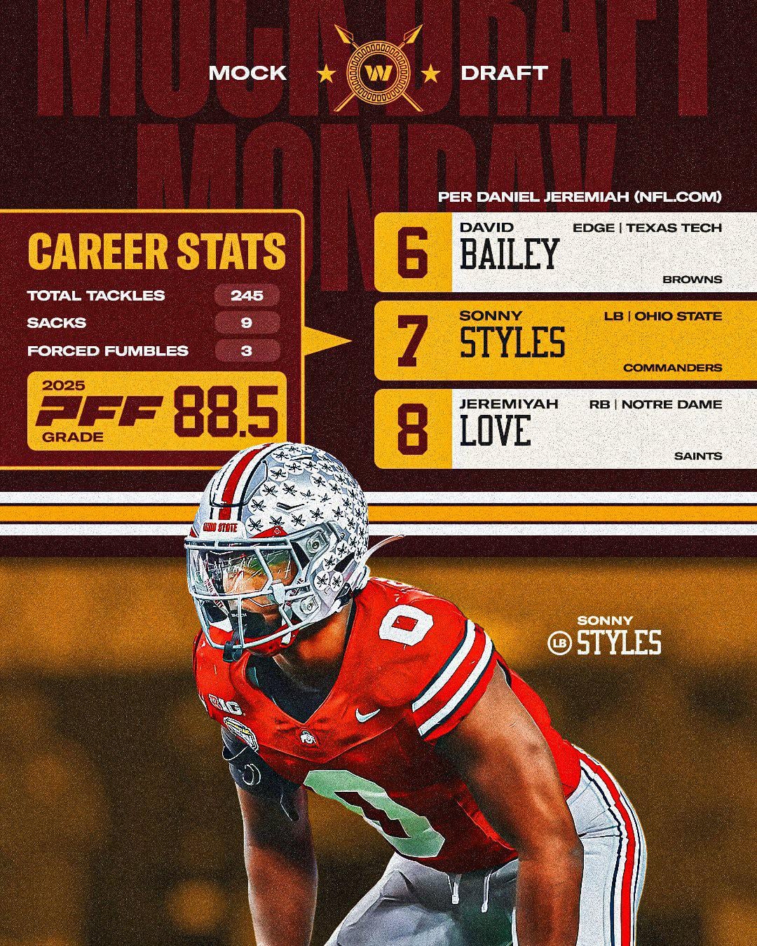
Whoever mocked a defensive player for the browns must be out their mind
I don’t hate it. The W is so disappointing man. Especially since we had it for the WFT years as a placeholder and then the best they could come up with is another W? Don’t get me wrong it’s grown on me over the years but with how long we waited for a rebrand to just be delivered a W 2.0 was just such a let down.
It’s cool it’s incorporated into something here. Was that so hard? I fw the spears. Reminds me of the dark maroon alts/still fits the commanders/warrior theme.
Lose the Cowboys stars and I’m in.
Sure is. And look at the font, it’s the “Super Bowl” era font. That logo is 100 times better with just the spears and stars alone with the circle. It’s SOME effort! Still not a fan of the W but this is better.
Washington Warriors you heard it here first
Where did this come from ???
Bring back the spear!
I hope not. Doing way too much. And I never want to see that w again.
Loving the Roman aesthetic they seem to be going for. This was hinted at last spring
Native American Commander’s
The whole rebrand has just fallen so flat.
Picked commanders because of the ties to Washington and the military, but then still use Native American imagery/weapons in the logo, but pretend it’s actually an homage to Greek/Roman commanders, and for good measure let’s make the mascot a pig.
I’d be way less annoyed about it if they just picked a direction and stuck to it. But this rebrand is all over the place.
I think those spears are dope af! Hear me out, what if they got rid of that “w”, make the circle more shield-like, and added 2 small daggers where I so artfully added yellow lines? Maybe it’s just me but I think that would look tough!
I still can’t believe we are the Commanders, the Dan Snyder picked name that no one wanted. I could care less about a logo
As a designer, it looks like a designer was just dressing up the graphic to make it look cooler.
Still uses that stupid W. Getting closer but not quite there.
Wow. Like it!
That w still weak as hell. Give me that nat’s cursive W like our old R hats and then we’re talking.
I don’t hate it but I’m not sure if I like it. I know everyone is trying to tie old and new together but it’s a real reach. Wolves or Red Wolves would’ve been so much better.
I love the spears but I need us to change the name to Spartans with the new stadium
We should just rename to the Spartans to match the spears.
Paving the way for spear helmets?
Sorry but I still hate the bae and the logo. Fuck Dan Snyder and the stain he left
Upvote to the logo downvote to the pick… its DOWNS stop over thinking this thing.
It went along with the theme this season. It was used a lot at the games. Who knows if they’ll keep it next season
If so, I love it.
Normally I don’t care much about the logo or name and just like watching the game but this logo’s hard and would look great on the helmets.

36 comments
It’s a lot cooler than that dumbass ugly W logo
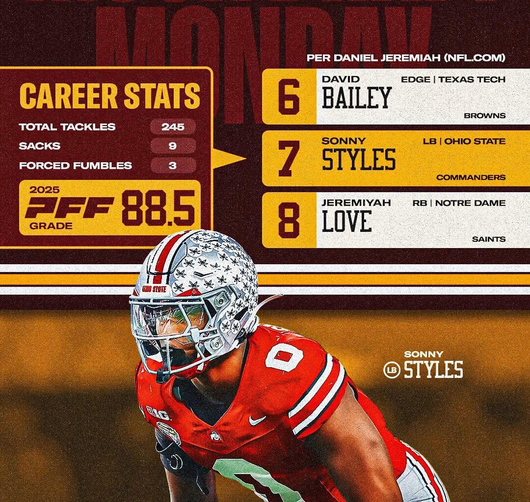
Whoever mocked a defensive player for the browns must be out their mind
I don’t hate it. The W is so disappointing man. Especially since we had it for the WFT years as a placeholder and then the best they could come up with is another W? Don’t get me wrong it’s grown on me over the years but with how long we waited for a rebrand to just be delivered a W 2.0 was just such a let down.
It’s cool it’s incorporated into something here. Was that so hard? I fw the spears. Reminds me of the dark maroon alts/still fits the commanders/warrior theme.
Lose the Cowboys stars and I’m in.
Sure is. And look at the font, it’s the “Super Bowl” era font. That logo is 100 times better with just the spears and stars alone with the circle. It’s SOME effort! Still not a fan of the W but this is better.
Washington Warriors you heard it here first
Where did this come from ???
Bring back the spear!
I hope not. Doing way too much. And I never want to see that w again.
Man I want the arrowhead back.
Where is this from? Official nfl website?
From the official Commander’s app!
https://preview.redd.it/mpzwhxy5r5hg1.jpeg?width=1320&format=pjpg&auto=webp&s=1736fbb4f788393e42e63ace90dea3e0981e829b
Bring back the spear helmet

Nature is healing
Warrriorrrsssss come out and playyyyyy
Loving the Roman aesthetic they seem to be going for. This was hinted at last spring
Native American Commander’s
The whole rebrand has just fallen so flat.
Picked commanders because of the ties to Washington and the military, but then still use Native American imagery/weapons in the logo, but pretend it’s actually an homage to Greek/Roman commanders, and for good measure let’s make the mascot a pig.
I’d be way less annoyed about it if they just picked a direction and stuck to it. But this rebrand is all over the place.
https://preview.redd.it/z4g1yoj0x5hg1.jpeg?width=1000&format=pjpg&auto=webp&s=421429ae62aa5efe2166c05b62aba02daf97e678
Capitol Rotunda
🤷♂️
https://preview.redd.it/i6f0olwfw5hg1.jpeg?width=657&format=pjpg&auto=webp&s=effe2ec2ced5005f0e11e5a39c5fd23e7901bc13
I think those spears are dope af! Hear me out, what if they got rid of that “w”, make the circle more shield-like, and added 2 small daggers where I so artfully added yellow lines? Maybe it’s just me but I think that would look tough!
I still can’t believe we are the Commanders, the Dan Snyder picked name that no one wanted. I could care less about a logo
As a designer, it looks like a designer was just dressing up the graphic to make it look cooler.
Still uses that stupid W. Getting closer but not quite there.
Wow. Like it!
That w still weak as hell. Give me that nat’s cursive W like our old R hats and then we’re talking.
I don’t hate it but I’m not sure if I like it. I know everyone is trying to tie old and new together but it’s a real reach. Wolves or Red Wolves would’ve been so much better.
I love the spears but I need us to change the name to Spartans with the new stadium
We should just rename to the Spartans to match the spears.
Paving the way for spear helmets?
Sorry but I still hate the bae and the logo. Fuck Dan Snyder and the stain he left
Upvote to the logo downvote to the pick… its DOWNS stop over thinking this thing.
It went along with the theme this season. It was used a lot at the games. Who knows if they’ll keep it next season
If so, I love it.
Normally I don’t care much about the logo or name and just like watching the game but this logo’s hard and would look great on the helmets.
Looks good. The W is still terrible though.