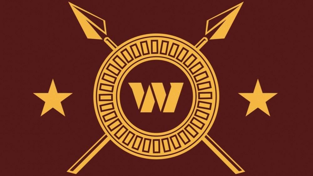
What do you guys think of the new logo that was teased for the rebrand?
February 5, 2026
What do you guys think of the new logo that was teased for the rebrand?
36 comments
WE HATE THE CORNY W. GET RID OF IT
Down with the taco holder. Just give us a spear.
The regular W (WFT) was unironically peak.
We are rebranding again??
Don’t get me wrong, I love the spear motif from when we were the Redskins, but It makes no sense now we’re Commanders.
Not enough
I like it
USC Trojans vibe. Weak sauce
Naaah
If the fans don’t like it, they’ll do it. Sure as shit.
Nope
Great for the shoulder of the jersey tbh.
I’m fine with it
It’s so busy. The two stars on the sides are unnecessary and don’t make sense. The DC flag has three stars.
I like that they’re trying something though, the W is just not working.
It’s not bad, but there is a lot of time between now and the first game to the season for them to make changes to it.
Replace the W with DC
The 🌮 holder is still trash. Slapping it on this is just trying to put lipstick on a pig (or hog, which would be a much better option).
The rebrand was an epic fail. If they are actually willing to making changes, trying to salvage any part of Tonya’s mess is a waste of time and effort. Just start fresh.
It’s an improvement but that was a very low bar
👎 Need to get away from that W altogether.
Strong Greek restaurant vibe.
Ehhhhh.
I miss our spear helmets. I have not enjoyed our marketing team for a while sadly.
I like the spears. I don’t like the stars. If they want stars, they should mimic the DC Flag.
People will probably disagree with me on this, I get the significance of it, but I feel like this would look sick without the spears and stars, it’s just too busy as is
No more W, and if you are going to add stars, make it reflect super bowls
I guess it’s supposed to be a Roman shield or something? I don’t like it much. Looks like they asked AI.
Why would they “tease” the new logo on a random social media post covering a random mock draft? It would be really weird for them to slip a new logo into a throw away post/article about a player that likely won’t even play for them and then not elaborate at all.
I’ll lean towards this being just a stylized version of the regular logo some graphic design intern cooked up for the website until we hear literally anything from literally anyone affiliated with the team.
Fuck the W trash logo
Pretty busy. Not terribly creative. Assuming it’s not going on the helmet. A W or DC (as someone else mentioned) in the old R font would be an upgrade.
Better than just the W logo. That’s about it.
Eww.
No Greek or Roman crap, please. Read the room, Josh. C’mon.
It looks more like something out of the movie 300.
Lose the W add another star in the middle
It’s shit..
God almighty.
Just scrap the W and replace it with a star. It would fit with the DC flag, also figure out how to put two bold lines underneath in gold to track with the DC flag.
IMO that would look super cool, and we can finally be done with the terrible looking W.
I’m biased, but I’d like it to have a DC flair paired with the history of the team.