New Alternate Jersey? From MLB The Show 26 Gameplay Video
February 5, 2026
New Alternate Jersey? From MLB The Show 26 Gameplay Video
13 comments
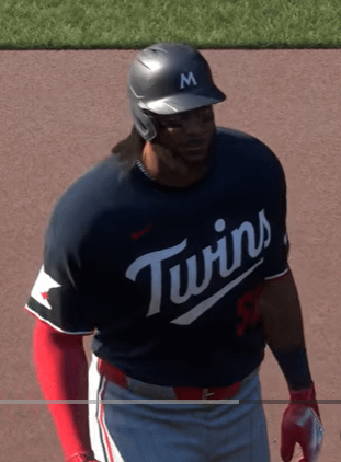
They needed a home blue alternate with the “Twins” script anyway.
Spring training right?
This better than the current one but hopefully looks actually blue.
Our jerseys are so wildly plain and boring other than the Twin Cities cream
They need to go back to the drawing board on this “branding”. The cursive makes the word “Twins” look like “turns” if you forget the dot in the i’s there. No trim doesn’t look clean it looks tacky and cheap (which tbf fits) and the lack of trim makes it so the red numbers don’t pop. It’s entirely possible to watch a night game with a runner on 2nd and not have any clue who the runner is bc the dark red is muted by dark navy.. as opposed to the mauer era jerseys which all popped.
We hardly wore the navy alternate at home as it was.
Doesn’t one of the minor league teams wear a red Twins jersey with white script? I always liked the red alts and they were pretty popular with players. Why not those instead?
Hideous
GThese have been available at Scheels EP for a while now
The one big glaring thing about the current uniform sets was the road “M” logos. I was hoping they would grow on me overtime but they have not.
Not bad, better than the boring MINNESOTA font. But why is the new M still a thing. It’s awful.
Nasty
Just bring back the 90s. It’s what we want
I like the jersey a lot. Still don’t like the pants. The red white and blue stripes are lame as hell, a double stripe, red and blue together, would look exponentially better.
Looks like it could be a new road jersey. See the M with the star above it. We only wear those hats on the road.

13 comments
They needed a home blue alternate with the “Twins” script anyway.
Spring training right?
This better than the current one but hopefully looks actually blue.
Our jerseys are so wildly plain and boring other than the Twin Cities cream
They need to go back to the drawing board on this “branding”. The cursive makes the word “Twins” look like “turns” if you forget the dot in the i’s there. No trim doesn’t look clean it looks tacky and cheap (which tbf fits) and the lack of trim makes it so the red numbers don’t pop. It’s entirely possible to watch a night game with a runner on 2nd and not have any clue who the runner is bc the dark red is muted by dark navy.. as opposed to the mauer era jerseys which all popped.
We hardly wore the navy alternate at home as it was.
Doesn’t one of the minor league teams wear a red Twins jersey with white script? I always liked the red alts and they were pretty popular with players. Why not those instead?
Hideous
GThese have been available at Scheels EP for a while now
The one big glaring thing about the current uniform sets was the road “M” logos. I was hoping they would grow on me overtime but they have not.
Not bad, better than the boring MINNESOTA font. But why is the new M still a thing. It’s awful.
Nasty
Just bring back the 90s. It’s what we want
I like the jersey a lot. Still don’t like the pants. The red white and blue stripes are lame as hell, a double stripe, red and blue together, would look exponentially better.
Looks like it could be a new road jersey. See the M with the star above it. We only wear those hats on the road.