Looking like two new alternates this year. Very cool and so much better than the City Connects!
32 comments
We really need to be moving into the 1968 style edition
Eh. Kinda Orioles-ish.
Guess that MLB The Show was onto something with the orange jerseys.
Detroit orioles
No thank you. It looks like Baltimore.
Those are both pretty sharp, IMO.
Old enough to remember when everyone was upset City Connect wasn’t orange. No orange is bad?
When do we expect to see these actually worn?
These are dope and much better than the city connect jerseys.
I would like them better swapped: script ‘Detroit’ in blue on the orange jerseys and orange olde english D on the blue
The black ones are atrocious. The orange are decent. I’ve wanted an orange alternate for a long time but idk if this is what I fully envisioned
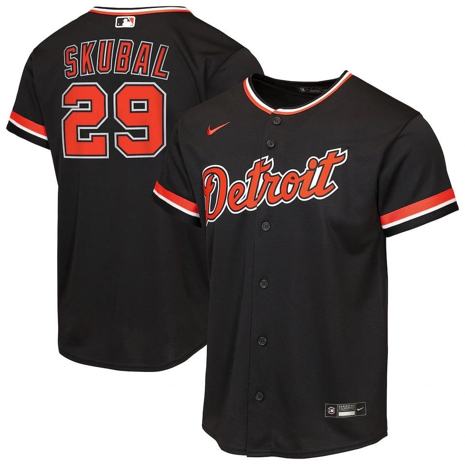
Why would the jersey be black and not navy?
Genuinely thought this was an Os uni at first
Oooh I think these actually look really nice!
blacks are the road alternates and orange is the home alternate?
Good the city connects were fucking disgusting
Blue one is amazing. Orange jersey would look a lot better with a different number font imo. Will be curious which ones they wear home and away or if it will be both
I’ve wanted a navy alt for a long time, but that one is disappointing. Put orange piping like the home uniform to look like the Milwaukee alt, and now we’re talking…
The orange I don’t hate.
We saw that the orange will be paired with a blue cap with an orange brim. I wonder if it’ll be the same for the blue.
Man, I really like the orange ones, been waiting for more orange to get involved
I like them!
I’d like a hat with the orange D & white outline, like some of the old school caps.
A lot better than those shitty City Connects. Those looked like beer league softball uniforms.
Orioles did it
JV also has worn orange jerseys for the Astros, Mets, and Giants.
First one looks like a Giants uniform.
The road one is sick, orange is a little too close to Orioles
The black ones would’ve looked cool if they were blue
Is that black or navy blue? I dig the script one if it’s blue.
I’m really not a fan of when teams have a black jersey when black is not one of their colors as a matter of principle.
Sometimes there are exceptions, but this is not one of them.
Getting one of these in a verlander for sure 😎
If you see a mf in a bright orange Don Kelly jersey at Comerica this year come say hi
This may be a controversial take, but I don’t think teams should drag out announcing jerseys until after The Show AND Fanatics leak them.

32 comments
We really need to be moving into the 1968 style edition
Eh. Kinda Orioles-ish.
Guess that MLB The Show was onto something with the orange jerseys.
Detroit orioles
No thank you. It looks like Baltimore.
Those are both pretty sharp, IMO.
Old enough to remember when everyone was upset City Connect wasn’t orange. No orange is bad?
When do we expect to see these actually worn?
These are dope and much better than the city connect jerseys.
I would like them better swapped: script ‘Detroit’ in blue on the orange jerseys and orange olde english D on the blue
The black ones are atrocious. The orange are decent. I’ve wanted an orange alternate for a long time but idk if this is what I fully envisioned
Why would the jersey be black and not navy?
Genuinely thought this was an Os uni at first
Oooh I think these actually look really nice!
blacks are the road alternates and orange is the home alternate?
Good the city connects were fucking disgusting
Blue one is amazing. Orange jersey would look a lot better with a different number font imo. Will be curious which ones they wear home and away or if it will be both
I’ve wanted a navy alt for a long time, but that one is disappointing. Put orange piping like the home uniform to look like the Milwaukee alt, and now we’re talking…
The orange I don’t hate.
We saw that the orange will be paired with a blue cap with an orange brim. I wonder if it’ll be the same for the blue.
Man, I really like the orange ones, been waiting for more orange to get involved
I like them!
I’d like a hat with the orange D & white outline, like some of the old school caps.
A lot better than those shitty City Connects. Those looked like beer league softball uniforms.
Orioles did it
JV also has worn orange jerseys for the Astros, Mets, and Giants.
First one looks like a Giants uniform.
The road one is sick, orange is a little too close to Orioles
The black ones would’ve looked cool if they were blue
Is that black or navy blue? I dig the script one if it’s blue.
I’m really not a fan of when teams have a black jersey when black is not one of their colors as a matter of principle.
Sometimes there are exceptions, but this is not one of them.
Getting one of these in a verlander for sure 😎
If you see a mf in a bright orange Don Kelly jersey at Comerica this year come say hi
This may be a controversial take, but I don’t think teams should drag out announcing jerseys until after The Show AND Fanatics leak them.