I feel like I’m taking crazy pills with the discourse around the new logo/uniforms. They’re horrible. I don’t want to be the Oilers. I want to be the Titans. *This* is going back to our roots. Not this shield shit

I feel like I’m taking crazy pills with the discourse around the new logo/uniforms. They’re horrible. I don’t want to be the Oilers. I want to be the Titans. *This* is going back to our roots. Not this shield shit
32 comments
New logo is good.
These were also good.
The current iteration of the uniforms has never been good.
I don’t hate the newest uniform, but this will always be my favorite.
New logo is great.
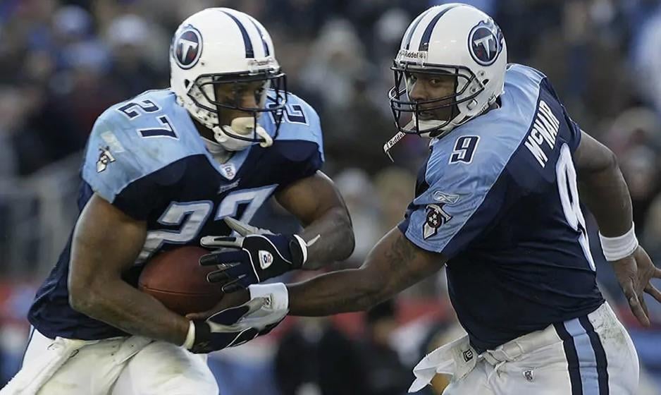
McNair and George are my GOATS.
Proud of our Oiler heritage.
Proud of my Titans fandom.
I’m all about the new gear
They were okay. Oilers look is superior though.
They’re good.
They’re not Oilers good.
My favorite uniforms of all time. Idc if they were “dated”, I think they are timeless
Desperately need throwbacks of these this season.
Am I allowed to like them all?
https://preview.redd.it/h2qoufegirjg1.jpeg?width=470&format=pjpg&auto=webp&s=5740184024e0d11054a1407f4122c0a268262038
Best combo of the old unis.
Unpopular take but I was never a huge fan of these. They are iconic of course but that’s because it was the most successful era in team history.
I agree these are wayyy better than the current set. If they went back to this I wouldn’t be disappointed. Warren Moon said they were going futuristic, so I’m afraid the new set is going to look ridiculous.
Like other teams, this uniform really excelled in the Reebok shiny material, but looked shitty when it switched to Nikes more matte materials
I liked the light blue alt better with white pants.
I always thought they should have done away with the colored bottoms and stick to white for home and away. I think if your helmet is white, your numbers and pants should be too.
Navy used as an alternate.
8 years old made me a fan for life!
uhhhhh but we literally are the oilers.. we own the history
These were great! I love them. I also think they belong in the era that they were in, and it’s time we move on to a cleaner modern look.
These needed a refresh but the current ones never rustled my jimmies. Excited to see the full new look. Fear they’re going too minimalist off the leaked logo. Withholding judgment though
one thing is sure, our currents are the worst in the NFL.
You could maybe say the new Falcons look but we take the cake
Never loved the logo but white helmet and two tone blue is far superior to their current look. If they want to go back to the Oilers uniform so bad then just do it. Go all the way with it. Oil derrick on the side of the helmet and all.
This was always it. Respectfully from Rhode Island – F the pats
I’ve always kind of been against the navy. Not a color I love so really hoping for the oiler color scheme to come back
I just miss teams having identifying fonts for numbers. Everything is 80s block numbers now and teams have lost identity because of it. Jags, Falcons, Cardinals, Lions…. anyone who has updated lately has the same font and we’ll be next with the swit h to the Oilers uni
Okay but hear me out
https://preview.redd.it/bpc1vxsm1sjg1.jpeg?width=900&format=pjpg&auto=webp&s=97f889833db61b8b0efe89cde2af635a00d673fa
*They’re horrible.*
-Has no idea what new uniforms actually look like
*I don’t want to be the Oilers. I want to be the Titans.*
-Still going to be the Titans
*This is going back to our roots. Not this shield shit*
-Posts picture of uniforms mostly consisting of oilers colors. Shield shit is literally on these helmets
I too feel like I’m taking crazy pills with the discourse around the new logo/uniforms.
They dont look good to me
FINALLY
a man of culture
My personal opinion…
The flames sucked. Discount Hot Wheels looking shit. That’s never been a good logo. I think they could’ve kept the sword with a minimal look, but the flame looks 1990s commercial. Also two tone blue just doesn’t look good either especially across the shoulders in a blocky way. It all needs to be sleeker. I think the new look blends all that sleekness together well.
I truly can’t understand or relate with anyone who thinks our Titans have ever had a uniform remotely as good as the Oilers/the new blend mocks.
I was a TN kid signing my elementary papers with my number surrounded by the flaming thumbtack, it’s still not a great logo and we’ve never had top tier uniforms.
I’d be open to mocks with the new centered design with centered flames, but come on folks.
Agree. Both in terms of the uniforms and the players.
They look so outdated now.
Your current uniforms are better by a wide margin than these. It’s the helmet. The navy helmet is horrible. The logo was fine but the flames were dumb. The primary should be the sword and the colors would look good in a more Oilers way.