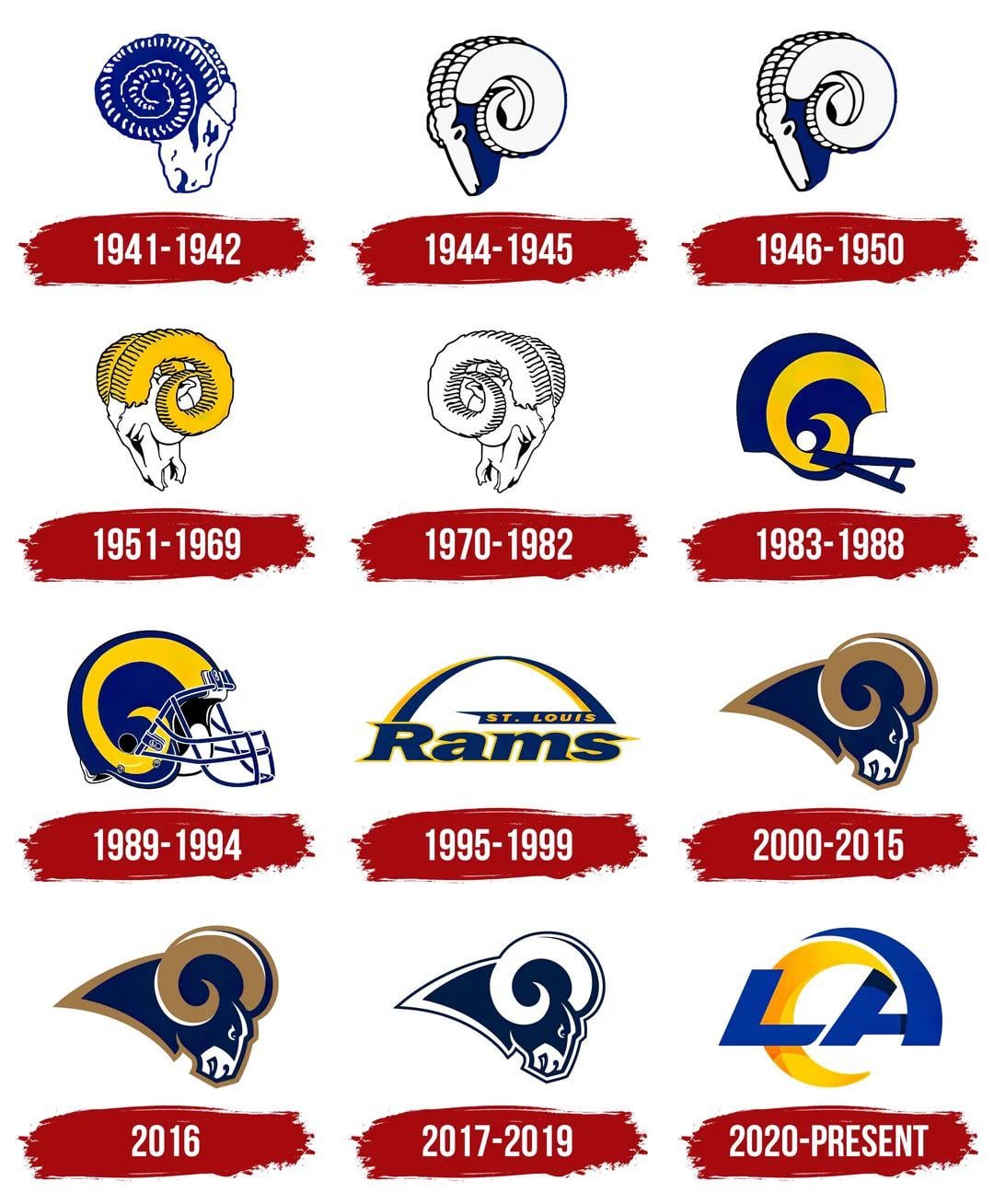
Since we are likely replacing are secondary logo for the 1951 logo, we could maybe go back to another logo for are primary.

Since we are likely replacing are secondary logo for the 1951 logo, we could maybe go back to another logo for are primary.
48 comments
51-69 or close to it would be my vote
What’s different about the 2016 one bs the 2000-2015 or the 44-45 one and the 46-50?
2017. Same vibes as 1951, but a bit more modern.
(Obviously not the Arch one.)
I’m a sucker for the STL era rams head 🤷🏻♂️
Seeing the 95-99 logo just rips my scab right off.
🙃💔
That shit hurt so bad.
But we’re back!! 🔥💪🏻🐏
I know a lot of folks love the 70’s Head logo, but I really feel like we can lean on this for inspiration but would be a mistake to copy it without an evolution.
70 to 82, but blue head, white horns, maybe a thin yellow strip.
Add 2020 to the 1995 scrap heap ASAP
The best NFL logo is the St Louis Ram head.
Slight refresh on the new era Rams head and the 89-94 blue and gold. Old rams head style could be secondary logo.
Let’s go back to the ‘95-‘99 logo
I don’t want anything related to St. Louis nor Georgia Frontiere. My only ask!
What’s the difference between the 2000 and the 2016 logos
Nothing that updates, has inspiration from, or refers to the trash that is the present logo.
Call me crazy but I really love the current one
Random question but for the St Louis Superbowl banner at SoFi, why do they use the helmet logo from 89-94?
89-94
51-82 is the best.
’83 to ’94 is the logo I saw before they moved to St Luis so I would vote for that
Huge fan of the realistic looking 51-82 logos, but can’t get over the fact it looks like a tooth, hopefully we can make a faithful modern adaption of it.
I like the current logo. Downvote me, I deserve it☹️
I like the current one the best
95-99
Actually those 1944 and 1946 ones look surprisingly modern. Though I am a big fan of the 1951 look.
I like the 2016 logo. It’s shaped like SoFi stadium
89-94 helmet logo is undefeated in my personal opinion
I just hope they get everything right this time with the uniforms and logos .
The current one is the best one. I love the LA wave.
I wouldn’t mind using the old helmet logo from 89-94 or the ram head from St. Louis again.
My best guess is that they’re going do what the Eagles did and have one primary and a retro logo. Hoping for a 1951-82 mix.
1983 was pretty cool
We either need to keep the current one or modernize one of the LA logos. I don’t want anything to do with St. Louis to ever touch this team. No disgusting navy and gold.
I like the helmet logo the most. I think “the vintage inspired logo” probably refers to using some details/ components of the old Rams head from the 70s’ without completely copying it.
Like the majority of fans, I hate our current logo and Ram head logo. They completely dropped the ball. I won’t buy gear with the current logos and I fully welcome a vintage inspired rebrand.
You’re missing the 84-88 LA inside the RAMS wordmark text – that one is classic.
I like the current logo.
89-94 is the best. Then 83-88.
The current ram head should be the primary and a new LA logo should be secondary
New one. Modern sleek design but as a Ram an not just letters or a helmet
https://preview.redd.it/udt666kguwjg1.jpeg?width=504&format=pjpg&auto=webp&s=e78d91c4f6520db094ad62cf912cb36c53b39b42
Do it
2016 logo with our modern colors would sit well with me
1995 logo St. Louis Rams of Los Angeles
Love the 51-69 ram skull and 89 helmet. I wish we’d incorporate the helmet logo more cause I love how simple it is
They should go back to the Greatest Show On Turf for just one game
[removed]
I always loved the ’89-’84.
Keep the ram head we have 😔, get rid of the LA logo
2000-2015 tbh
By far the best imo