Consider me a size queen becuase I wanted them twice as big
Those are kinda ugly lookin
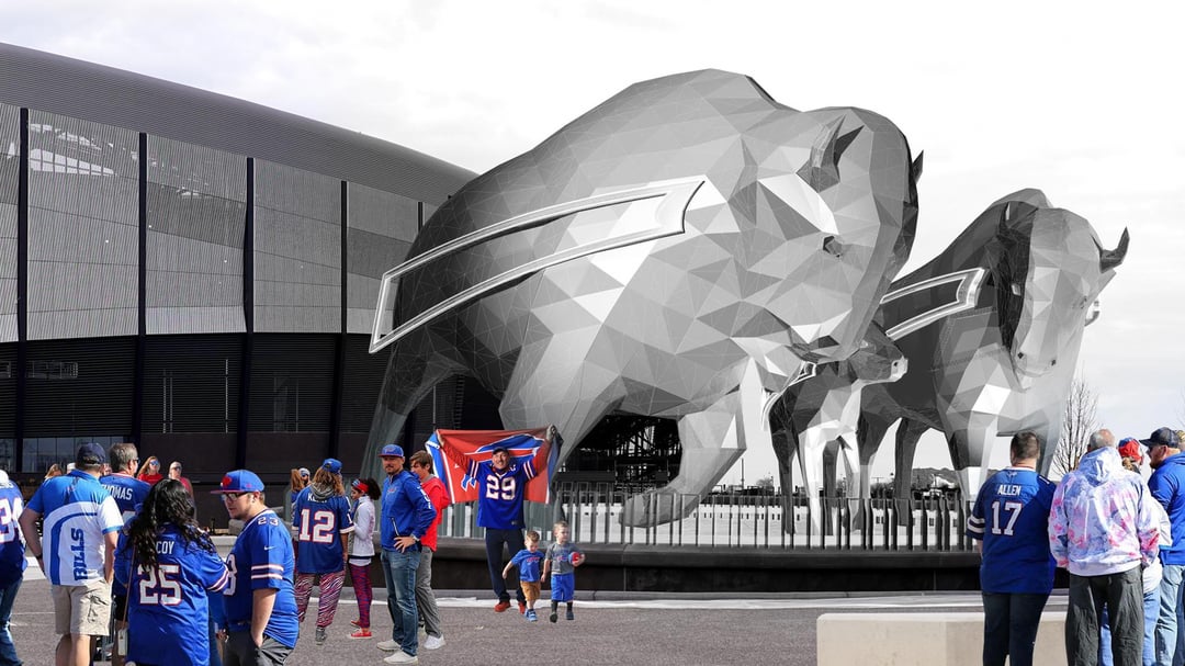
I hate the stripe and how stylized they are, also they needed to be bigger. I just wanted massive bison. I’m a bit disappointed.

I liked the plain Bisons more
Why not just make them look like buffalo? Dont even need the stripe.
Kinda hate em. Need something more realistic and iconic like Blucifer in Denver, not this polygon pixelated mess.
I want them as big as the chicago bean
The adult ones seem large enough that climbing would require a ladder. However the baby bison seems scalable.
Surprisingly, I don’t hate these. Even though i have been on team Bigger Buffalo.
My big concern is light reflection. I was hoping when the national pre-game broadcast come to town, they could use this as a backdrop. But they might be limited by solar reflection.
Yuck. Flat out terrible.
I thought low poly died awhile ago? I mean they’re not terrible, but they’re not great either
Looks like it was the first step in designing the Buffalo and then somebody said ‘looks good’ in passing and the person just cashed a check for a few months.
Steam is cool – but why do them in a low polygon design aesthetic? Seems to take away from their majesty and size

Just as poorly designed as everything else about this new stadium. Disappointing, but not surprising
Thanks! I hate it.
YIKES
I’m sorry but these look ridiculous and in my opinion will look extremely dated in a few years
It seems small but if it’s anything close to the falcon outside of AMG people will absolutely love it
I think it’s kinda funny that they essentially told us what they would look like with the Blizzard Uniforms from last year. The logo had the same “textured” look.
Overall this stadium is pretty underwhelming. I dropped $30k on PSLs so I’m still pumped to go to games, but there are a lot of questionable choices:
* The roof doesn’t even cover all the seats. European stadiums do this better, and even Miami’s canopy gives fans more coverage.
* About 10,000 fewer seats than the Ralph.
* The exterior design is honestly pretty ugly.
* The “futuristic bison” concept feels forced.
It feels like the planners overthought everything and missed on some basics. That artsy Frank Carvotta guy seemed way too involved in the overall direction.
Awful. The charging stripe barely makes sense on our logo, but it’s classic and iconic. Putting the stripe floating on the body looks absolutely ridiculous.
1. they really walked back a ton of stuff from the initial renders that got the community (the community that’s paying for this) so excited
2. these are not as big as initially proposed
3. this look, the low-poly art design movement is genuinely ALREADY quite dated. leave it to buffalo to go with something that will look and feel very 2010 in 2030.
What’s wrong with just regular looking bison?
Fill them with the ashes of dead Bills fans
I prefer the more realistic look from before, but just wanted them bigger.
Are they still loading?
PS1-ass buffaloes
I thought they were going to be more realistic, less modern angular.
Gtfo with the stripes, surprised branding approved this. Particularly on the little one… is it too late to not do this?
Man yall will really complain about anything huh
Someone is jumping off of them through a table 100%.

I don’t know if whoever designed or approved this has ever seen the Bills logo, but the “charge” stripe should be coming from the horn.
Jesus what is wrong with you negative fuckheads these are AWESOME
Yikes. Is it really that hard to throw together a few designs and let people vote on them or something? These look lame.
I see I’m in the minority here, but I love em. Plenty big, much bigger than when the initial announcement came that drew the boos. They listened on size at least.
Looks like an N64 version of a bison
The basic Buffalo rendering was much better than this design, the stripe just doesn’t look good. We jisy want a big basic Buffalo.
Damn this is a swing a miss. They should be more natural and realistic. Not stylized with the stripe. What a disappointment.
Looks sick
It always blows my mind that companies will spend tens (hundreds?) of thousands of dollars simply for a CONCEPT of a design, which ends up TERRIBLE, when the simple, most popular answer was free and right in front of their face. We all saw the original design of the huge, plain bison and thought it was awesome. Why did they feel the need to muck it up with this modernist, pixelated garbage? Did they solicit ANY fan feedback on this? It’s just simply mind boggling.
Someone call a medic- that girl posing with her boyfriend has been in a horrible accident!
Do these have a tie-in to the Rivalry jerseys? They’re just like the sleeve logo right?
I think these will age poorly.
I like em. Everyone’s so negative
These are very bad I need someone to love them and convert me

50 comments
Not big enough.
Cool. It’d be cooler with just compressed air.
Consider me a size queen becuase I wanted them twice as big
Those are kinda ugly lookin
I hate the stripe and how stylized they are, also they needed to be bigger. I just wanted massive bison. I’m a bit disappointed.

I liked the plain Bisons more
Why not just make them look like buffalo? Dont even need the stripe.
Kinda hate em. Need something more realistic and iconic like Blucifer in Denver, not this polygon pixelated mess.
I want them as big as the chicago bean
The adult ones seem large enough that climbing would require a ladder. However the baby bison seems scalable.
Surprisingly, I don’t hate these. Even though i have been on team Bigger Buffalo.
My big concern is light reflection. I was hoping when the national pre-game broadcast come to town, they could use this as a backdrop. But they might be limited by solar reflection.
Yuck. Flat out terrible.
I thought low poly died awhile ago? I mean they’re not terrible, but they’re not great either
Looks like it was the first step in designing the Buffalo and then somebody said ‘looks good’ in passing and the person just cashed a check for a few months.
Steam is cool – but why do them in a low polygon design aesthetic? Seems to take away from their majesty and size

Just as poorly designed as everything else about this new stadium. Disappointing, but not surprising
Thanks! I hate it.
YIKES
I’m sorry but these look ridiculous and in my opinion will look extremely dated in a few years
Looks like some shit you’d see in a ps1 game
https://preview.redd.it/2z99w85ko1rg1.jpeg?width=5712&format=pjpg&auto=webp&s=a22bcf49e5485a5f3f817c81ccde9b78ba95b301
It seems small but if it’s anything close to the falcon outside of AMG people will absolutely love it
I think it’s kinda funny that they essentially told us what they would look like with the Blizzard Uniforms from last year. The logo had the same “textured” look.
Overall this stadium is pretty underwhelming. I dropped $30k on PSLs so I’m still pumped to go to games, but there are a lot of questionable choices:
* The roof doesn’t even cover all the seats. European stadiums do this better, and even Miami’s canopy gives fans more coverage.
* About 10,000 fewer seats than the Ralph.
* The exterior design is honestly pretty ugly.
* The “futuristic bison” concept feels forced.
It feels like the planners overthought everything and missed on some basics. That artsy Frank Carvotta guy seemed way too involved in the overall direction.
Awful. The charging stripe barely makes sense on our logo, but it’s classic and iconic. Putting the stripe floating on the body looks absolutely ridiculous.
1. they really walked back a ton of stuff from the initial renders that got the community (the community that’s paying for this) so excited
2. these are not as big as initially proposed
3. this look, the low-poly art design movement is genuinely ALREADY quite dated. leave it to buffalo to go with something that will look and feel very 2010 in 2030.
What’s wrong with just regular looking bison?
Fill them with the ashes of dead Bills fans
I prefer the more realistic look from before, but just wanted them bigger.
Are they still loading?
PS1-ass buffaloes
I thought they were going to be more realistic, less modern angular.
Gtfo with the stripes, surprised branding approved this. Particularly on the little one… is it too late to not do this?
Man yall will really complain about anything huh
Someone is jumping off of them through a table 100%.

I don’t know if whoever designed or approved this has ever seen the Bills logo, but the “charge” stripe should be coming from the horn.
Jesus what is wrong with you negative fuckheads these are AWESOME
Yikes. Is it really that hard to throw together a few designs and let people vote on them or something? These look lame.
I see I’m in the minority here, but I love em. Plenty big, much bigger than when the initial announcement came that drew the boos. They listened on size at least.
Looks like an N64 version of a bison
The basic Buffalo rendering was much better than this design, the stripe just doesn’t look good. We jisy want a big basic Buffalo.
Damn this is a swing a miss. They should be more natural and realistic. Not stylized with the stripe. What a disappointment.
Looks sick
It always blows my mind that companies will spend tens (hundreds?) of thousands of dollars simply for a CONCEPT of a design, which ends up TERRIBLE, when the simple, most popular answer was free and right in front of their face. We all saw the original design of the huge, plain bison and thought it was awesome. Why did they feel the need to muck it up with this modernist, pixelated garbage? Did they solicit ANY fan feedback on this? It’s just simply mind boggling.
Someone call a medic- that girl posing with her boyfriend has been in a horrible accident!
Do these have a tie-in to the Rivalry jerseys? They’re just like the sleeve logo right?
I think these will age poorly.
I like em. Everyone’s so negative
These are very bad I need someone to love them and convert me