The MINN is terrible, no question, but let’s not pretend like the new “Shep” is ok. The Wolves have tons of awesome old logos and unis to mine for a rebrand. This “leaked” stuff is a sloppy mud pie.
The primary would look better if the eye was a different shape.
Hopefully not the MINN logo
I hate MINN in general. Just do MN
AP Style for Minnesota in press datelines is “Minn.”

Stop changing the logos please.
Why are we cursed with so many mid redesigns?
This is garbage
I hope not
“Minn” is proof our new owners actively hate us
just go back to the kg era and stop fucking around. its not hard!
Minnteattle Timberhawks
If this is real, I’m never buying official Wolves merch.
This is absolutely heinous
They’re both trash
So can get someone actually from Minnesota to design this shit?
This screams bland corporate bullshit
Hope this is fake. That is awful
It looks like a mole rat.
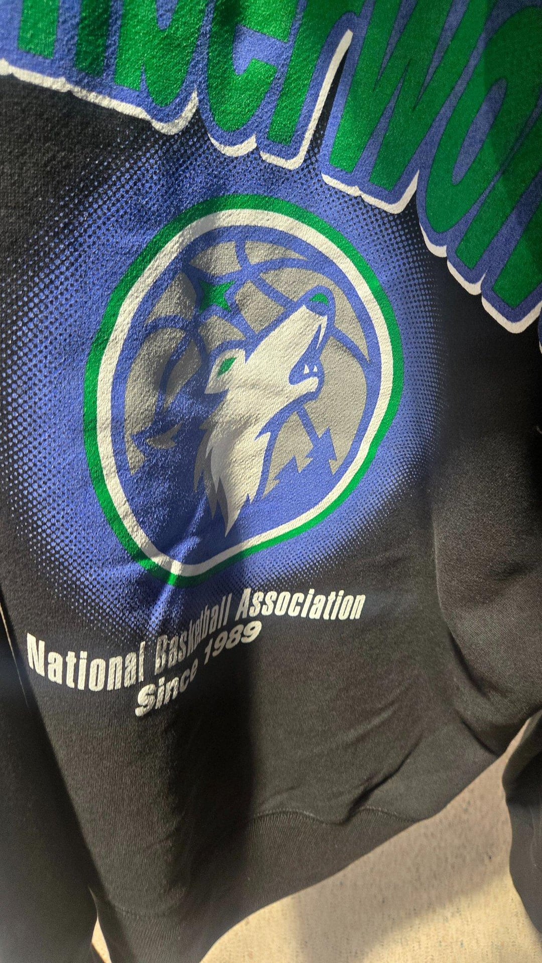
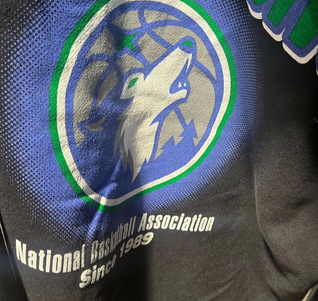
I’m surprised at some of the reactions to these. I mean, I don’t expect the “MINN” logo to very prominent in the branding other than some merch like what you see in the photo. Lots of teams have some weird alternate logos that hardly see any use. As for what seems to be the main logo, it’s the current one with the golden age colors- I don’t see that as an issue. If they rolled out that logo with uniforms similar to the “remix” edition from 3 years back, would people have an issue?
lol this would be so bad. Theres no way this can be real.
I don’t get it. The tree line jerseys, the mean wolf from that era, the font – arguably the toughest merch in the NBA. The purple rain city edition stuff, amazing. Whyyyyy do we not lean more into those?
mulligan? :/
This sucks. Kill the round logos already. So dumb.
The font for “National Basketball Association” is so off that this is either not real or so preliminary it means nothing. Also above it, it looks like “timberwolves” is in lowercase and looks like bad 90s word art. So uh yeah no
I don’t get all the hate
I like it
Gross
I love Minn

I hate this logo I hate it I hate it I hate it I hate it Please Don’t I hate it

46 comments
Looks like the Minnesota Temowolves.
That “Minn” one is awful
Genuine question has any Minnesotan ever referred to our state as “Minn”
Wolf good, Minn bad.
Whoever came up with the Minn should be fired
I don’t like the Minn…reminds me how out of staters call MN “minnie”
I just want the old face forward aggresive wolf back
The Old style logo plus trees is nice.
Oh great lets make the branding shit
Meh
Extremely ugly
Dog, or rather, wolf shit
Better not
At least the colors are better
Ah, the good ol’ Minn TDogs
https://i.redd.it/7at9qjxjl2rg1.gif
The MINN is terrible, no question, but let’s not pretend like the new “Shep” is ok. The Wolves have tons of awesome old logos and unis to mine for a rebrand. This “leaked” stuff is a sloppy mud pie.
The primary would look better if the eye was a different shape.
Hopefully not the MINN logo
I hate MINN in general. Just do MN
AP Style for Minnesota in press datelines is “Minn.”

Stop changing the logos please.
Why are we cursed with so many mid redesigns?
This is garbage
I hope not
“Minn” is proof our new owners actively hate us
just go back to the kg era and stop fucking around. its not hard!
Minnteattle Timberhawks
If this is real, I’m never buying official Wolves merch.
This is absolutely heinous
They’re both trash
So can get someone actually from Minnesota to design this shit?
This screams bland corporate bullshit
Hope this is fake. That is awful
It looks like a mole rat.
I’m surprised at some of the reactions to these. I mean, I don’t expect the “MINN” logo to very prominent in the branding other than some merch like what you see in the photo. Lots of teams have some weird alternate logos that hardly see any use. As for what seems to be the main logo, it’s the current one with the golden age colors- I don’t see that as an issue. If they rolled out that logo with uniforms similar to the “remix” edition from 3 years back, would people have an issue?
lol this would be so bad. Theres no way this can be real.
I don’t get it. The tree line jerseys, the mean wolf from that era, the font – arguably the toughest merch in the NBA. The purple rain city edition stuff, amazing. Whyyyyy do we not lean more into those?
mulligan? :/
This sucks. Kill the round logos already. So dumb.
The font for “National Basketball Association” is so off that this is either not real or so preliminary it means nothing. Also above it, it looks like “timberwolves” is in lowercase and looks like bad 90s word art. So uh yeah no
I don’t get all the hate
I like it
Gross
I love Minn

I hate this logo I hate it I hate it I hate it I hate it Please Don’t I hate it
Am I the only one who actually likes this 😭😭
Please no.
Not supporting this change.