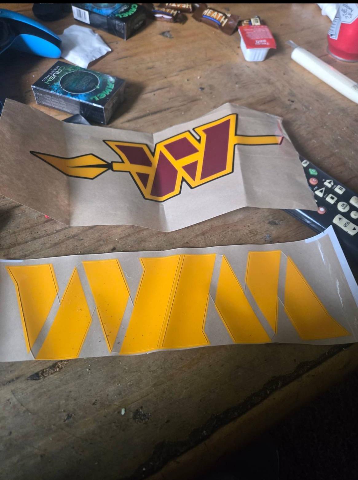
Found this under a sports page on Facebook. The poster claimed he had an insider at Riddell
35 comments
Looks awful if true imo lol
This is definitely not it. They took the current logo and put ugly lines through it
Hopefully not. That’s pretty damn bad
I know its just for ease of manufacturing but hate the WasteManagement logo
Fake. ❌ Look at that thing, it’s a mess.
The working conditions at Riddell look pretty bad 😅😅😅 Smokes, sauce packets, and heath bars. Though they do have video games, apparently? Anyways, isn’t the spear going the wrong way here? Looks fake as hell.
Who is blackmailing the franchise into keeping that hideous W?
Awful execution if true, the arrow is broken into bits going from one side of the W to another at random not at all like how one solid arrow would look
For those who hate our name and logo.. can we at least finally look forward to never hearing from you again after this? Good luck in your pursuit of determining the most esthetically pleasing branding for which to devote your fanship moving forward. Do you spend the rest of your time in Wizards subs complaining about the rebrand? How is that going?
Yikes
I hate that our entire logo is a font
They make logos at the trap house?
We just gonna ignore the two packs of camels
the smell of boredom
WM looks like the Waste Management logo
The string cheese is killing me
This seems like it came from some guy getting high in the basement, chain smoking camels, chasing Polly-o-string cheese dipped in BBQ sauce, with heath bars. I’ve seen it a hundred times.
Yes, watching Commanders football requires at least two packs of Camel Crush Menthols
God no
Can we please retire the taco holder W already
Man just got back to the redskins 🤷🏾
That’s fake lol.
I want that string cheese.
The perspective is SO off that this can’t be real. How is the spear pole in front of panel 3, but behind panel 2? This makes absolute zero visual sense.
This man drawing logos in a sweatshop
That’s even worst. I hope this is fake
I like the top one. Bottom looks like the waste management logo
Upside down can of Bud in upper right hand corner, packs of Camel, fun sized Heath bars, and controllers. Looks more like a stoner’s basement than anything else.
There is zero chance this is real. Whoever did this sucks as a graphic designer. It looks like a flea market knockoff.
I’m intrigued by the dipping sauce
There’s some MC Escher shit going on with that spear too. It’s not possible to be underneath the second (from the left) section but on top of the third section when the overlap makes it clear that the third section is on top of the second.
Really wish they can ditch the W. They’re a multi billion dollar team yet the logo looks like it was still made with Microsoft Paint.
Idk if it’s fake or not but the guy said his friend works at Riddell and gave these to him…he’s not claiming the pick is from the Riddell factory
Camel crushes, Xbox, candy bars, McDonalds sauce and bud heavy

35 comments
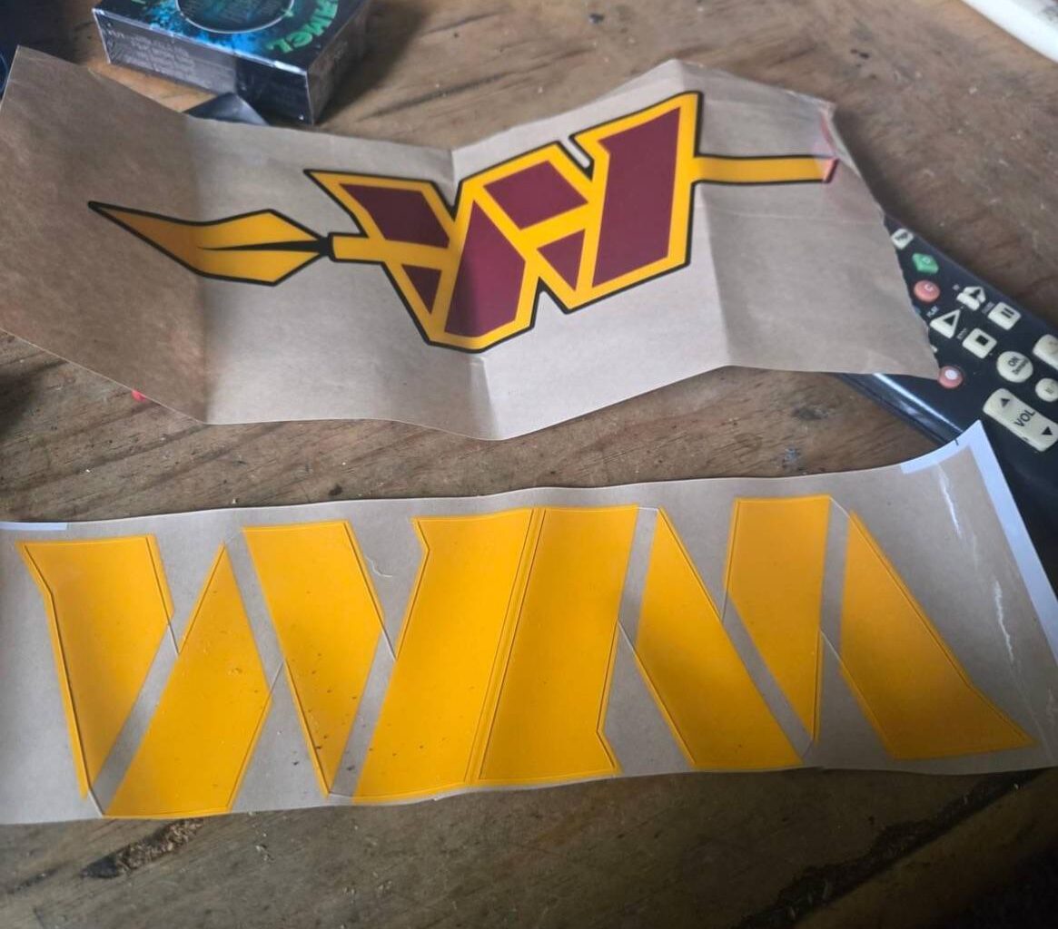
Looks awful if true imo lol
This is definitely not it. They took the current logo and put ugly lines through it
Hopefully not. That’s pretty damn bad
I know its just for ease of manufacturing but hate the WasteManagement logo
Fake. ❌ Look at that thing, it’s a mess.
The working conditions at Riddell look pretty bad 😅😅😅 Smokes, sauce packets, and heath bars. Though they do have video games, apparently? Anyways, isn’t the spear going the wrong way here? Looks fake as hell.
Who is blackmailing the franchise into keeping that hideous W?
Awful execution if true, the arrow is broken into bits going from one side of the W to another at random not at all like how one solid arrow would look
For those who hate our name and logo.. can we at least finally look forward to never hearing from you again after this? Good luck in your pursuit of determining the most esthetically pleasing branding for which to devote your fanship moving forward. Do you spend the rest of your time in Wizards subs complaining about the rebrand? How is that going?
Yikes
I hate that our entire logo is a font
They make logos at the trap house?
We just gonna ignore the two packs of camels
the smell of boredom
WM looks like the Waste Management logo
The string cheese is killing me
This seems like it came from some guy getting high in the basement, chain smoking camels, chasing Polly-o-string cheese dipped in BBQ sauce, with heath bars. I’ve seen it a hundred times.
This is the best fan-made logo i’ve seen.
They need to hire this guy:
https://www.reddit.com/r/Commanders/s/mJXC8ywLAj
Yes, watching Commanders football requires at least two packs of Camel Crush Menthols
God no
Can we please retire the taco holder W already
Man just got back to the redskins 🤷🏾
That’s fake lol.
I want that string cheese.
The perspective is SO off that this can’t be real. How is the spear pole in front of panel 3, but behind panel 2? This makes absolute zero visual sense.
This man drawing logos in a sweatshop
That’s even worst. I hope this is fake
I like the top one. Bottom looks like the waste management logo
Upside down can of Bud in upper right hand corner, packs of Camel, fun sized Heath bars, and controllers. Looks more like a stoner’s basement than anything else.
There is zero chance this is real. Whoever did this sucks as a graphic designer. It looks like a flea market knockoff.
I’m intrigued by the dipping sauce
There’s some MC Escher shit going on with that spear too. It’s not possible to be underneath the second (from the left) section but on top of the third section when the overlap makes it clear that the third section is on top of the second.
Really wish they can ditch the W. They’re a multi billion dollar team yet the logo looks like it was still made with Microsoft Paint.
Idk if it’s fake or not but the guy said his friend works at Riddell and gave these to him…he’s not claiming the pick is from the Riddell factory
Camel crushes, Xbox, candy bars, McDonalds sauce and bud heavy