
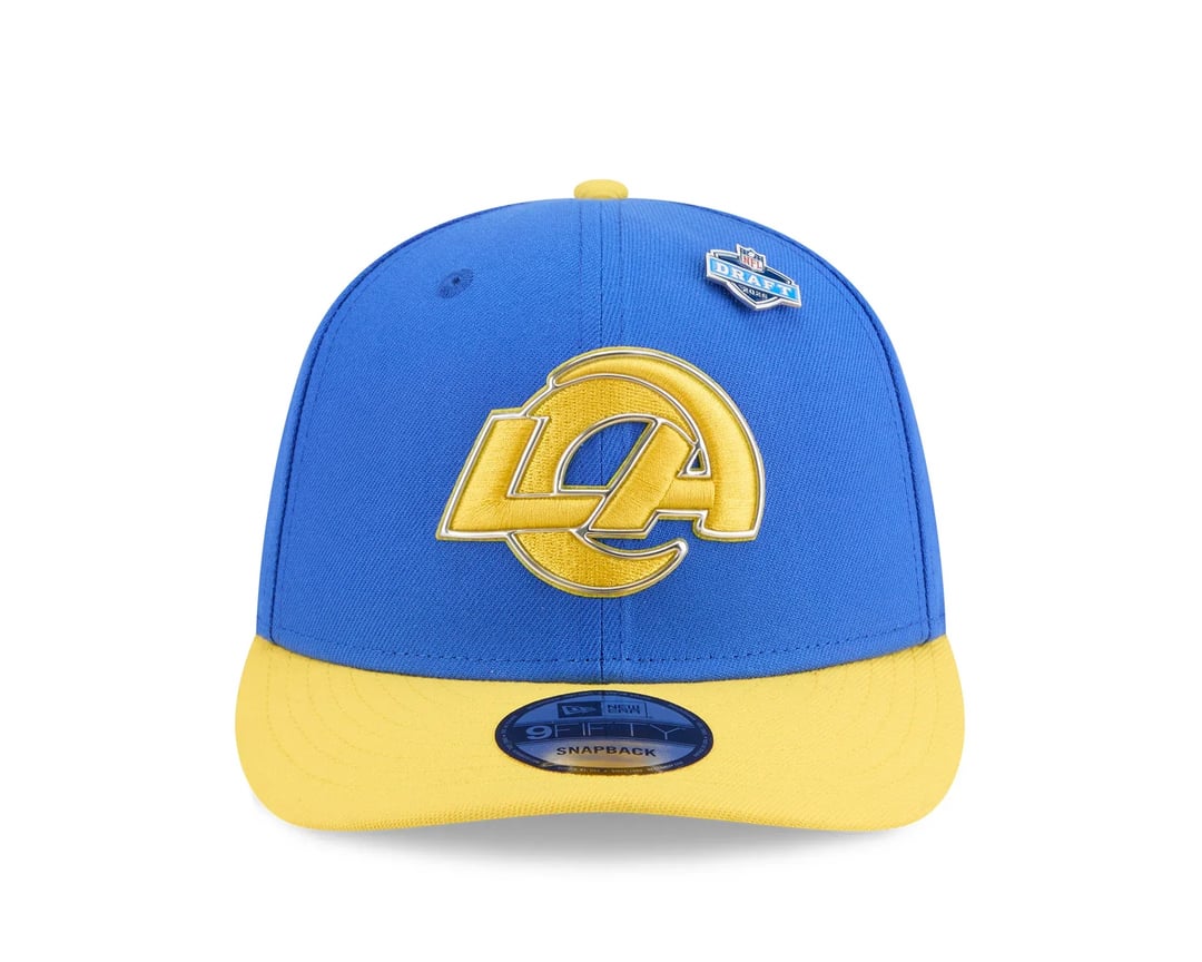
I know the leaked images of this has been posted before but this is the new draft hat that just got officially released by Capz which is an Australian based company that is an official reseller of these hats. You can Google their website easily.
Notice the change to our team name wordmark as well as the logo being all yellow? This is not an one-off design choice for the draft only as it appears that all other teams have their draft hats in their standard logos and team name wordmarks.
Even more curiously, I noticed these hats are NOT listed in the official NFL shop whereas all 31 other teams are listed… The plot thickens…
50 comments
Im gonna cry lol
I don’t know if there’s a plot to thicken outside of the Rams being terrible with their rollout timing. The LA logo is sticking around. The gradient will
be gone.
The fuck is that Rams shit on the back there
This is ugly AF. Should tweet at Atkins so he can bring up to Mcvay that this is awful?
Went full chargers colors
The word mark looks like dogshit wtf is with the random alien arm reaching over lmaooo
I hated the rebrand initially and eventually found a way to tolerate it, but now they’ve gone and made it even worse 😂 how sway

I honestly refuse to believe this is real that’s how bad it is in all seriousness. It’s to the point where if this is announced I will just buy existing stock because the current logo is so obviously better.
God Kevin Demoff fucking sucks
Pass. The type is so bold you can barely tell what it is!
Maybe it’s the millennial in me, but chrome/gold is disgusting. It just immediately yells cheap ass plastic to me.
What’s done is done I guess. These people from the midwest just don’t fucking get it lol.
Bruh they really doubling down on the highlighter yellow WTF
I actually like the wordmark, but the logo fucking blows. People were coping so hard thinking it was just going to the the draft cap
Same colors

In addition to making a shitty logo even uglier, what the fuck is that shade of blue??????
Fuck every single person who designed and approved this.
Ray Charles could make a better design than this

…are we the fucking Chargers??
Blue hat with mustard stain
This sucks
Maybe sales will be so low it will force them to come up with something new
Sad day
What the hell is this?
I always defend the uni’s but this awful. It’s a chargers hat. SMH
Makes me wonder how the person that green lit this dresses each day. This is horrendous

All they had to do it make the Ram skull the logo. Easiest slam dunk of all time
This is the dumbest logo in the league now and not even close. Even the weird browns Keebler Elf and the Patriots monstrosity are better than this.
Atrocious.
It give Banana Splitz 🫤
Barf
[removed]
Wtf we we want chargers colors for
Yuck.
I’m okay with this logo but only as a secondary. I want the retro rams head as the primary.
[removed]
Yeah this is ass im sorry. How does a team in LA not have a good designer?
At this point, it’s all of our fault for getting our hopes up with the rebrand
Worst logo in the league got worser
I’ll never wear something with that logo on it lol
Looks like charger gear
Guess I’ll stick to buying throwback and bootleg merch for at least 5 more years 😔
Friggin Chargers colors. Sacrilege
DOGSHIT
Kind of disappointing that they’re actually using that type of yellow. Was hoping for something closer to gold. As far as the wordmark is concerned, that R seems kind of unnecessary.
Kevin Demoff? No… Kevin Jackoff…yes
Ain’t no way this real!??! lol wtf man lolol dawg lol FUCKKKK lmao what is going on? I don’t understand genuinely don’t understand why we can’t get a dope ass design wtf
https://i.redd.it/gyboy2no8bsg1.gif
Can’t believe they made it even worse. The nightmare continues.
Only throwback or bootleg items again.