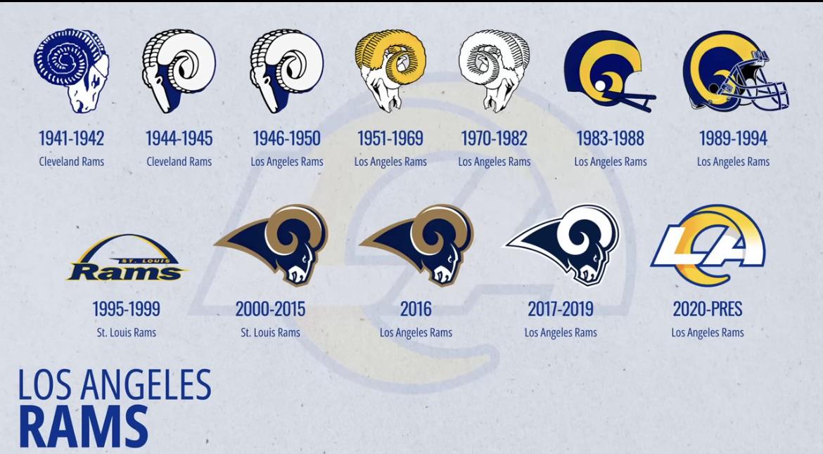
89-94 is the best IMO. Simple and clean, not a fan of the character logos
It should be a ram. Just make it happen
Miss the ram . The LA is bad but at least it’s not a helmet like the bengals and browns.
Honestly I think they shoulda just kept using the 2000-2019 Rams head and just changed to our new blue and yellow colors. My personal favorite is 1961-1969 but I could see a lot of ppl saying that looks outdated
2000-2016 is so peak. Probably the best sports logo of all time imo
51-82 the Rams face looks old and wrinkled to me. I like the 2000 and after head.
Helmet logo was peak
1941-1942
2017-2019
2000-2016
Current
I don’t like the helmet ones or the arch logo. Just doesn’t feel right. Can’t really explain why I like the 1941 logo and not the other older Rams Head logos, just don’t. I do like the current one for the purpose of rebranding, but the next one should not include LA. Just focus on the Ram
1970-1982 and 2017-2019 are my favorites
That 2017 is the very best
The helmet logos are the best ones. Anything pre-1983 looks like an illustration, not a pro sports logo
83-94 are my favorites
This might be a controversial opinion, but i think the helmet logo is the worst. It’s just lazy and unimaginative.
Helmet logo.
I really like that one in the bottom left, think we should go with that
Love the current one honestly
I actually love the helmet profile from the ’80s. So generic and honest. It’s my favorite of these, which doesn’t say a lot for Rams logos.
2000-2019 was absolute peak, shame that logo is not in use anymore
’83-’94 or similar is the only style that I will spend money on. Give me those throwbacks or GTFO.
Everyone knows we just need the 2000-19 logo with our current colors.
1. 2020-present, 2. 1951-1969, 3.1970-1982
We should change animals
I think the 2000-2019 Rams head would look great in our new colors but I honestly like our gradient LA logo with the yellow horn. Gradient numbers are bad but the two color tiered logo is good. Having an all yellow logo like the leaks suggest is just lazy

25 comments
Amazing that the current one is by far the worst
89-94 is the best IMO. Simple and clean, not a fan of the character logos
It should be a ram. Just make it happen
Miss the ram . The LA is bad but at least it’s not a helmet like the bengals and browns.
Honestly I think they shoulda just kept using the 2000-2019 Rams head and just changed to our new blue and yellow colors. My personal favorite is 1961-1969 but I could see a lot of ppl saying that looks outdated
2000-2016 is so peak. Probably the best sports logo of all time imo
51-82 the Rams face looks old and wrinkled to me. I like the 2000 and after head.
Helmet logo was peak
1941-1942
2017-2019
2000-2016
Current
I don’t like the helmet ones or the arch logo. Just doesn’t feel right. Can’t really explain why I like the 1941 logo and not the other older Rams Head logos, just don’t. I do like the current one for the purpose of rebranding, but the next one should not include LA. Just focus on the Ram
1970-1982 and 2017-2019 are my favorites
That 2017 is the very best
The helmet logos are the best ones. Anything pre-1983 looks like an illustration, not a pro sports logo
83-94 are my favorites
This might be a controversial opinion, but i think the helmet logo is the worst. It’s just lazy and unimaginative.
Helmet logo.
I really like that one in the bottom left, think we should go with that
Love the current one honestly
I actually love the helmet profile from the ’80s. So generic and honest. It’s my favorite of these, which doesn’t say a lot for Rams logos.
2000-2019 was absolute peak, shame that logo is not in use anymore
’83-’94 or similar is the only style that I will spend money on. Give me those throwbacks or GTFO.
Everyone knows we just need the 2000-19 logo with our current colors.
1. 2020-present, 2. 1951-1969, 3.1970-1982
We should change animals
I think the 2000-2019 Rams head would look great in our new colors but I honestly like our gradient LA logo with the yellow horn. Gradient numbers are bad but the two color tiered logo is good. Having an all yellow logo like the leaks suggest is just lazy
Everything looks great until the 2020 rebrand.