
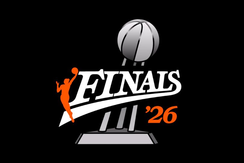
The Women’s National Basketball Association (WNBA) has officially unveiled the latest iteration of its Finals logo, introducing a fresh visual identity designed to anchor the championship brand across future global commercial campaigns.
The launch arrives as the league navigates a period of intense public discourse and commercial expansion, sparked by recent commentary surrounding competitive categories and grassroots participation frameworks.
Despite the complex sociopolitical environment, league administrators and players maintain that heightened public engagement is translating into tangible commercial growth and increased spectator attendance.
The brand refresh coincides with heightened public attention following recent commentary from Indiana Fever guard Sophie Cunningham regarding competitive fairness and Title IX protections.
Concurently, former National Basketball Association players Enes Kanter Freedom and Royce White announced intentions to pursue the twenty twenty-seven WNBA draft, further amplifying media scrutiny across the sporting landscape.
Cunningham maintained that young girls “shouldn’t have to go against biological men,” igniting widespread political reactions, national demonstrations, and a formal White House statement.
Addressing the broader impact of the discourse, Cunningham expressed confidence that the heightened visibility ultimately benefits the organisation’s bottom line.
“You have a lot of new fans, not only just watching, but coming to games and seeing the environment and seeing the talent,”
“I think anytime you can get more eyes on the W, that’s an awesome thing, because then that inspires other young kids that maybe have never seen the game or heard about the game or been to a game, they get that experience.
“So I definitely think that it’s been a very positive thing,” Cunningham said.
The newly redesigned badge pays homage to the league’s inaugural championship fixture played on August thirty, nineteen ninety-seven, where the Houston Comets defeated the New York Liberty.
Central design elements feature the iconic Logowoman paired with bespoke typography capturing the pace of elite competition, alongside a prominent championship trophy rendered in the background for the first time since two thousand and six.
Furthermore, the inclusion of the specific year adjacent to the trophy creates a dynamic branding asset that evolves with every annual champion, strengthening long-term marketing and merchandise value.
Don’t miss out on the latest in sports business – Subscribe today to the free Ministry of Sport newsletter and stay ahead of the game. For even more exclusive insights, event tickets, professional development and networking events, become a MoS Member today!.